
Table of contents
Skip table of contentsForced colors is a CSS media query that when active radically changes the way your site looks, without any of your input. In this article we'll explore where it comes from, how it changes your site and how you can adapt to it.
Making sure your site works well with Forced colors is not a lot of work and you can get very far with a little bit of effort and have a massive impact on the people using Forced colors. Read on to learn more!
This article is adapted from a talk Kilian gave at Web Directions AAA 2021. You can contact us if you're interested in Kilian presenting this at your conference, meetup or organisation.
Where does forced color mode come from?
Forced colors started in Windows 7, with support in Internet Explorer 10, as "High contrast mode" available from the system settings. With High contrast mode users can pick from one of 4 high contrast themes or choose their own theme. And when they do, their entire OS is rendered in that theme.
The feature is available in all current versions of Windows, though in Windows 11 it's been renamed to just Contrast Themes. It's also available in Ubuntu.
Here's an important bit of information though: High contrast mode is not about high contrast.
Well it kind of is, but it also isn't. Let me explain.
What High contrast mode does is severely limit the palette of available colors, and lets users pick which colors those are, for the things that make up a UI:
- Text
- Background
- Links
- Buttons
Usually users will pick highly contrasting colors for the text and background. But they don't have to. They can also choose to avoid specific colors, create a sepia theme or specifically configure the theme to avoid contrast.
The main feature is that it limits and controls the range of colors, making it easier for users to emphasize content and UI in a way that works for them.
In other words, they force colors. In the rest of this article I will try to be intentional with when I use Forced color mode and when I use High contrast mode, but in most situations you can use them interchangeably.
Who uses this feature?
High contrast mode is useful for many different people and includes people with low vision, color blindness, people prone to migraines or light sensitivity and people prone to overstimulation.
But also people who know of the feature and use it to keep their screen readable in bright sunlight, or dim their entire UI in dark environments. High contrast mode is one of the only features that will force all colors to change, and guarantees that across the operating system UI and browser (compared to say, prefers-dark-mode, which only works for sites that have it implemented).
In terms of numbers, Microsoft states that 4% of Windows users use High Contrast mode. In the WebAIM low vision survey, 50% of low vision users indicate they used the mode but of course, that is likely a very self-selecting group of savvy users.
You can still assume that one in twenty-five of your visitors will have it enabled.
How do you turn on High contrast mode?
When you open the system settings on Windows 10 there is an option called "Ease of access" where you can find various accessibility options.
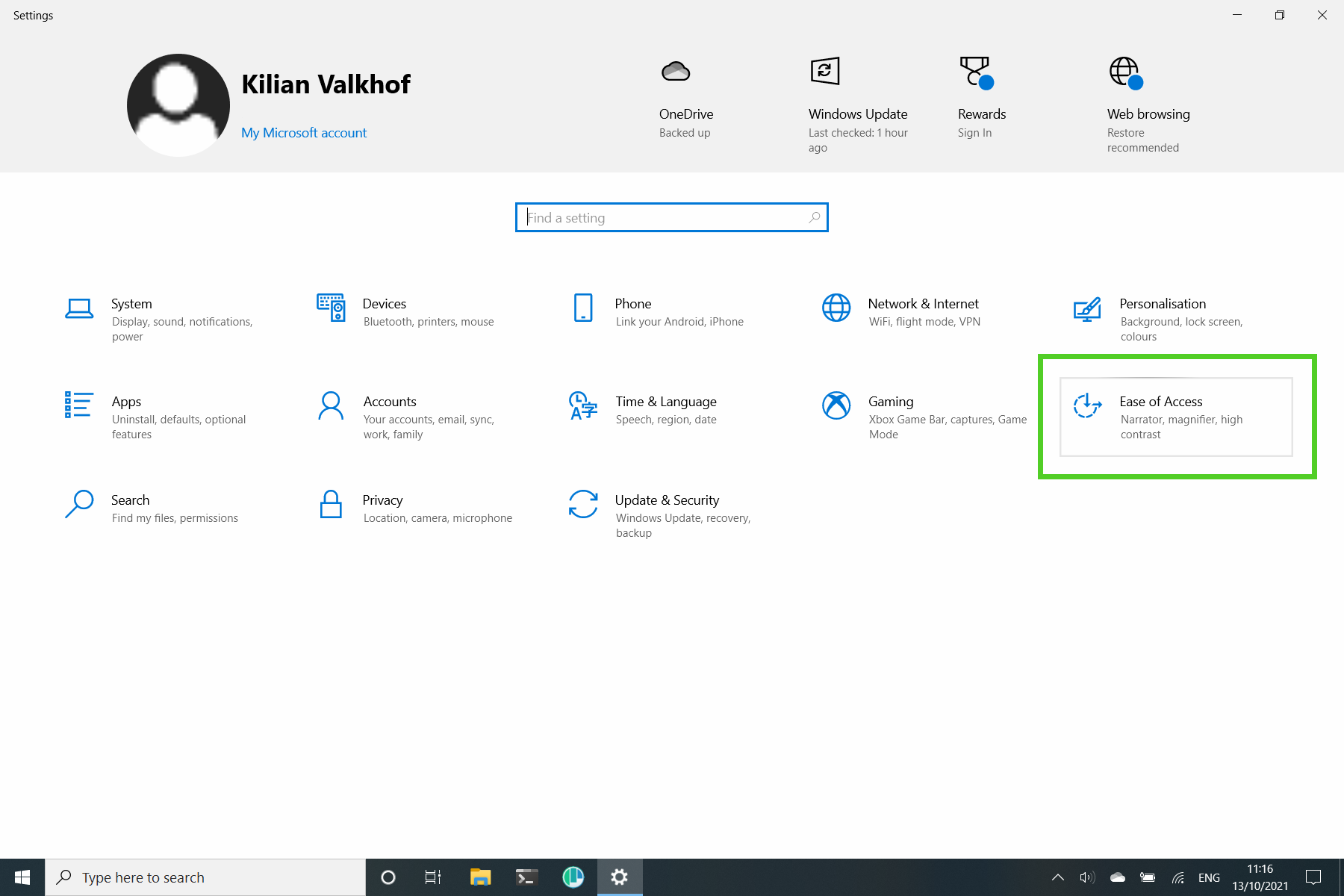
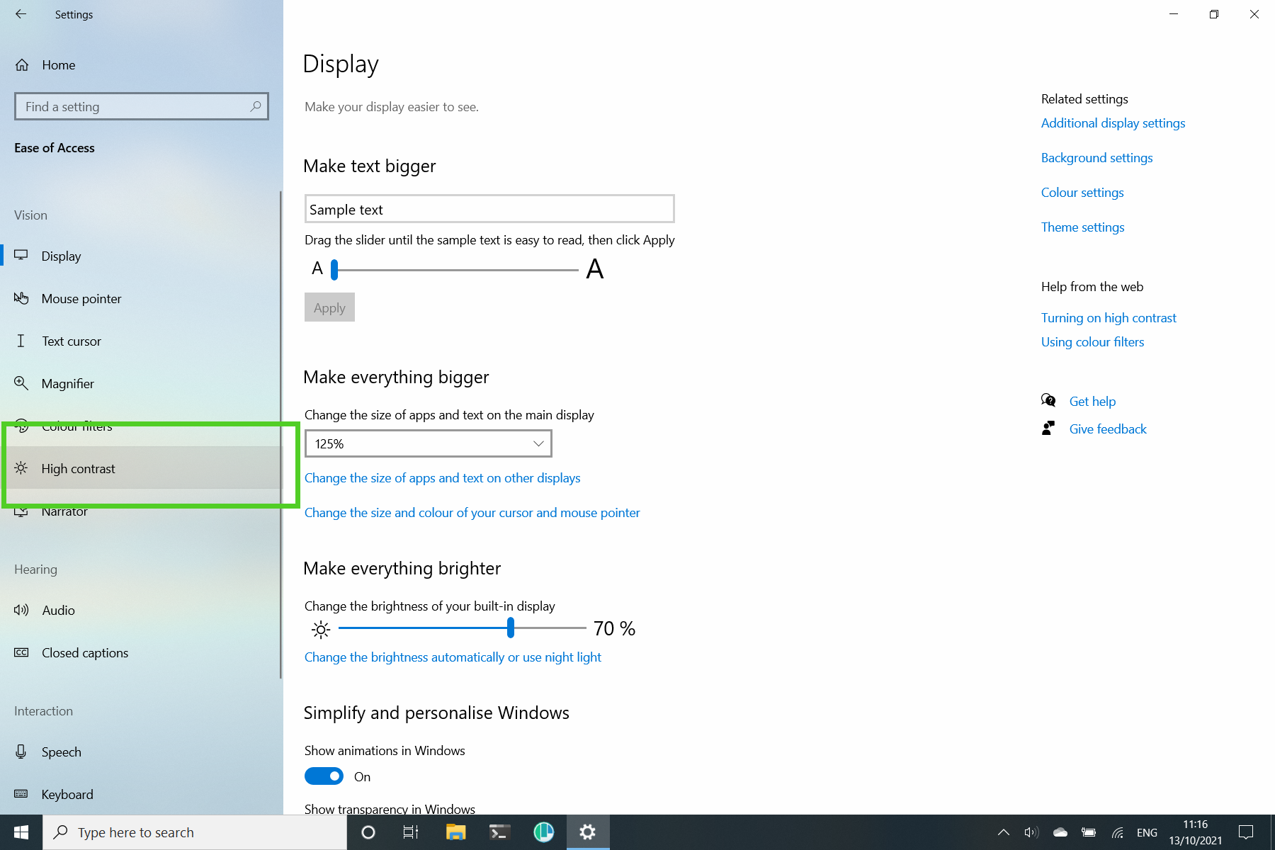
To the left you see a couple of different categories: Vision, Hearing and Interaction. Under Vision is where you can find high contrast.
If you use Windows and haven't looked around here yet, go and see all the other neat features that are available. I for example have set a different zoom level here to keep things readable on my relatively small screen.
Here you can toggle it on and off, and then choose the theme you want.
There is also a shortcut to toggle it on and off: left alt + left shift + print screen. This will use your last selected theme.
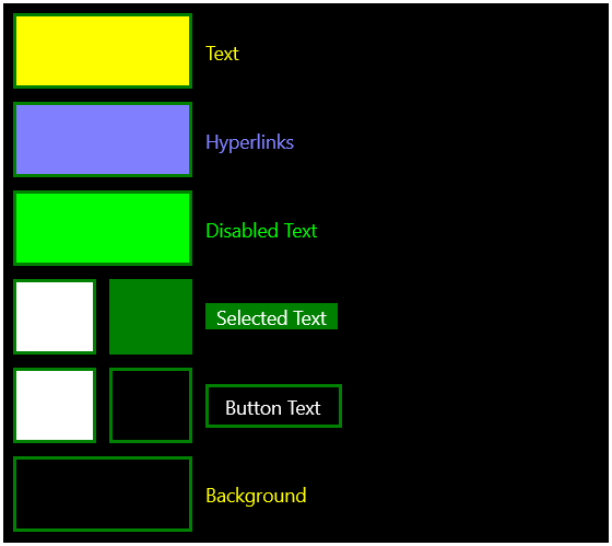
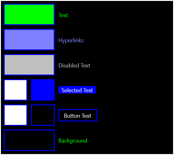
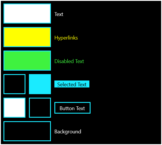
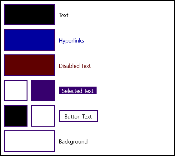
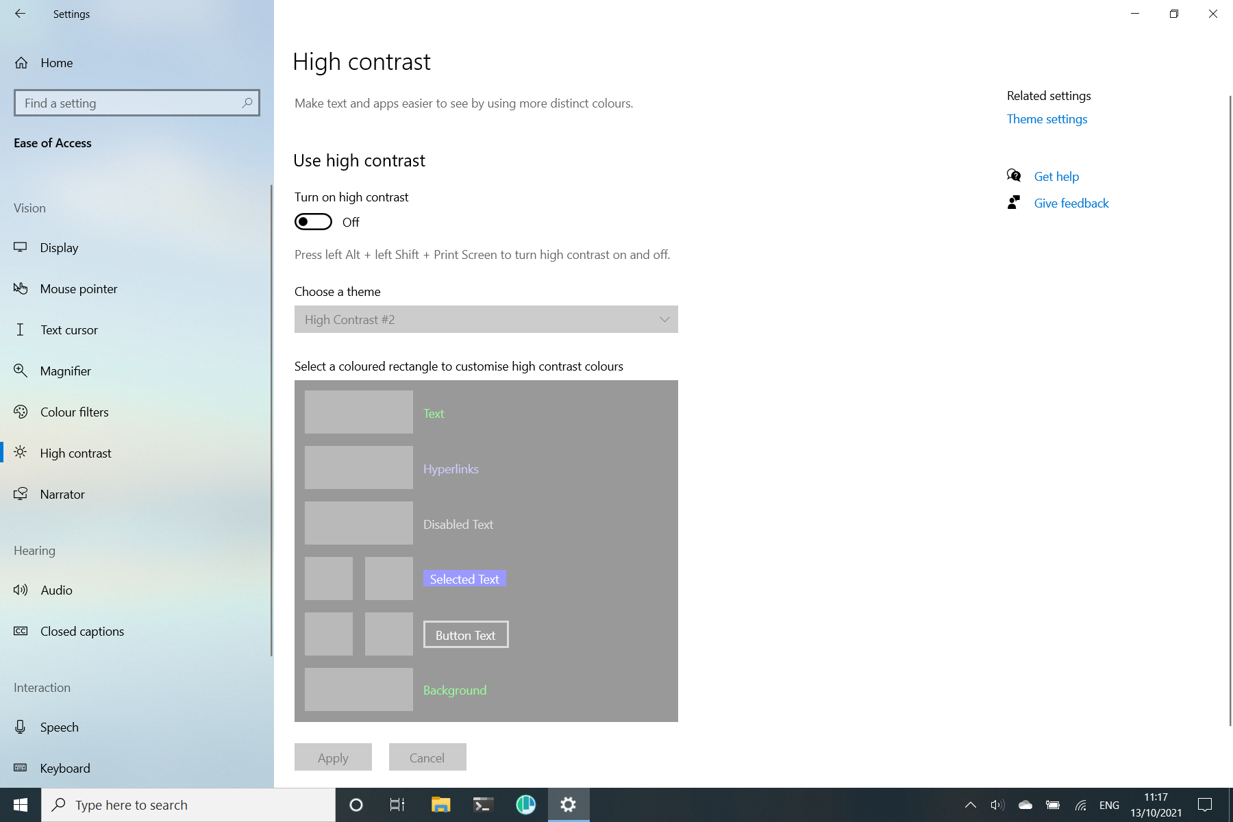
There's four themes available:
- High Contrast #1
- High Contrast #2
- High Contrast Black
- High Contrast White
The first three are all light-on-dark themes and mostly differ in their accenting color. Green for #1, Blue for #2 and teal for "black". High contrast white is the only dark-on-light theme.
All of those are pretty high contrast, why did I mention that it wasn't really about contrast earlier?
That's because from here you can also configure your own color theme by clicking on each of the color swatches. Choose colors for text, links, buttons and background and when you apply you get to save it as your own theme.
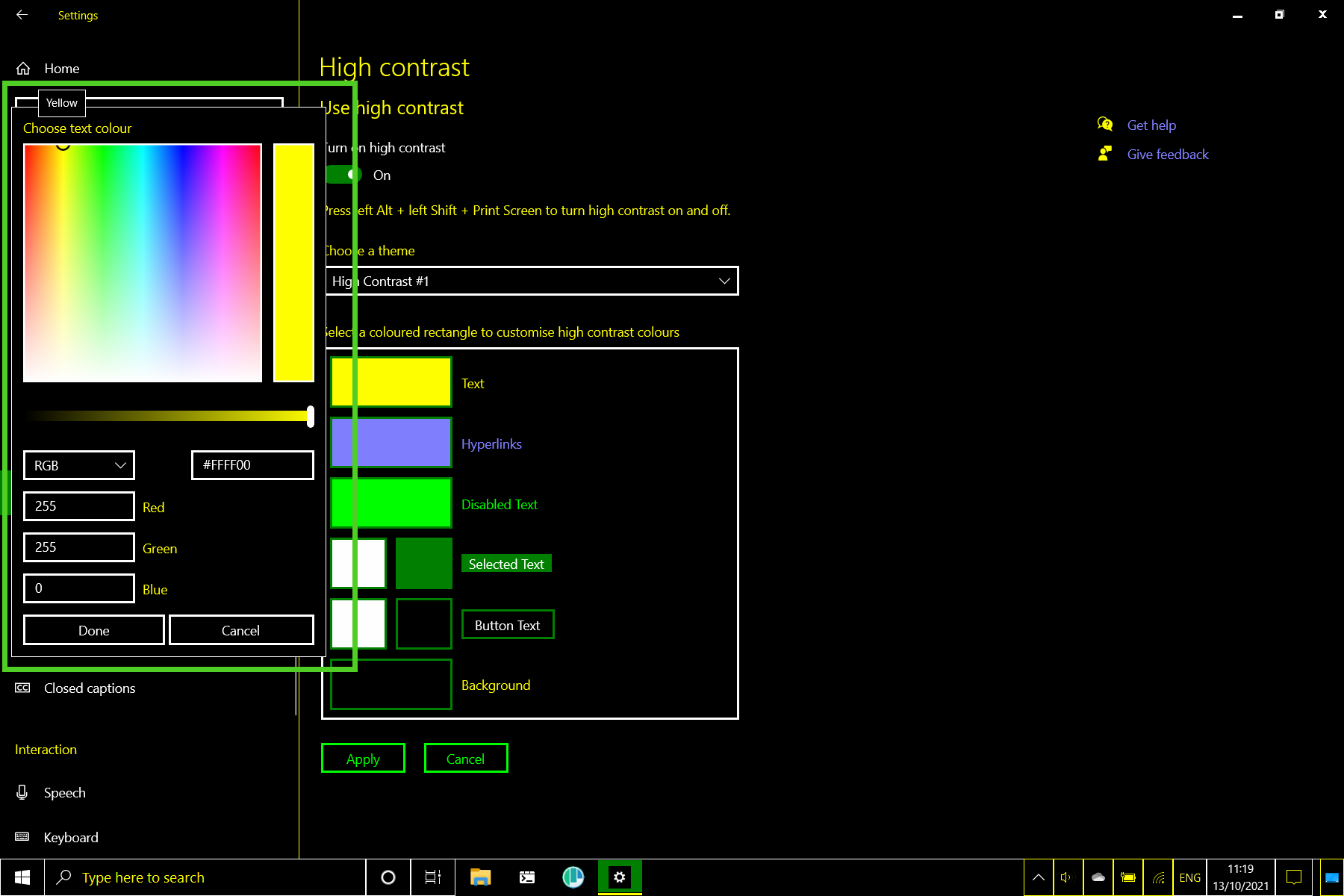
Notice by the way that it also shows the currently selected colors name, I thought that was neat. Interestingly, there's no way to edit a previously created theme, export it or import it. That seems like an oversight.
In terms of browser support, Edge, Firefox, Chrome and Chromium derivatives all support the forced-colors media query for Windows high contrast mode. So they will display your site in the forced colors your visitor set. IE and Old Edge support Windows high contrast mode but they use an outdated, non-standard syntax that we won't be looking at in this article.
Now we know what high contrast mode is, how to activate it and what browser support it. But how does it work?
How does Forced color mode work?
When Forced-colors is active in a browser, anything that lets you specify a color, but also things that contain colors like shadows, get reset. Background images are preserved, except on links and form elements, buttons excluded. The following styles will get reverted to their initial value and overwritten with user theme colors.
- color
- background-color
- border-color
- outline-color
- fill
- stroke
- text-decoration-color
- text-emphasis-color
- column-rule-color
- scrollbar-color
- -webkit-tap-highlight-color
- box-shadow
- text-shadow
- background-image
Text that's on top of images get a solid background color, called a "backplate", to force the correct contrast. Forced colors keeps your inline images and SVG icons intact, including their colors.
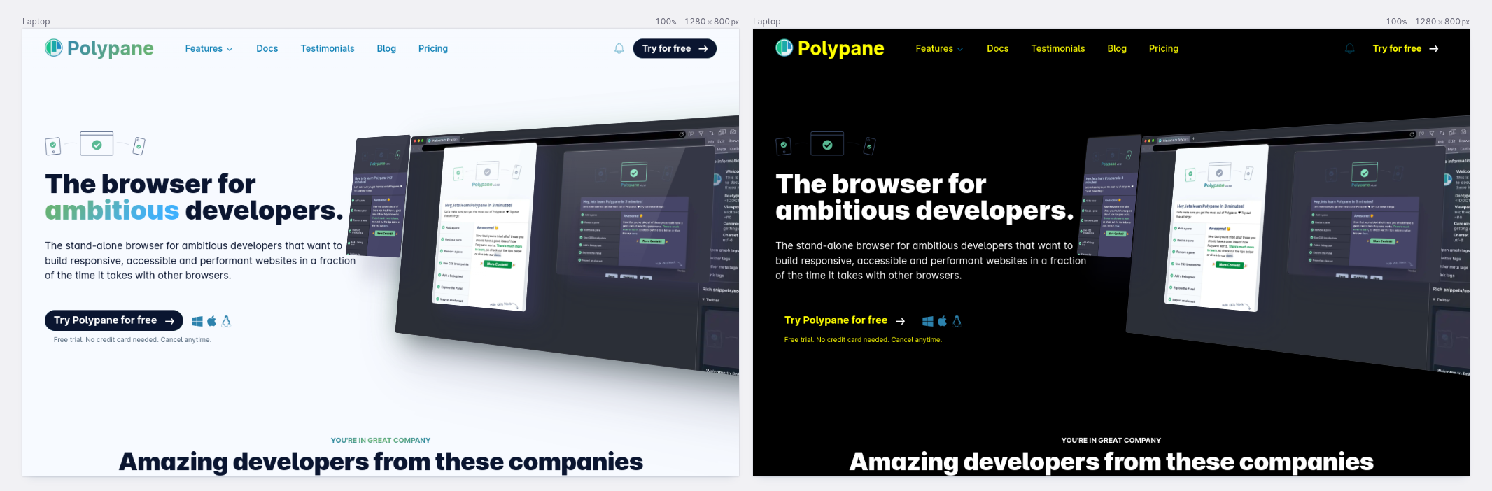
So Forced colors takes your site, maintains the layout and typography but completely rewrites your colors. For a quick idea, here's a comparison with an existing website. Notice how backgrounds and colors have changed or disappeared, but images still look the same.
Similar browser features
There's two browser features that can do similar things.
First is Reader mode. Reader mode will extract and reformat the content of a page in a user-chosen theme, and discard all the layout of a page. Forced colors maintains the layout while changing just the colors.
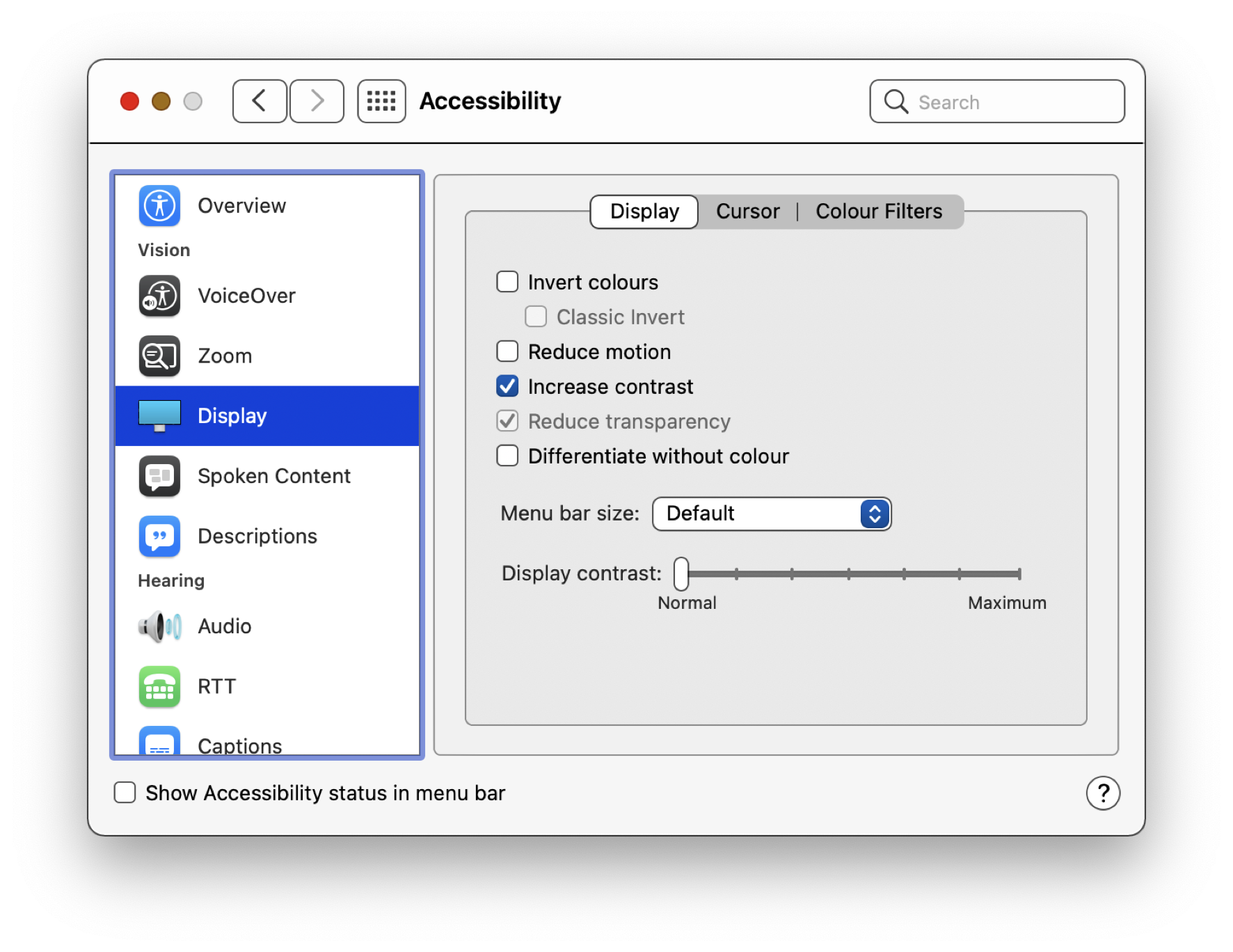
The other feature is the prefers-contrast media query. This is an upcoming media query that has support in Safari and Chromium. Prefers-contrast is a way for users to ask for more or less contrast, for example with macOS's "increase contrast" accessibility option.
While this works nicely on macOS, on Windows forced-colors and prefers-contrast are always active at the same time, and there isn't a way to turn off forced-colors without turning off prefers-contrast as well. This means that prefers-contrast on itself is not very useful on Windows.
How to know when your site is being rendered in Forced colors mode and what should you do with it?
Firstly, the media query forced-colors will be active when it's on and none when it's off.
Additionally, browsers will look at the background color of the high contrast theme to determine if this is a dark mode or light mode theme, and use that to set prefers-color-scheme to dark or light.
@media (forced-colors: active) {
  /* forced colors are active */
}

@media (forced-colors: active) and (prefers-color-scheme: dark) {
  /* High Contrast #1, #2 or Black is active (or custom theme) */
}

@media (forced-colors: active) and (prefers-color-scheme: light) {
  /* High Contrast White is active (or custom theme) */
}
Test your site
If you turn on forced color mode to test your site, then you're in for a surprise. Your entire OS will be in forced color mode, and that's not always what you want. Also, what if you don't have a windows device? Here's a couple of ways that still let you test your site:
- You can run a Windows VM and activate it in there. It's gonna be slow, and the entire VM will be in forced color mode, but it's the most accurate way to test. You can use a free Development VM for this. Note that these will expire after a couple of weeks, so you'll have to re-download them.
- You can test it in Assistiv labs. This runs a cloud-based VM, so it has the same upsides and downsides.
If you want to test it on your device regardless of your OS, you can use Polypane. Polypane has a built-in forced color mode that only affects the pane, not your entire OS. This is the fastest and most convenient way to test forced colors. The downside is that you can't experiment with how different custom themes look. Usually though, checking the dark and light modes are enough to suss out any issues.
To test your site in Polypane, open up the pane emulation settings and toggle the "Forced-contrast" toggle.
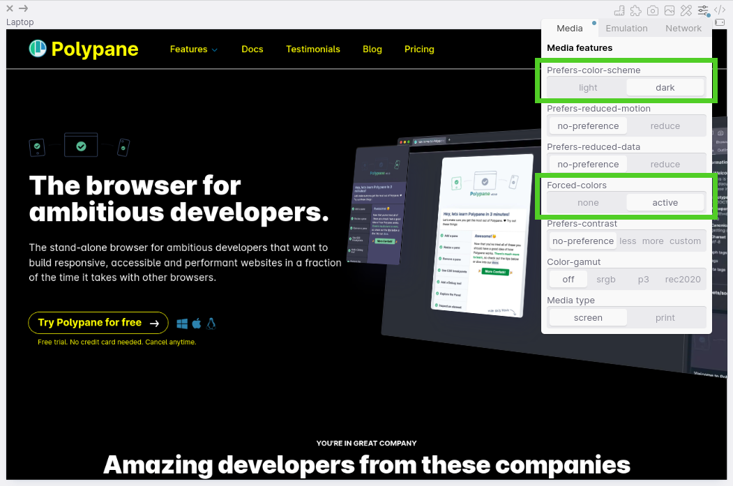
Here you can also toggle the "prefers-color-scheme" setting to see how your site looks in both a dark and light forced color theme:
With forced color mode turned on we can test our site! There are small differences in how Firefox, Chrome and Edge deal with forced color mode, particularly around images, but they shouldn't affect the testing and styling you do.
The changes we're going to make are not about making your site look "good" again, they are to respect the visitors wishes and nudge your site closer to those. We're going for clarity and readability.
Replacing backgrounds with borders
Without your colors and backgrounds things might look a little empty. Forced colors resets your background colors, and resets all background colors to the same color. That means areas that were differentiated by different background colors will now all look the same, and that can hinder understanding.
What we're going to do is add either borders or outlines to elements that need it. Whether you want to use a border or outline is more or less up to you, depending on what you can do with your layout (borders influence your layout while outlines don't). Keep in mind you will want to use the outline for focus styling as well though.
We can use the platform to keep things simple and add border:1px solid or outline: 1px solid leaving out the color. The browser will match the text color for us.
Adding these borders will also reduce the visual complexity of your page by adding clear delineations, like I have done here for buttons and the header.
Find missing content
Next, scan your page for missing content, in particular SVG icons, as they are left alone by forced colors and you need to help the browser along and give them the right color. How do you do that if you don't know what colors a user has picked? A long time ago CSS2 came with something called "system colors", that let you use the exciting array of grays that Operating systems came in in 1998.
However, browsers have not supported those for a long time. It turns out that when you give web developers the exact styling used to create the OS style, they abuse that to show fake popups and get users to do things they shouldn't do. So they don't work anymore.
Luckily, CSS4 comes with an updated set of System colors, specifically designed to work with forced colors. These also work without forced colors but with forced colors active, they will map perfectly to the theme chosen by your visitor.
CanvasText: Regular text colorCanvas: Background colorLinkText: Link colorButtonText: Button text colorButtonFace: Button background colorHighlightText: Selected text colorHighlight: Selected text background color
When you're updating SVGs, check where you use them (in text, in links or in buttons) and pick the one that matches your SVG's use case.
You can probably fix a lot of these with some generic CSS already, though check whether your SVGs are styled with fill or stroke before making your CSS too generic.
@media (forced-colors: active) {
  svg {
    stroke: CanvasText !important;
  }

  a svg {
    stroke: LinkText !important;
  }

  button svg {
    stroke: ButtonText !important;
  }
}
Here we give all regular SVGs the text color, all linked SVGs the link color and all SVGs in buttons the button color.
Alternatively you can use currentColor for the SVGs to automatically follow the color of the element they're in. This will make them follow the forced color theme of your user as well. In Chromium versions between 89 and 102 there was an error where this didn't happen, but that has been resolved.
Of course, make sure you check if this fixes all your inline SVGs and if you need to tweak some of them individually.
Check the colors
When you replace all the colors on your page, you also lose the meaning of anything that's only conveyed through color. Using only color to convey meaning is a WCAG violation so you shouldn't do that anyway... but it's still something you have to check.
Are there any elements that only use color to convey meaning? Those need to be updated. Common ones are showing a red or green border on form fields. Make sure to add a shape like a checkmark or better, clear error or success text. This also makes your site better for the 95% of people not using forced colors, so everyone wins.
Text in images
Another one I have to mention is, check if your page does not have any text in images. They won't be converted to the users theme. The solution is straightforward: Don't have text in images.
Semi-transparent images
That's not the only type of images you have to check though. You might also be using semi-transparant PNGs or external SVGs that you expect to be shown on a certain color background. For these, consider adding a dark and light mode alternative to the image and swapping between them depending on what prefers-color-scheme matches.
For SVGs that you use in image elements, you can also add an inline <style> element with CSS for forced-colors in the SVG itself, and the browser will pick that up. Pretty neat!
Focus styles
Lastly, it's time to tab through the page and make sure that focus is still clearly indicated. If you have disabled the outline in favor of your own nicer looking focus styles, for example with box shadow to get those nice rounded corners: remember that focus mode removes all box shadows.
A good way to deal with this is to replace your outline: none with outline-color: transparent. Without forced colors, the outline will still not be visible but with forced colors, that outline color will be overwritten with the current text color, making it nicely visible again without needing any special adaption or re-styling for forced color mode.
/* don't: */
element:focus {
  outline: none;
  box-shadow: 0 0 0 2px orangered;
}

/* do: */
element:focus {
  outline-color: transparent;
  box-shadow: 0 0 0 2px orangered;
}
In summary
So to summarize, when adapting to Forced colors you want to make sure you:
- Replace areas delineated by backgrounds with borders or outlines.
- Make sure all your icons are visible and follow the users theme.
- Take care that there is no meaning conveyed by color alone, as that color will be gone in forced color mode.
- Replace or provide alternatives for images that don't work well, such as ones with text or ones with transparency.
- Make sure a focus indicator is still visible for all focusable elements.
Disabling forced color mode
But ...what if you need to disable forced colors? There are situations where the colors you picked are absolutely important, such as when showing a color selector in a webshop. Used sparingly on specific elements, and definitely not on entire sections or entire pages, you can add this CSS property.
.my-specific-element {
  forced-color-adjust: none;
}
With that you can turn off forced colors for that element and it's children. There are a few legitimate places where this makes sense but please make sure to use it sparingly and to respect your visitors wishes as much as possible.
In closing
And with that, we've explained Forced colors. We now know what forced colors are, how to configure them, why they're used, which browsers support them, how to test them, how to make sure our sites look good in them and lastly, how to disable them only when that's absolutely needed.
If you want to read more, in particular on the differences with Internet Explorer then these four links should give you plenty information:
- Styling for Windows High Contrast by Melanie Richards and Alison Maher
- WHCM and system colors by Adrian Roselli
- Assistive Technology Experiment: High Contrast by Jon Whiting
- Working with High Contrast mode by Eric Bailey
If you want to learn about more CSS media queries, check out our complete guide to CSS Media Queries and get a Polypane trial to quickly start testing your sites in Forced Color mode.

