The browser for devs who care about their craft and users
A desktop browser for web devs. Preview viewports side-by-side, audit accessibility, SEO and performance. Built to boost productivity and streamline building and testing.
Trusted by developers shipping work that matters.
This thing is FAST and the synchronized scrolling works amazingly. Prepare to be impressed.

Polypane is really saving my bacon. Kilian knocked it out of the park, this is my new favorite development tool.

Polypane helped me see a spacing issue between two breakpoints that I wasn’t aware of. Love it 💯

I've started playing around with Polypane and 🤯. It has awesome debugging tools, I'm really impressed.

Polypane helps you craft sites with care.
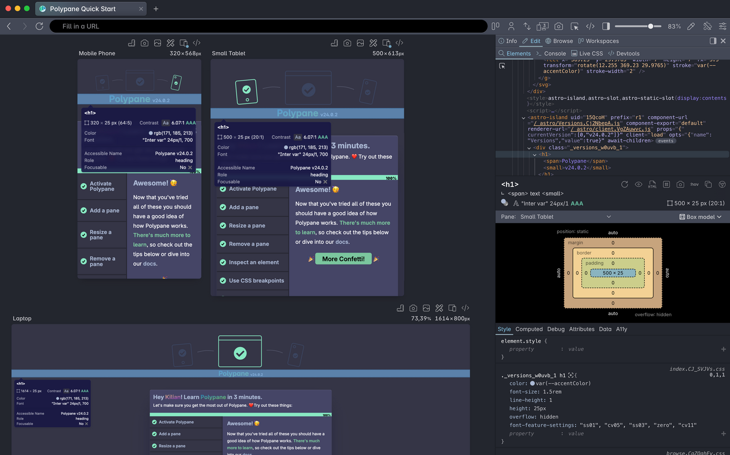
A desktop browser purpose-built for modern web developers. From real-time responsive previews to in-depth accessibility and SEO testing, it brings everything you need into one streamlined environment.
Responsive design
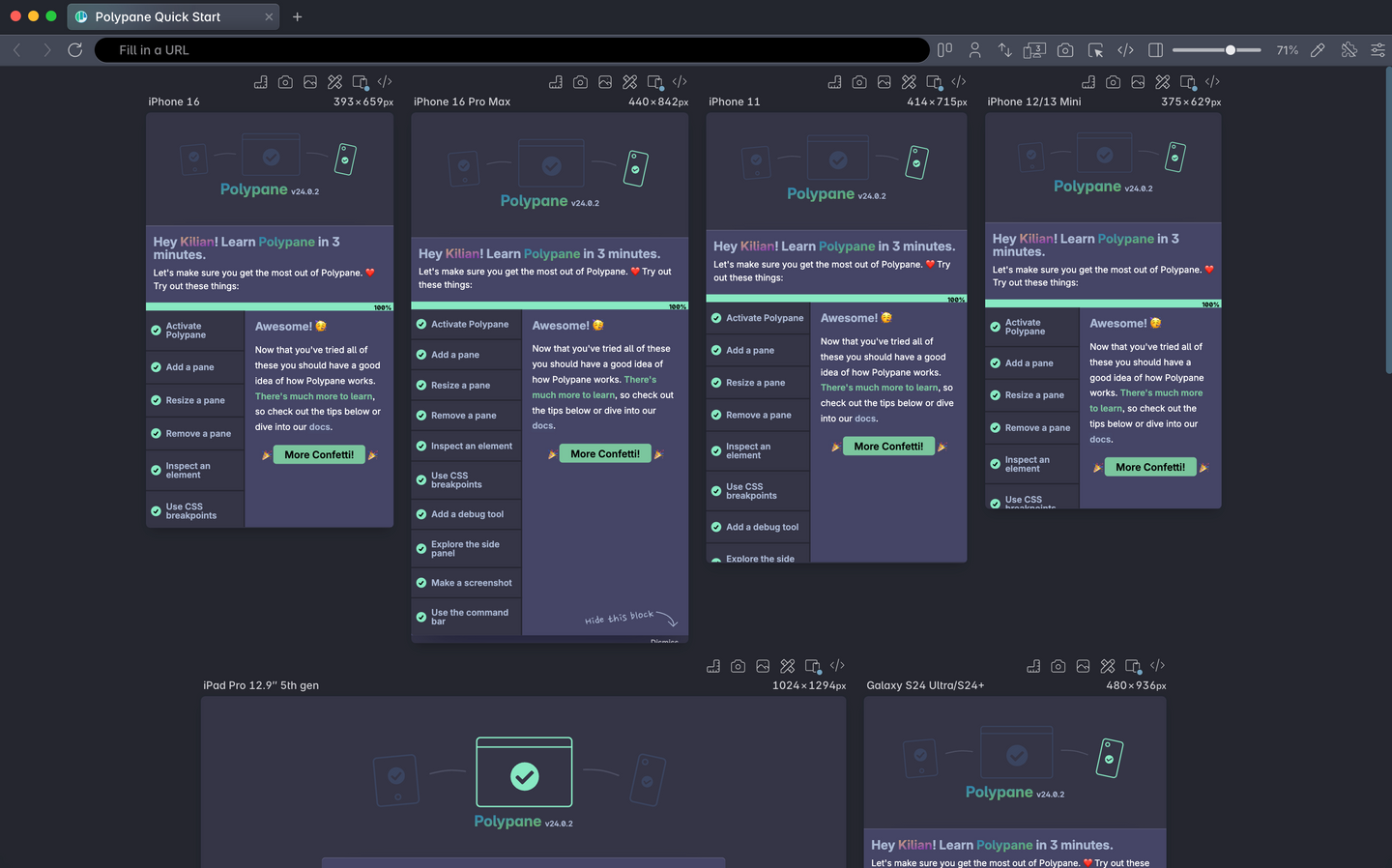
Mobile screens to 5K monitors, see all viewports in one overview.
Lint as you go
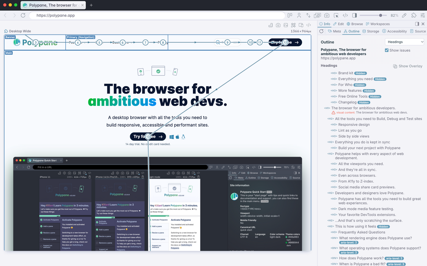
Check your structure, metadata and accessibility. Get instant suggestions.
Side by side views
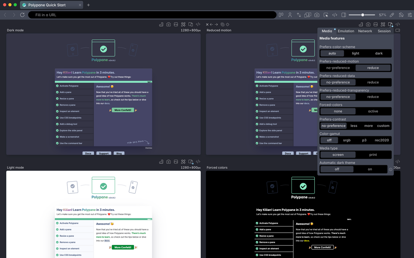
Test dark and light and more without changing your system settings.
Why devs switch to Polypane
Polypane replaces your patchwork of tools with a single, powerful browser designed for building better websites. Once you try it, you'll never want to go back.
Regular Browsers
Frustration. Inefficiency. Blind spots.
With Polypane
Clarity. Speed. Confidence.
Switching between breakpoints manually
Constantly resizing your window or dragging dev tools around.
Multiple synchronized viewports
See and interact with all breakpoints at once. Build once, preview everywhere.
Slow testing workflow
One screen, one viewport, one change at a time.
Faster iterations
Edit code → changes live across all devices instantly.
Missing accessibility issues
Limited or no built-in accessibility checks.
Built-in accessibility auditing
Instant contrast checks, focus order overview, accessibility features emulation, and more.
Guessing about UX across devices
What your site actually looks like on mobile is a mystery until you test each one individually.
Device realism
Pre-configured panes that match real device resolutions and behaviors.
Over-reliance on extensions
Cramming 10+ dev tools into your browser and still missing insights.
All-in-one power tools
Meta previews, live reloading, image overlays, design & dev tools in one clean interface.
Inconsistent testing environments
You test in your browser and screen size, your teammate tests in another. Everyone sees something else.
Unified testing experience
You all see the same thing: every pane, every breakpoint, every audit. Everyone's on the same page.