If you want to be kept up to date with new articles, CSS resources and tools, join our newsletter.
"The squint test" is a method to get a feel for the visual hierarchy of your page and the name is quite literally what you're supposed to do. When you squint your eyes and move away from your screen a little you distort your vision to the point where you can no longer focus on the page but can still make out the large areas and colors in your design. In other words, you only see the visual hierarchy.
When you're designing or building a website, it can be easy to focus in on the details. Is everything precisely aligned to the grid? Are you using the exact right font-size and colors? Is this the right border-radius? But when you focus on the details, the major hierarchy of your website can get away from you.
The squint test is a quick way to check if your page is still on the right track because it hides those details and lets you focus on the larger patterns in your page.
What to look for when doing the squint test 🕵️♀️
When you do the squint test there's a few question you're trying to answer:
Is the primary focus of the page clear?
Most pages have one primary focus. One thing they want users to do or one topic. When squinting, is the primary call to action
or primary point of focus still recognizable, and is it clear what the primary focus is?
Are relationships between elements clear?
Most visual elements have some sort of relationship with others, like titles and text below it, or the header and the logo.
When you squint, is it still clear that they belong together, or is the spacing causing elements to look separate?
Which elements stand out? (and should they stand out?)
Elements with tons of contrast or color stand out more than others. When you squint these elements gain more prominence
compared to when you see them with "noisy" text around it. Are these elements the one you want to have stand out?
Another important step for this question is to distinguish between foreground elements and background elements. Are background element like dividers and backgrounds more prominent than the primary focus of the page?
Is the page still recognizable?
Can you still find the logo, are the colors used recognizable as your brand and consistent with the rest of your site?
If an element is interactive, is that still clear when squinting?
You don't want people to have to hunt for buttons and other interactive elements. When squinting, can you still detect
whether a link is clickable? If you're just using an underline that might
get lost when blurring, but if you also have a different color then it's
still clear.
Are elements that look the same when squint actually related?
A common usability concept is "things that look the same are the same". And when they're not that leads to confusion.
Are the elements on the page that look the same, also similar in behavior? If not, you might want to make sure they look
different too.
The squint test ...without squinting 👀
If you keep squinting while checking your design for all those points you'll end up with quite a headache.
Polypane has two debug tools that can help you do the same tests, no squinting required.
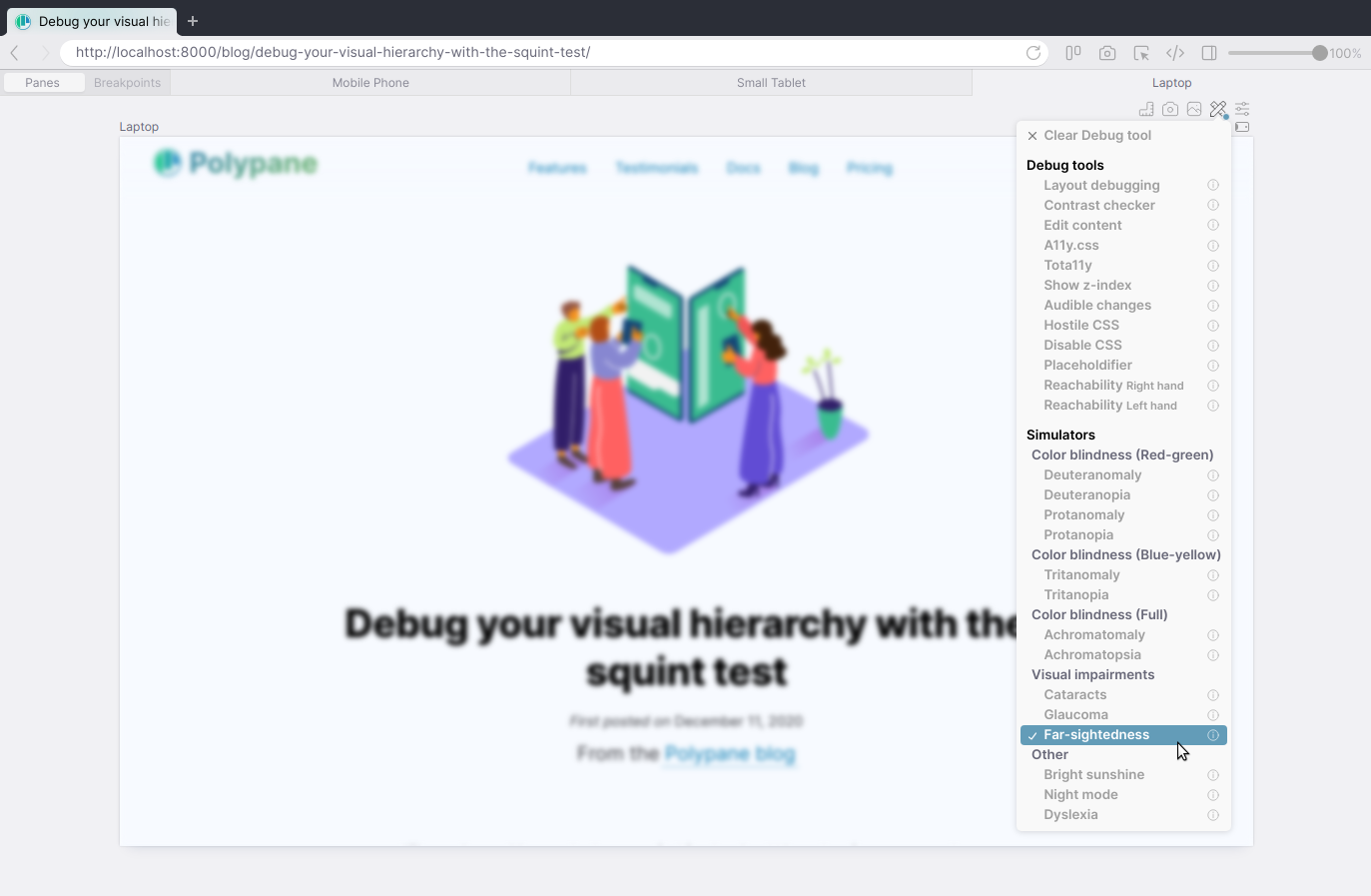
Far-sightedness emulation
The Far-sightedness emulation blurs the page you're looking at to emulate what people with far-sightedness see.
When you squint your eyes you also can't bring the page in focus making this an ideal substitute for the squint test without needing to physically squint.
Turn on the emulation and scroll through your site, taking note of the questions above and seeing where improvements can be made.

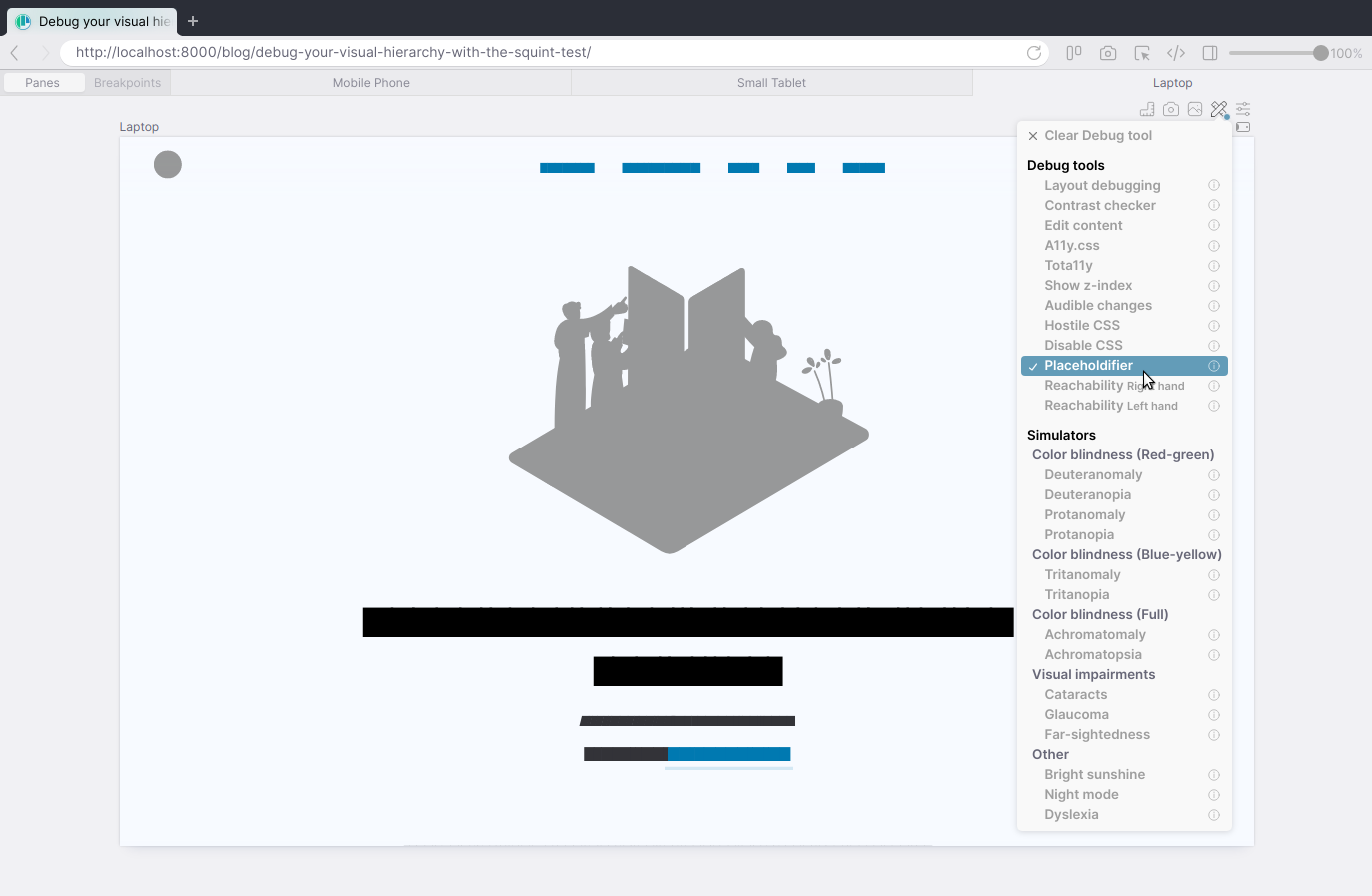
Placeholdifier debug tool
But even a blurred page can give you physical discomfort when looking at it for too long, since your eyes will keep trying to get the page into focus.
With the Placeholdifier debug tool every element stays sharp but text and images become solid blocks of color. With this you take away the focus on the actual words and imagery and are left with the general layout and hierarchy.

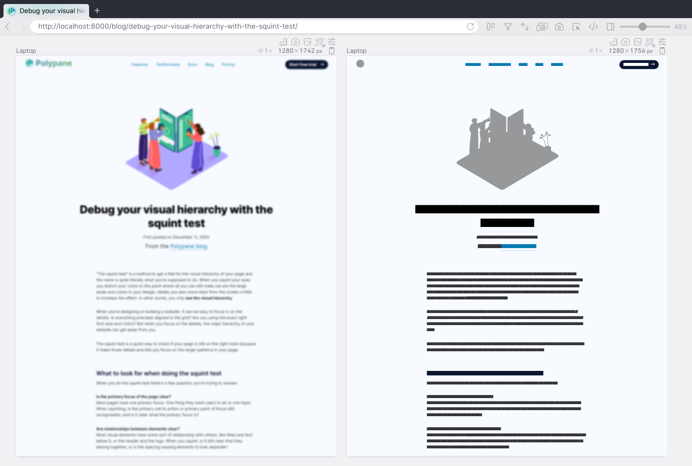
Run them side by side
With Polypane, you can also show these two debug tools side by side. Because each highlights some issue more than the other, checking a page in both at the same time lets you see the entire overview in one go.

Try it yourself 🤩
Test out these debug tools, and over 25 others (like color blindness simulators, dyslexia emulation and layout debugging) in Polypane by starting a free 14 day trial. Polypane is available on Mac, Windows and Linux.
