Skip to contentSkip to footer

A breakpoint, responsive breakpoint or CSS breakpoint is a width or height that you specify in a media query at which point you want to change the style or layout of a page. For example, to change text side, or to go from one to two columns.

This should not be confused with a JavaScript breakpoint, which you can use to pause your javascript code and inspect it.
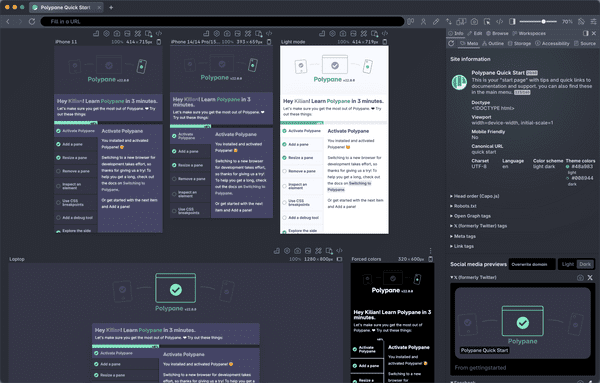
The responsive design glossary explains the many terms used in responsive design and development. It's a practical reference for anyone getting started with responsive design and development.

Get an overview of all responsive design terms

Build your next project with Polypane

  • Use all features on all plans
  • On Mac, Window and Linux
  • 14-day free trial – no credit card needed
Try for free
Polypane screenshot