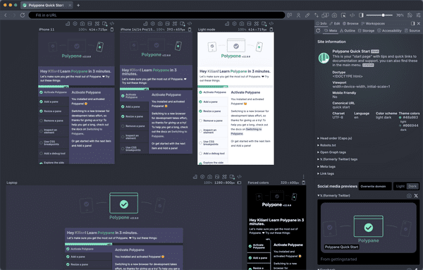
With a media query you can define CSS that is only applied when your media query is applicable, like when your screen is at least 500px wide:
@media (min-width: 500px) {
  ...
}
This lets you write CSS that only makes sense when your page is a certain (minimum) width or height. For example to move from one column to two columns of text. When using media query values, it's best to use min-width exclusively and work mobile first.
You can test for many values in a media query, such as test for dark mode with @media (prefers-color-scheme: dark) and target the styling when the page is printed with @media print.
Want to learn more?
Our complete guide to CSS Media Queries will tell you everything there is to know about CSS Media Queries.
