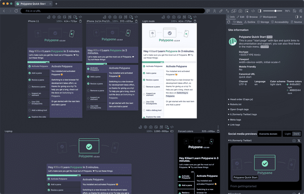
Mobile first refers to the practice of starting a responsive design or implementation with the smallest view first. Because of the limited available space, the smallest version is often simpler than the (larger) desktop version. This forces you to prioritize the important parts of a page. It then becomes easier to design or develop for larger screen sizes, as opposed to designing or developing for desktop first and trying to fit everything in on mobile.
What is Mobile first?
From the Responsive Design Glossary
The responsive design glossary explains the many terms used in responsive design and development. It's a practical reference for anyone getting started with responsive design and development.
Get an overview of all responsive design termsBuild your next project with Polypane
- Use all features on all plans
- On Mac, Windows and Linux
- 14-day free trial – no credit card needed
