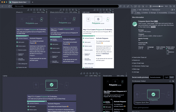
The viewport is the size of the part of your site that's visible in the browser.
What is a Viewport?
From the Responsive Design Glossary
The responsive design glossary explains the many terms used in responsive design and development. It's a practical reference for anyone getting started with responsive design and development.
Get an overview of all responsive design termsBuild your next project with Polypane
- Use all features on all plans
- On Mac, Windows and Linux
- 14-day free trial – no credit card needed
