3D transforms and perspective can be a great trick to add depth and texture to any website but they're tricky to get right.
They can easily look skewed, too flat or distorted if you don't use a fitting perspective or go overboard on the angles.
Still, there are sites out there that make excellent use of 3D transforms to make their pages more vibrant and visually interesting. For example, here's Modulz:
3D Transform by Modulz
div {
  transform:
    perspective(75em)
    rotateX(18deg);
  box-shadow:
    rgba(22, 31, 39, 0.42) 0px 60px 123px -25px,
    rgba(19, 26, 32, 0.08) 0px 35px 75px -35px;
  border-radius: 10px;
  border: 1px solid;
  border-color:
    rgb(213, 220, 226)
    rgb(213, 220, 226)
    rgb(184, 194, 204);
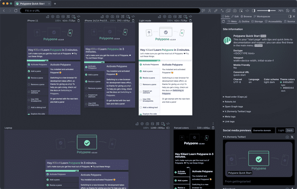
}We've been collecting these in a new resource: Beautiful CSS 3D Transform examples. We've taken examples from Framer, MagicPattern, Polypane and other websites, simplified them and placed them side-by-side with their CSS.
Each example comes with a Copy CSS button that lets you easily copy over the CSS that creates the 3D effect. These examples are great startingpoints for you to create your own beautiful CSS 3D transforms and when you do, reach out and we'll add them to the list!
