
We first released our color contrast checker three years ago. At the time it was one of the first ones that gave suggestions, based on the needs I had while working on an open-source corona tracking app.
Later on the contrast checker was updated with support for the new EyeDropper API so you could pick colors from anywhere on your screen as well as the ability to set your preferred format between hex, rgb, hsl and hwb.
We've been adding a bunch more, read on below!
A new home: ColorContrast.App
And now it's time for our color contrast checker to get a new home at ColorContrast.App! It'll still be available here on the site as well, but the short, memorable domain should make it easier to find and share.
Dark mode
While moving the contrast checker to a new domain, we also took the opportunity to add a dark mode. The site will by default use whatever your system default is (and change along with it) unless you explicitly set it to light or dark mode, then it'll stay that way.
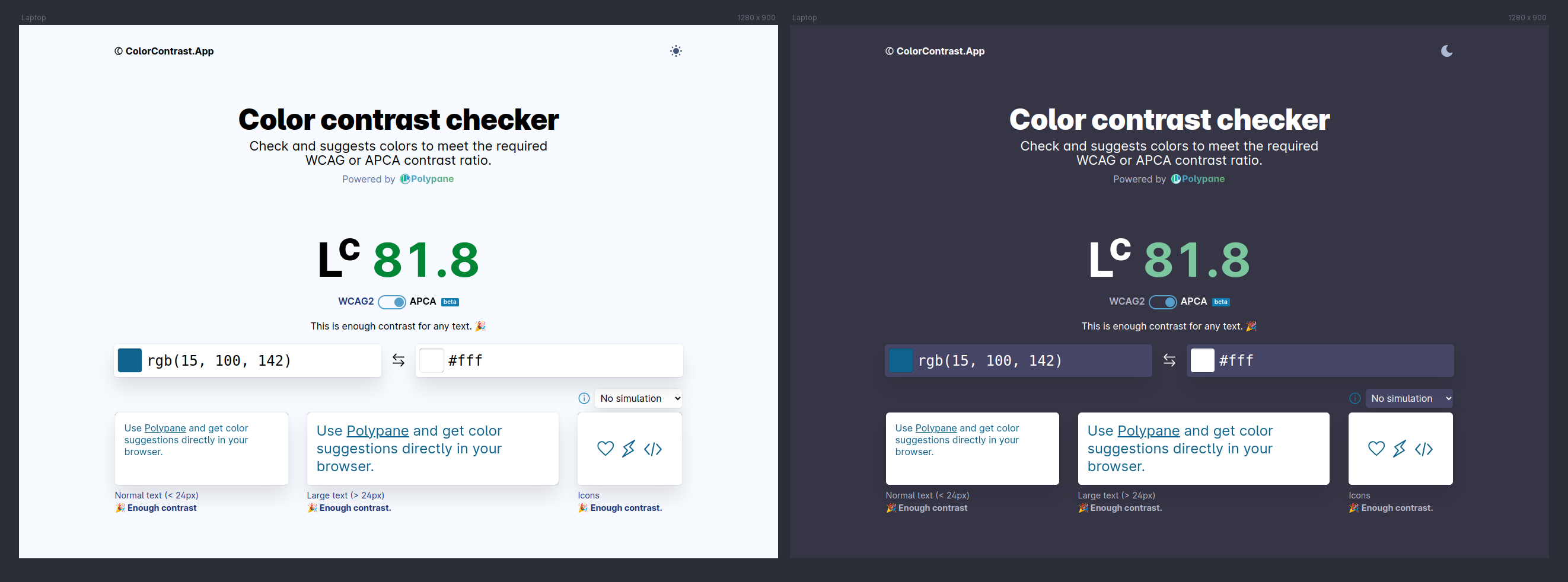
APCA
Recently, we added support for APCA in Polypane 13.1 and based on that we've also added support for it in our online color contrast checker. While APCA is not a standard yet, it's a more reasonable way to calculate contrast (though it is also stricter compared to WCAG 2) so it's good to contrast and compare.
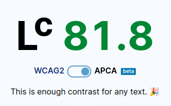
While WCAG 2 has a well known set of limits for contrast, APCA's limits are more fine-grained and are more context and font-dependent. In order to make the resulting values more easily digestible, we're grading contrasts on three levels:
- 45: For large (36px or more) or bold (24px or more) or non-text elements.
- 60: For medium-size (24px or more) or bold (16px) text.
- 75: For normal body text.
These roughly correspond to the middle of APCA's current "Bronze" level scoring and we've been in contact with Myndex to validate this approach.
We're keen to hear your thoughts on these rating levels, so let us know if they work for you (or why not). For a more fine-grained set of scores there is always the official APCA Contrast calculator.
Color Blindness Simulators
If you've used Polypane you know it ships with over 20 different simulators. In ColorContrast.App you can now switch between the four most popular ones and get a live preview of what the colors (can) look like for someone with that specific color blindness.
You can now pick from the following simulators and get an instant preview of your selected colors:
- Protanopia: Red-blindness
- Deuteranopia: Green-blindness
- Tritanopia: Blue-blindness
- Achromatopsia: Total color blindness
Please keep in mind that you should not change colors based on what you see with these simulators on. Both the WCAG and APCA ratings already take visual impairments into account, so use the rating to determine if a set of colors has enough contrast.
Suggestion previews
Lastly, when you now hover over any of the suggested colors, the examples now update to show you what the text or background would look like with that color:

