
Table of contents
Skip table of contentsIf you want to be kept up to date with new articles, CSS resources and tools, join our newsletter.
Even though more and more people get access to the internet every day, not all of them have fast gigabit connections or unlimited data. Using the media query prefers-reduced-data we can keep our sites accessible to everyone. This media query is part of a set of upcoming media queries designed specifically to support different user preferences and their environments.
Note: Though no browser supports prefers-reduced-data yet, you can emulate the media query in Polypane and, when you enable the right flag, in Chromium.
prefers-reduced-data indicates users want to use as little data as possible. We'll go over why that's important, what support looks like today, the available alternatives, strategies for implementing prefers-reduced-data in your website and what you can do to actually save data.
Watch as video
Kilian presented an abridged version of this article at Shortstack Conference. You can watch the video below, or read on for the full article.
Why reduce data?
The average size for web pages is slowly climbing: pages are getting bigger and bigger with the average size of a desktop page now being over 2MB, and the average size of a mobile page not being far behind at 1.9MB. It doesn't look like this trend is slowing down, the average page size grew by about 40% in the last year along. (source: HTTParchive)
While a 2MB page size might not be such an issue for people on a home network with a gigabit connection, every day more and more people gain access the internet, often with significantly slower connections.
So while the country I'm from, The Netherlands, sits at #12 word wide with an average (mobile) speed of 100Mbps, a country like India sits all the way down at #128 with an average speed or 15Mbps. India has the second highest number of internet users in the world (behind China), yet only 54% of Indians currently have access to the internet. (sources: Speedtest, Wikipedia) That number is growing by 9% every year though. Similar growth is happening in many parts of the world.
In other words: More and more people are gaining access to the internet world wide, yet their internet speed is incomparable to what we are used to in the west.
And then there's also data caps.
Most mobile internet subscriptions come with a data cap, after which access to the internet is cut off, or speed is severely reduced. At 2MB per website, if someone has a 1GB data cap that's 500 web pages, or just 16 pages per day. (Of average size. If someone scrolls through Facebook or Twitter, that data will last them a lot shorter)
Just for fun, check out much tabs you currently have open. With just those, are you over your daily budget of 16? (If so, close some! If you were meant to read them, they'll find their way back.)
Reducing your web pages' size helps with both load time for people with slower internet connections and them having access to your pages in the first place.
A fun anecdote in this vein is how, many years ago, the Youtube team decided to optimize their video pages. It took a long time and a lot of work and at the end they were horrified to find out that the average load time of pages had gone up.
All that work for nothing! Turns out now that their pages were now optimized they had actually become usable for a new group of people: those with slower connections. The average load time went up because an entirely new group of users had access to videos for the first time.
Browser support
There is none.
Now wait, before you close the tab... Support is coming and, in Polypane and other Chromium browsers (provided you set the right flag, see the testing section) you can already emulate the media query so you can future-proof your web pages.
Reduced data for users
Without browser support, how can users opt in to reduced data? There is another way users can currently already send a preference for reduced data to servers, using the "Save-Data" header. This is build in on Mobile Chromium versions (on Android), and is available in various browsers with browser extensions.
The Save-Data: on header
Note: In Polypane, use the Custom headers to add the "Save-Data: on" header and test with it.
The Save-Data header is a Request Header, something the browser sends to the server. The server can then decide to send a different response (like a smaller image). Unfortunately this is something front-end developers usually don't have much say in. Luckily you can also detect if it's on using JavaScript:
if ('connection' in navigator) {
  if (navigator.connection.saveData === true) {
    // prevent loading resources and other data saving measures
  }
}
This "connection" api is available in Chromium browsers and behind a flag in Firefox. In addition to checking if saveData is turned on, you can also get the effective internet speed of a connection. You can combine those together to check if a person either has saveData on, or is on a slow connection in general:
const connection = navigator.connection || navigator.mozConnection || navigator.webkitConnection || {};

if (connection.saveData || ['slow-2g', '2g', '3g'].includes(connection.effectiveType)) {
  // prevent loading resources and other data saving measures
}
On the one hand having this as a header makes it much more powerful, since you can send entirely different responses from the server. Unfortunately having this as a header also means that it's much less flexible and requires a lot of coordination between front-end development, backend developement and server management.
Strategies for implementing prefers-reduced-data
Using a media query on the other hand, is something front-end developers are familiar with and know how to use.
The prefers-reduced-data media query has two possible values:
no-preferencereduce
Like prefers-reduced-motion, it's good to think of the prefers-reduced-data: reduce option as the default option: people get the lean, fast experience, and only when they indicate no-preference, we send them more data. That way, older browser that don't support the media query get the lean experience by default.
You might not yet want to do this for new websites until proper support lands. The alternative is to add strategic use of prefers-reduced-data: reduce and prefers-reduced-data: no-preference around your CSS, something we'll go into detail on in the next section.
What to use prefers-reduced-data for
So now that we have some strategies for implementing prefers-reduced-data, lets go over what to use it for specifically.
Conditionally load fonts
Though every web developers likes using custom fonts we're also aware of, and often okay with, using alternative fonts. In fact, this is baked into CSS with the concept of "font stacks" and it's specifically this feature we can use to our advantage when conditionally loading fonts:
@media (prefers-reduced-data: no-preference) {
  @font-face {
    font-family: 'Inter var';
    font-weight: 100 900;
    font-display: swap;
    font-style: normal;
    font-named-instance: 'Regular';
    src: url('Inter-roman.var.woff2') format('woff2');
  }
}

body {
  font-family: Inter, system-ui, -apple-system, BlinkMacSystemFont, Segoe UI, Ubuntu, Roboto, Cantarell, Noto Sans, sans-serif,
    'Apple Color Emoji', 'Segoe UI Emoji', 'Segoe UI Symbol', 'Noto Color Emoji';
}
In this bit of code, we specify a font-stack that uses system fonts as a fallback, and only load our preferred font (Inter) when prefers-reduced-data is set to no-preference. If Inter is not available, it will automatically use the next available font instead.
If you still want to show your preferred font to older browsers, you can add the media query block around your body CSS declaration instead:
@font-face {
  font-family: 'Inter var';
  font-weight: 100 900;
  font-display: swap;
  font-style: normal;
  font-named-instance: 'Regular';
  src: url('Inter-roman.var.woff2') format('woff2');
}

body {
  font-family: Inter, system-ui, -apple-system, BlinkMacSystemFont, Segoe UI, Ubuntu, Roboto, Cantarell, Noto Sans, sans-serif,
    'Apple Color Emoji', 'Segoe UI Emoji', 'Segoe UI Symbol', 'Noto Color Emoji';
}

@media (prefers-reduced-data: reduce) {
  body {
    font-family: system-ui, -apple-system, BlinkMacSystemFont, Segoe UI, Ubuntu, Roboto, Cantarell, Noto Sans, sans-serif,
      'Apple Color Emoji', 'Segoe UI Emoji', 'Segoe UI Symbol', 'Noto Color Emoji';
  }
}
This has some code duplication, but because web fonts are loaded only when they are used in the page and not when they're declared in the CSS, this will still prevent loading the font files.
Alternative or no background images
A quick win is to use different or no background images for your CSS. Even with modern image formats like WebP and AVIF images often are still a significant portion of a web page's payload.
/* Serve a smaller image by default */

body {
  background-image: url(/images/small-fast-image.webp);
}

/* But replace it with a large image when applicable */

@media (prefers-reduced-data: no-preference) {
  body {
    background-image: url(/image/large-pretty-image.png);
  }
}
Or maybe you can do away with the image entirely and only use it to enhance your page:
/* use a solid background color by default */

body {
  background: #353546; /* A nice dark blue */
}

/* Overlay it with a textured version */

@media (prefers-reduced-data: no-preference) {
  body {
    background-image: url(/image/nice-texture.png);
  }
}
Instead of a solid color, you could also use gradients to approximate the image to get the same feel. Experiment with it!
Load smaller images in the page
The picture element can be used to serve different images dependent on a media query, and we can also use the prefers-reduced-data media query to send a smaller image rather than a full size or 2x retina size image. Either by setting a media feature on a source like so:
<picture>
  <source srcset="small.jpg" media="(prefers-reduced-data: reduce)" />
  <img src="full-size.jpg" alt="My image" srcset="full-size2x.jpg 2x" />
</picture>
Or by adding it in a sizes attribute, for example like this:
<picture>
  <source
    srcset="/small.jpg 200w,
            /full-size.jpg 400w"
    sizes="(prefers-reduced-data: reduce) 200px,
           (min-width: 400px) 400px,
           200px" />
  <img src="full-size.jpg" alt="My image" />
</picture>
Prevent preloading or autoplaying videos with JavaScript
Videos can have a significant impact on a page's full size (trust me, I have a video on the homepage) and there's two things you'll want to prevent when someone prefers reduced data: you don't want it to auto play (because that will trigger a download) and you also don't want to tell the browser to preload it.
Preloading videos makes starting them much faster which is a great experience for your visitors, but if they prefer reduced data and you preload images, you're potentially wasting their bandwidth on a video they might not watch.
to prevent autoplaying and preloading videos, we need to use the window.matchMedia JavaScript function:
const video = document.createElement('video');
const canAutoPlayAndPreload = window.matchMedia('(prefers-reduced-data: no-preference)').matches;

video.setAttribute('autoplay', canAutoPlayAndPreload);
video.setAttribute('preload', canAutoPlayAndPreload);
This will test the media query on page load and set the right values for the attributes on your video element. For more on window.matchMedia, read Using media queries in JavaScript.
Unfortunately, since browser support for prefers-reduced-data is non-existent, this will prevent preloading for all visitors. For now, it makes more sense to default to the 'happy path' of preloading and autoplaying if there is no support for prefers-reduced-data. To test for that, we have a tricky media query we can use:
const supportsPrefersReducedData = window.matchMedia('not all and (prefers-reduced-data), (prefers-reduced-data)')
  .matches;
Essentially what this says is "evaluate to true when prefers-reduced-data does not match, or when it does match". The comma in a media query acts as an OR. So it will be true if prefers-reduced-data is supported, regardless of the value. But if a browser finds a media query it doesnt understand, it will evaluate it to false.
So with this, we can check if there is support in the first place and use that to autoplay and preload either when:
- There is no support.
- There is support and the user has no preference.
That looks like this:
const video = document.createElement('video');

const supportsPrefersReducedData = window.matchMedia('not all and (prefers-reduced-data), (prefers-reduced-data)')
  .matches;

const noPreference = window.matchMedia('(prefers-reduced-data: no-preference)').matches;

const canAutoPlayAndPreload = !supportsPrefersReducedData || (supportsPrefersReducedData && noPreference);

video.setAttribute('autoplay', canAutoPlayAndPreload);
video.setAttribute('preload', canAutoPlayAndPreload);
You can improve on this even further by also taking the "Save-Data" header I mentioned earlier into account:
const video = document.createElement('video');
const connection = navigator.connection || navigator.mozConnection || navigator.webkitConnection || {};

// default to save data being on
const saveData = connection.saveData || true;
const slowConnection = ['slow-2g', '2g', '3g'].includes(connection.effectiveType);

const supportsPrefersReducedData = window.matchMedia('not all and (prefers-reduced-data), (prefers-reduced-data)')
  .matches;

const noPreference = window.matchMedia('(prefers-reduced-data: no-preference)').matches;

const canAutoPlayAndPreload =
  !supportsPrefersReducedData || (supportsPrefersReducedData && noPreference) || !saveData || slowConnection;

video.setAttribute('autoplay', canAutoPlayAndPreload);
video.setAttribute('preload', canAutoPlayAndPreload);
Don't auto-load more data on infinitely scrolling pages
Lastly, when users have prefers-reduced-data: reduce on it's advisable to prevent loading in more data without explicit consent from the user.
If you have an infinitely scrolling page that loads in more data, like Twitter, Facebook or Reddit, consider instead adding a "Load more" button when you detect the user prefers reduced data. The implementation of this is going to depend on your own code, but could look something like this:
const button = document.querySelector(".loadmore-button");
const list = document.querySelector(".my-list");

const showButton = window.matchMedia(
    '(prefers-reduced-data: reduce)'
  ).matches;

if (showButton) {
  list.appendChild(button);
  button.addEventListener("click", loadMoreData)
} else {
  list.addEventListener("scroll", function () {
    const shouldLoadData = /* code that checks the scroll position */;
    if (shouldLoadData) {
      loadMoreData()
    }
  });
}

function loadMoreData() {
  // fetch data, show it.
}
Testing with Polypane and Chromium
As you start to implement this media query you'll want to check if your site still looks and behaves like you expect it to. A nice way to test it is to keep two screens side by side so you can compare the differences between the normal view and the reduced data view.
Since there is no browser implementation yet, you can't turn it on with an OS setting (like you can for dark mode). However, you can emulate support for the media query in Polypane and in Chromium.
Prefers reduced motion emulation in Chromium
Turning reduced data emulation on in Chromium is done through the rendering pane, but you'll have to enable the emulation feature before it's visible.
First, you'll want to go to chrome://flags in your browsers.
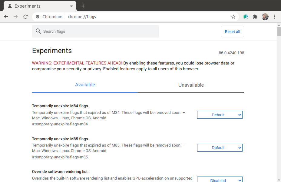
Search for #enable-experimental-web-platform-features and enable it.
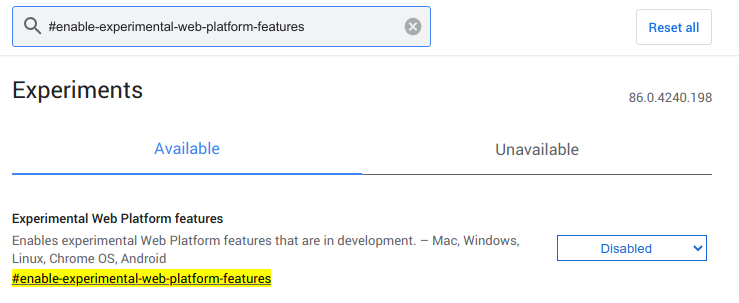
Restart Chromium.

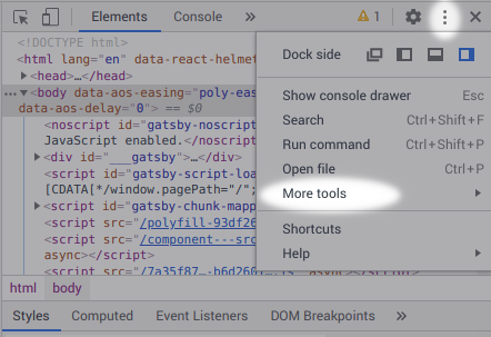
Open your devtools and click the three dots ("kebab" menu) in the top right. Then go to "more tools" and select "Rendering".
In the newly opened Rendering pane you'll see a whole bunch of checkmarks, scroll past them all the way to the bottom.
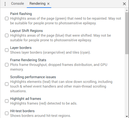
There is a dropdown with the title "Emulate CSS media feature prefers-reduced-data", that you can set from "No emulation" to "prefers-reduced-data: reduce".
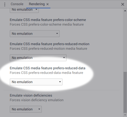
The pane is now in reduced data mode and you can begin testing.
Prefers reduced motion emulation in Polypane
Turning reduced data emulation on in Polypane is done through the emulation settings of a pane.
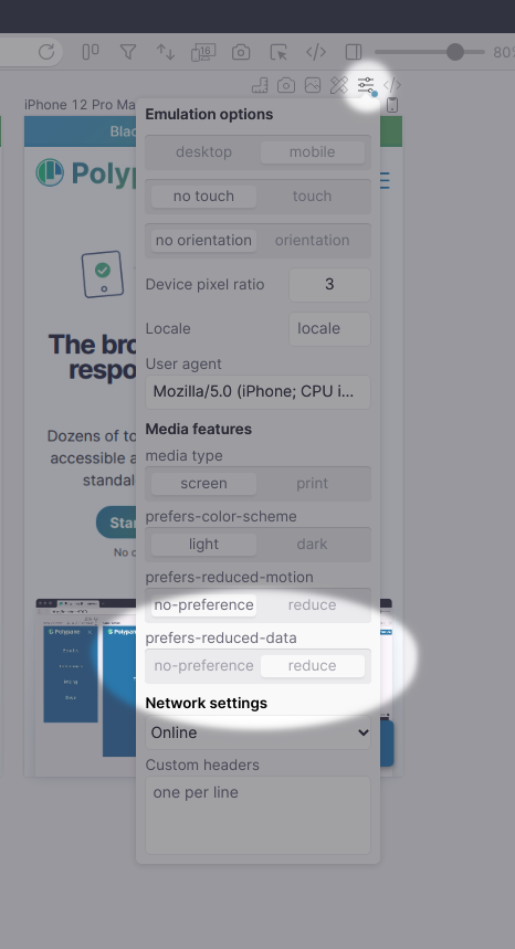
Go to the Emulate settings of that pane, and click the toggle for "prefers-reduced-data".
The pane is now in reduced data mode and you can begin testing.
In the wild
I haven't seen prefers-reduced-data in the wild yet which is unsurprising given how browsers do not support it yet.
I'll be adding some of the techniques I showed in this article to the Polypane website in the next few weeks.
If you decide to implement reduced data on your site, let me know and we'll see if we can make a list of sites experimenting with this feature!

