Documentation
Learn how Polypane improves your workflow
Emulation
Polypane lets you emulate different user preference media queries, device properties like pixel ratio and user agent, and network conditions, so you can test for a wide range of situations right inside Polypane.
The emulation settings are applied to a pane, and you can configure them by clicking the Emulation icon in the pane header: . If any sort of device emulation is active, the icon will have a blue dot.
All the Device presets include emulation settings that match the selected devices, but you can always change or update them in the emulation pane.
The panel is split into four different tabs: Media, Emulation, Network and Session. Media is where you can test out all the different preference media queries, Emulation is where you can set device properties, Network is where you can throttle your network speed, add custom headers and disable navigation sync and Session lets you manage the session of the pane.
Media
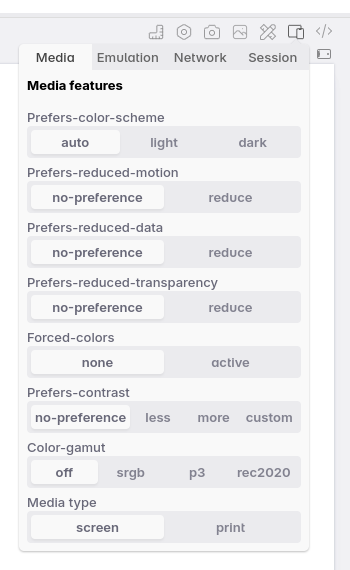
Easily toggle between different media features to test how your site responds to them, like dark mode, reduced motion, or print.
- prefers-color-scheme: Switch between 'light' and 'dark' mode color schemes using prefers-color-scheme. Defaults to 'auto', which follows the browsers color scheme.
- prefers-reduced-motion: Switch between 'no-preference' and 'reduce' options for the prefers reduced motion media feature.
- prefers-reduced-data: Switch between 'no-preference' and 'reduce' options for the prefers reduced data media feature.
- prefers-reduced-transparency: Switch between 'no-preference' and 'reduce' options for the prefers reduced transparency media feature.
- forced-colors: Emulates the forced-colors mode when active. This overwrites all the styles on your page to either a light mode or dark mode theme, depending on what you picked for prefers-color-scheme.
- prefers-contrast: Switch between 'no-preference', 'less', 'more' and 'custom' options for the prefers-contrast media feature.
- color-gamut: Switch between 'off', 'srgb', 'p3' and 'rec2020' color gamut emulation.
- Media type: Switch between 'screen' and 'print' stylesheets.
- Auto dark theme: Toggle the Chromium automatic dark theme feature. Not strictly a media query, but it does change the way your site is rendered based on the user's settings.
Hold ⇧ when changing a media feature to apply it to all panes.
If you want to learn more about these media queries, check out our evergreen complete guide to media queries.
A note on print emulation: Print emulation is not the same as the print preview in Google Chrome. Print emulation applies your print CSS but doesn't format the page to a letter/a4 size.
The print preview logic is not handled by the rendering engine (Chromium in our case) but by a standalone component in browsers that's not part of the rendering engine. If you need to test the actual print preview, you'll need to use the browser's print preview. You can use Polypane print preview to test if your Print CSS is working correctly.
Emulation settings
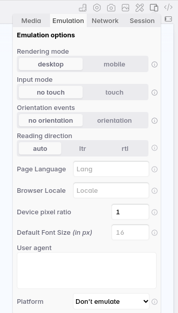
In the emulation tab, you can edit the following device settings:
- Set the device type to desktop or mobile
- Switch between mouse and touch input modes
- Turn on orientation change events
- Set a custom userAgent
- Set a custom platform
- Set a different browser locale
- Set the device pixel ratio
- Set a default font size
- Set the safe area inset values
- Set the difference in height between the viewport and the small viewport
- Toggle to show an overlay for the safe area insets and svh.
- Toggle between LTR and RTL direction
- Set a page language
If any of these settings are changed from their default, a "reset" button will appear that lets you reset all of them to their default values.
Device type (Desktop vs Mobile rendering)
Browsers have two different ways of rendering a page: Desktop rendering and Mobile rendering. Desktop rendering is the most common one and behaves like regular desktop browsers.
With the Mobile rendering, Polypane will respond like a mobile browser. This means it will do things like take into account the viewport tag and zoom out the page if needed.
Input mode
When you turn on touch emulation, clicking into the pane will change your cursor to a round dot. Now you can use your mouse as if it was your finger, and drag to scroll the page. Clicking outside of the pane will change your cursor back.
Orientation
When you turn on orientation emulation, Polypane will automatically set the orientation depending on your pane dimensions and send the appropriate orientation change events when you rotate a pane. This is only needed for JS, since the orientation media query already works based on the pane dimensions.
Custom User-Agent
Some scripts and sites still use user agent sniffing to determine what device they're running on, as opposed to doing feature detection. With this custom userAgent you can support these too. For each device preset we already include the appropriate user agent.
Platform
Alongside a user agent, you can also set navigator.platform and navigator.userAgentData.platform to emulate a different platform. For the preset devices the Custom User-Agent and Platform match, but we don't enforce this.
Browser Locale
You can set a different locale to request a page in that language and set the language used by the Intl JS API's . When filling in a locale we will automatically suggest both locale codes (like "nl-NL") and languages ("Dutch"), the latter is replaced with the appropriate locale when picked.
Learn how to use this feature with our tutorial: How to check your site in different languages and writing modes.
Device pixel ratio
The device pixel ratio is used to determine which images to load for a given device (1x, 2x, 3x). To emulate this rendering behaviour you can set a different device pixel ratio from your own. For each device preset we already include the correct pixel ratio.
Default font size
Set a different default font size for the page. That is normally 16px and corresponds to 1rem on your root, but users can configure their browsers to use a different default font size. Setting a different default font size will change the default font size for the page, but not the font size of the text itself.
Use this to test how your site behaves when the user has set a different default font size in their browser.
Safe area insets
Set the safe-area-inset-* environment values to emulate devices with notches, action bars and camera holes. For each device preset we already include the appropriate safe area insets. You can also toggle an overlay to see where these insets are on the page.
Small viewport height (svh) difference
This sets the difference between the viewport height and the small viewport height (svh). The svh is the height of the viewport when the browser UI (like the address bar) is visible. For each device preset we already include the appropriate svh difference.
You can also toggle an overlay to see where this svh difference is on the page.
RTL/LTR emulation
If you want to quickly check if your CSS works for languages that read from right to left you can turn on RTL emulation to force a page into right-to-left (or set it to LTR to force it to left-to-right reading mode). Leave it set to 'auto' to keep the original page's setting.
Learn how to use this feature with our tutorial: How to check your site in different languages and writing modes.
Page language
Set a language for the current page (the lang attribute on the html element) to test various components.
Learn how to use this feature with our tutorial: How to check your site in different languages and writing modes.
Network settings
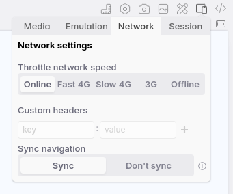
The Network tab contains two ways to change the way your connection works: you can throttle the connection, and send custom headers with your requests.
Throttle network speed
Switch between "online" (your regular connection), a "high-end mobile" connection (Fast 4G), a "mid-tier mobile" connection (Slow 4G), a "low-end mobile" connection (3G) and offline to throttle your download, upload and latency and give you an approximation of how fast your site will load under these conditions.
When you throttle the network to fast 4G, slow 4G or 3G, the emulation icon will have an orange dot and the pane title will show an orange warning sign to remind you that this pane is throttled.
When the network speed is set to offline, no network activity will be allowed and the dot and warning sign will be switched to red. Additionally, the full pane will get a red border.
Custom HTTP headers
Supply multiple custom headers (one per line) and they will be sent with each request. This is an amazingly powerful way to sent along custom data for each pane, or test different headers to see if your server handles them correctly.
Polypane will suggest commonly accepted headers (like Accepts-Encoding) for you as you type. You can also send your own custom headers, like polypane: true, and use that to include extra scripts or debugging information.
Sync navigation
The sync navigation toggle will let you decouple the navigation of a pane from all the other panes. You can use this to compare your local site with the live site, or compare two different sites side-by-side.
When sync is turned off, the title of the pane is switched to an address bar and you can navigate in this single pane by filling in different URLs. Additionally, a broken link icon is shown in front of the URL to indicate this pane is decoupled from other panes.
For detailed guidance on working with multiple URLs and advanced navigation scenarios, see Showing multiple URLs.
Session settings
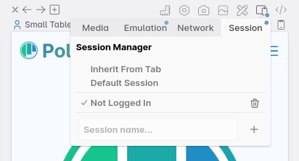
The Session tab lets you set a session for this specific tab. Sessions can be unique, shared between multiple panes, or apply to the entire tab. For more details, read our session management documentation.
Emulation or simulation?
The words emulation and simulation are often used interchangeably to obscure what apps are really capable of. This is confusing when you need to find out what those apps actually do.
We like to follow the definitions that companies like Apple and Google use, and that Chromium uses internally. So to avoid confusion, here's what we mean when we say emulation and how that differs from simulation.
- A simulator simulates an entire device. Think of the iOS simulator for Mac or the simulator in Android Studio. This runs the actual browser or application in a simulated environment.
- Emulation, on the other hand, mimics behaviour but implements it in the current engine. For example, Polypane can emulate the Safari for iOS user agent, causing your site to think it's being rendered by Safari while it's being rendered in Polypane with the Chromium rendering engine.
This means that you can test all the things you actively do to support a specific browser in Polypane (for example, check whether a fallback or polyfill is loading correctly), but you can't debug a rendering bug in the actual rendering engine of that browser. This is a limitation of all emulators, not just Polypane.
That means that even though you can get 90% of your testing done in Polypane (100% of testing for Chromium-based browsers, 80% for Safari and Firefox), you still need to test in an actual Safari and Firefox.
To make that easier, Polypane ships with Polypane Portal. This lets you open the web page shown in Polypane in other browsers and devices while keeping those browsers and devices in sync with what you do in Polypane. You can open Portal while you work, and instantly test all browsers without having to repeat your actions in each of them.
Have a question about Polypane?
Reach out via (real human) chat, Slack or our contact form:
Contact SupportBuild your next project with Polypane
- Use all features on all plans
- On Mac, Windows and Linux
- 14-day free trial – no credit card needed

