
Table of contents
Skip table of contentsIf you want to be kept up to date with new articles, CSS resources and tools, join our newsletter.
The @starting-style at-rule makes it possible to animate in elements as you add them to the DOM, something that previously needed JavaScript trickery to achieve. In this article, we'll go over how to use @starting-style and how to debug it in Polypane. Once you get the mental model, it becomes very easy to use, and lets you create smooth animations for elements as they are added to the page, without needing any JavaScript.
@starting-styleis supported across Chromium, Firefox and Safari and has been since 2024. It's ready to use!
Despite @starting-style being implemented since the very end of 2023 (in Chromium, which Polypane uses), debugging it became available only in the Chromium DevTools in version 143, released in November 2025. Polypane on the other hand, has supported inspecting, editing and debugging the @starting-style at-rule since Polypane 20 released all the way back in June of 2024, over a year and a half earlier.
Why did Polypane get support for this so much earlier? Because Polypane is built for web developers, not browser developers. That seems like splitting hairs, but it has a direct impact on how we approach devtools for new features. First, though, let's look at what the @starting-style at-rule is and how it works.
The problem @starting-style solves
When the browser animates something, it needs to know two things:
- Where to animate from
- Where to animate to
When an element is already in the DOM, and you change its style, the browser can easily figure out both of these things. The "from" is the current state of the element, and the "to" is the resolved, computed new styles. Add a transition time and the browser can animate between the two.
When an element is added to the DOM, however, there is no "from" state. There is nothing, and then there is something. The browser only knows the "to" state, the resolved styles of the element. The browser doesn't know where to animate from, so it just snaps the element into place without any animation.
Previously, you had to add the element hidden (opacity 0, height 0, off-screen), then reveal it after it was added to the DOM. This gives the browser a "from" and a "to" state to animate. Having to do any animation like this in two stages is a pain and it also means you needed JavaScript.
@starting-style solves this issue by letting you define that "from" state directly in your CSS.
How to add a starting style
To add a starting style to an element, you use the @starting-style at-rule in your CSS. It's easiest to use CSS Nesting for this. The syntax looks like this:
div {
  size: 50px;
  height: 50px;
  border-radius: 5px;

  background: green;
  opacity: 1;

  transition: all 1s ease;

  @starting-style {
    filter: blur(5px);
    background: red;
    opacity: 0;
  }
}
The "to" state is what you want the element to be styled as. In this case, a rounded green square. And the "from" state is the stuff in the @starting-style block: the background color starts as red, the opacity starts at 0 and it's blurred. When you add this div to the DOM, it will transition from a blurred transparent red square to a solid green one.
I'll admit that an "at-rule" without anything after it looks a bit odd (like only writing @media without the media query), but that's because @starting-style doesn't need parameters.
You get used to it.
Keeping the @starting-style separate and dealing with specificity
If you want, you can keep the @starting-style separate as well:
div {
  size: 50px;
  height: 50px;
  border-radius: 5px;

  background: green;
  opacity: 1;
  transition: all 1s ease;
}

@starting-style {
  div {
    filter: blur(5px);
    background: red;
    opacity: 0;
  }
}
If you look at the above code sample you might be tempted to place the @starting-style block before the regular styles to make it clear you're going from those first styles to the regular styles. Unfortunately, that won't work. @starting-style itself has no specificity (like any at-rule), so the div selector inside it has the same specificity as the div selector above it.
When specificity is the same, the last specified one wins, so if the @starting-style was first, its styling would always be overwritten by the "to" styling from the declaration below it, and your animation would never play.
You define the "from" styles last to deal with specificity, and the browser makes sure to only apply those styles initially for the animation, and then remove them once the animation is done.
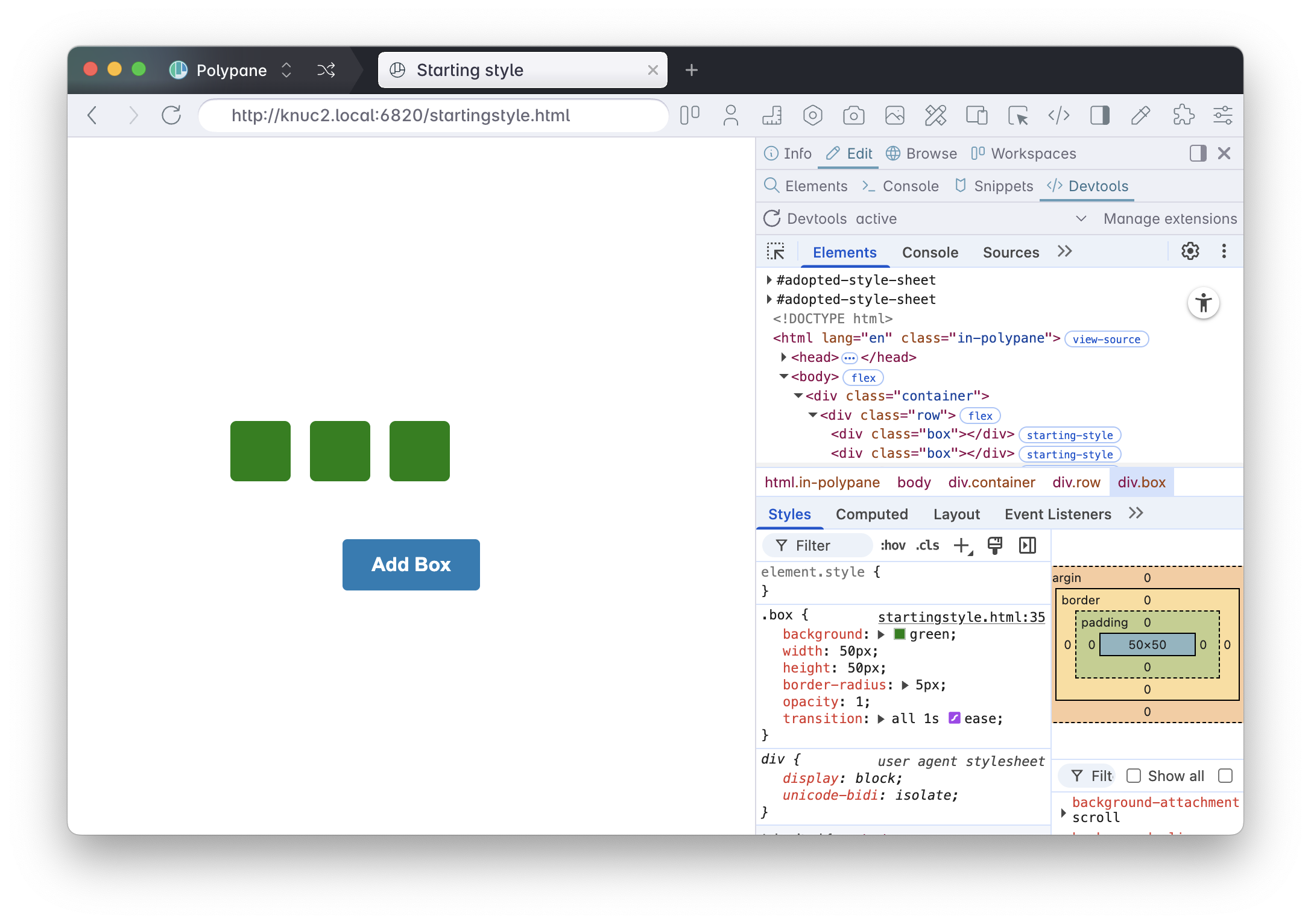
Inspecting and debugging the starting style
To debug the @starting-style at-rule in Polypane, inspect the element by holding ⌥ and clicking it. This opens up the elements panel with all the styles that apply to the element, including the @starting-style styles. If you're reading this article in Polypane, try it with the demo above!
These styles can be edited and changed like any other styles, with changes applied directly just like editing any other CSS property.
Because they are only applied to the "from" part of the animation, to see them in action you have two options. For the demo above: press the button to add a new div with the updated @starting-style:
Or force the @starting-style from the Polypane elements panel, which you can do from the same menu that lets you force hover, focus and other element states:
With just those tools, you can easily inspect and debug your @starting-style styles, without needing anything more than the regular elements panel.
You might be wondering why this needs a tutorial, it's literally just "select element, edit styles, see changes". That's kind of the point. It's that simple because of the design choices we made for the elements panel.
Why Polypane's Elements panel makes this so easy
So what's different about Polypane that makes this so easy? It has everything to do with the design choices we made for the Elements panel.
Regular developer tools are built from the viewpoint of people building browsers.
If you build a browser and the devtools to support it, you want to be able to use the elements panel to verify that the browser is showing the correct styles for an element. You want to be able to see the styles that apply to an element in its current state. So the elements panel need to show you the exact same thing the browser is showing you (and only that thing). The devtools implementation only cares about the current state, and that means the @starting-style style declaration is not visible in your styles tab:
Anything that is not part of the page's current state is irrelevant if your elements panel is designed to verify the current state. This is why you also don't see :hover styles in any browser's devtools unless you force a hover state.
This works exactly how you want it to work when you're interested in confirming that the browser is rendering styles correctly. But it creates friction for the actual work of web development, where you constantly need to inspect, compare, and debug styles across different states. In the Chrome DevTools, you need to activate the @starting-style badge to see the starting styles:

Polypane's devtools are different. Polypane's developer tools are built from the viewpoint of web developers. As a web developer, the current state of an element is just one of the states you care about, just like you care about your design at all screen sizes, not just the one your screen happens to have.
Polypane's elements panel is designed to show you all the styles that apply to an element, even if those styles are for states your element currently isn't in, like :hover and :active styles:
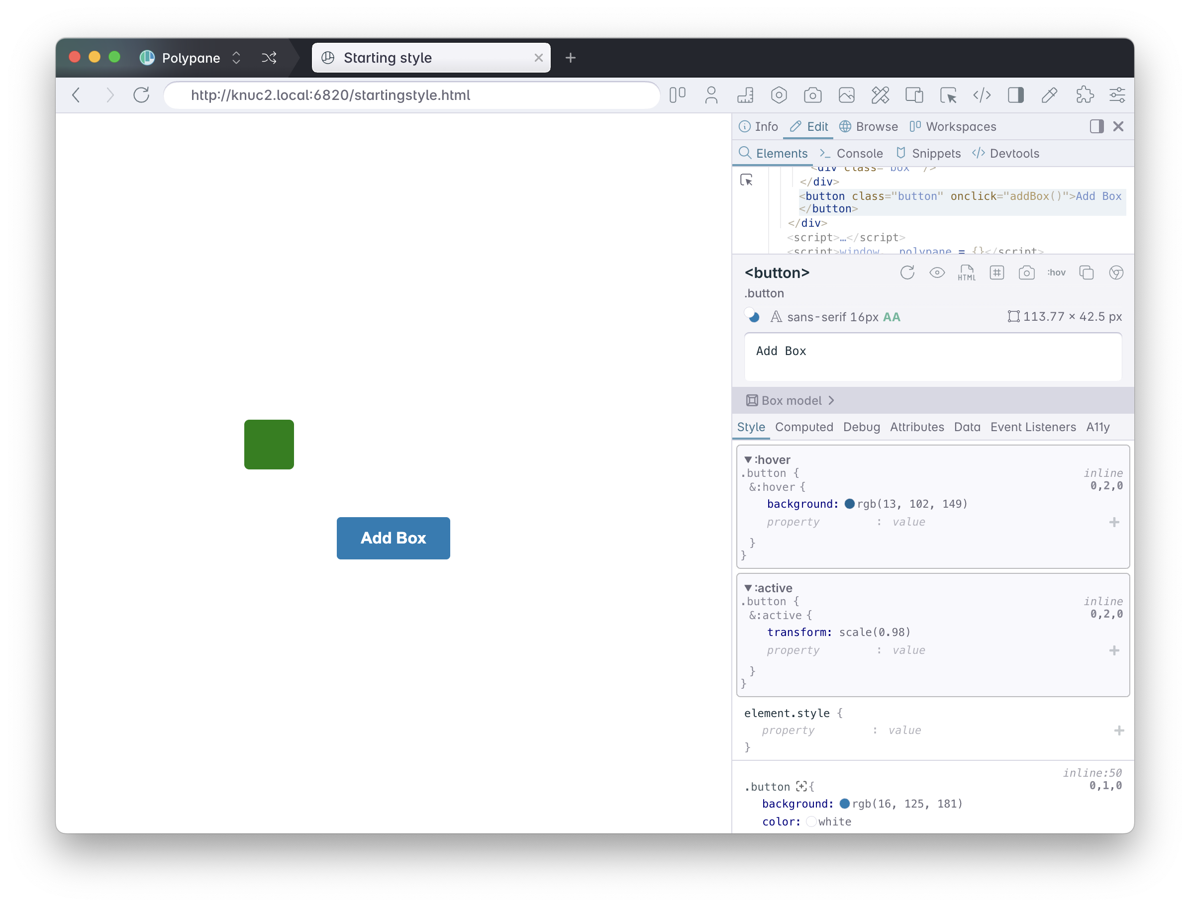
This means you can still inspect and edit them without needing to force them first. For the @starting-style at-rule, this means you can see all the styles that apply to the element and edit them directly.
In Polypane you can work with these styles directly and see the changes in real time.
Safari and Firefox do a bit of both
It should be noted that, despite only showing the current state of elements when it comes to states like :hover and :focus, both Firefox and Safari do actually show @starting-style styles directly in the devtools!
While I appreciate that functionality, this inconsistency creates a confusing developer experience. Why show @starting-style but not :hover? Both are non-current states. This means developers have to learn different workflows for different CSS features: you edit @starting-style one way, but :hover styles another way.
Polypane is for web developers, not browser makers
Polypane's more consistent approach means you learn one workflow that works for all states. Whenever new features like this are added, my primary concern when implementing developer tooling is
- What do web developers need to know to use this feature effectively?
- How can I make it easy for web developers to understand the whole feature in the context of the rest of the page?
The choice to show all styles for an element regardless of state is a direct result of that. As a developer, you want an overview of the styles of an element, because comparing styles between states is a common task when debugging hover effects, animation or transitions.
Yes, if you've spent years following the traditional browser devtools workflow, there's a small learning curve. But the payoff is immediate: you understand your own code better because everything is visible. You spend less time hunting through panels and forcing states.
That's why Polypane had @starting-style support over a year before Chrome DevTools itself: The design choices we made for the elements panel made it the natural, obvious thing to do.

