If you want to be kept up to date with new articles, CSS resources and tools, join our newsletter.
They are fundamental CSS concepts you use every single day whether you know it or not: the offset parent and stacking context. In this article we'll explore how you can use them to position elements in all three dimensions, and how to debug them.
Prefer video?
Kevin Powell and I recorded a video on the offset parent and stacking context as well so if you prefer video, you can find all the info here:
Offset parent
When you position your element with absolute positioning along the X and Y axis, what is it positioned relative to? The answer is the offset parent. Whenever you position an element with top, right, bottom and left, the browser looks at this 'offset parent' to determine where to place the element.
The offset parent of an element is the nearest ancestor with a position other than static, or the body if none of the ancestor have positioning. This means that if you position an element with position: absolute and top: 0, it will be positioned at the top of the offset parent. So when you're laying out a page, knowing the offset parent of an element is crucial to understanding where it will be positioned.
Something that could trip you up here is that we're talking about placing an element relative to another element, but using position: absolute to do so. When an element has an absolute position, it get's taken out of the document flow (it no longer pushed other elements down) but it's placement is still relative to the offset parent.
An example
Let's look at an example. Here we have the HTML and CSS for a block quote and we want to put a quote mark behind it for styling.
As you can see, the quote is in the top left of the page instead of the top left of the block quote, and that's because the blockquote itself doesn't have an offset. That means the offset parent of the quote mark is the body.
<div class="parent">
<blockquote>
<span>“</span>
Lorem ipsum dolor sit amet consectetur adipisicing elit. Tempora
tenetur molestias consequatur, quidem nam ipsum minima aliquid
recusandae delectus enim.
</blockquote>
</div>blockquote { /*position: relative;*/ }
blockquote span {
  position: absolute;
  top: 0;
  left: 0;
  font-size: 10em;
  font-family: serif;
  font-weight: bold;
  line-height:0.5;
  color: palegreen;
}Click the button above to set position: relative on the <blockquote> (or edit the CSS directly!) Now without changing the styling of the span with the quote mark, it moved from the top left of the page to the top left of the blockquote. and that's because we made the blockquote an offset parent.
How to find the offset parent
For a given element, how do you find the offset parent? You could open the element inspector and go through all ancestors to see which one has a position other than static set, but browsers also have a built-in way to find the offset parent: the offsetParent property on the element in JavaScript. This property returns the offset parent of an element, or null if there is none.
const offsetParent = element.offsetParent;But selecting an element, switching over to the console tab and typing that in each time is also a bit cumbersome.
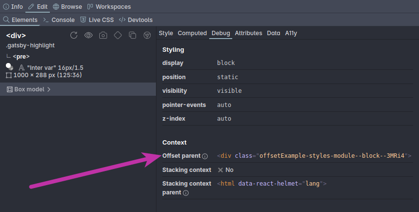
There's a much easier way to find the offset parent: the 'debug' tab in the Polypane Elements panel. This tab shows you the offset parent of the currently selected element, you can hover it to highlight it in the page and by clicking it the elements panel immediately jumps to it so you can edit it, in sync across all the panes in your tab.

Now that you know about the offset parent and how to quickly find it, debugging positioning issues becomes a lot easier as you'll always know what an element is positioned relative to. But there's more to positioning than just the offset parent. Let's look at the other dimension: the z-axis.
Stacking context
Where offset parents tell you how an element is positioned in the x and y direction, the stacking context tells you how it gets positioned in the third dimension: how close it is towards the front of the screen.
You'll have encountered stacking context before when you used z-index to position elements on top of each other and two elements not responding to z-index the way you think they should. That's because they were in different stacking contexts: regardless of how high or low your z-index is, it's only relative to other elements in the same stacking context.
What is a stacking context?
When you create a new stacking context, all the elements inside that stacking context will be positioned on the z-axis relative to each other, initially in source order (they have an implied value of 0, or auto). This is helpful because it means that you can position elements on top of each other without having to worry about other elements on the page, and lets you "group" elements together. The element that you create the stacking context on is called the stacking context parent.
In other words, stacking only happens within the context. There's no way to break out of it. In fact, you could look at z-indexes the same as CSS specificity: No matter how high your z-index is, any stacking context with a higher z-index will always be on top of the stacking context with a lower z-index and all elements inside it.
Suppose you have this DOM tree:
- Stacking context 1:
z-index: 1- Element 1:
z-index: 10
- Element 1:
- Stacking context 2:
z-index: 2- Element 2:
z-index: 5
- Element 2:
Then despite Element 1 having a higher z-index than Element 2, it's still below it, because the z-indexes behave like specificity. The 'real' z-index of Element 1 is (1,10) while that of Element 2 is (2,5). Because the z-index of stacking context 2 is higher, it and Element 2 are still on top.
Creating a stacking context
Unlike offset parents, the default context is not the body, but the html element. Also unlike offset parents, which only get set with a position other than static, there are many different properties that can each create a new stacking context:
positionoffixedorstickyz-indexother thanauto(with apositionother thanstaticor when in a flex or grid layout)opacityless than 1mix-blend-modeother than normalfilter,backdrop-filter,transform,perspective,clip-path,mask,mask-imageormask-box-imageother than noneisolationset toisolatecontainer-typeset tosizeorinline-size(so any container element)will-changeproperty set tomix-blend-mode,filter,transform,perspective,clip-path,mask,mask-imageormask-box-imagecontainset tolayout,paint,strictorcontent
That's quite a list! But it's not as bad as it looks. Most of these properties are not used very often, and the ones that are used often are position, z-index and opacity. So if you're having trouble with z-index not working, check if the elements are in the same stacking context.
If you want to be more explicit in creating a stacking context, isolation: isolate is the most explicit one. It also isolates other things, like mix-blend-mode, which means it doesn't interact with elements outside of the stacking context, but that's not likely a change that will affect your design.
An example
Lets look at an example. We're building on the previous example. If you look at the previous example you can see that the quote sits on top of the text, obscuring it.
We want to move it behind the blockquote and we can do this by setting a negative z-index on the blockquote (step 1). When we do that however, we can see that it disappears, because it's now behind the div.parent element as well.
The stacking context of the blockquote is the html element, so a negative z-index will place it at the beginning of that stacking context, which is behind the div.parent element.
<div class="parent">
<blockquote>
<span>“</span>
Lorem ipsum dolor sit amet consectetur adipisicing elit. Tempora
tenetur molestias consequatur, quidem nam ipsum minima aliquid
recusandae delectus enim.
</blockquote>
</div>blockquote span {
position: absolute;
top: 0;
left: 0;
font-size: 10em;
font-family: serif;
font-weight: bold;
line-height:0.5;
color: palegreen;
}To keep the quote behind the text but in front of the background, we can add isolation: isolate to .parent (step 2).
This will make .parent a new stacking context, so z-index: -1 will only place the quote behind all elements within that stacking context or in our case, only behind the text.
How to find the stacking context parent
Unfortunately, there is no element.stackingContextParent property in JavaScript, so you can't find the stacking context parent with JavaScript as easily as you can find the offset parent. You'll have to check parent elements for each of the properties listed above to see if an element is in a specific stacking context.
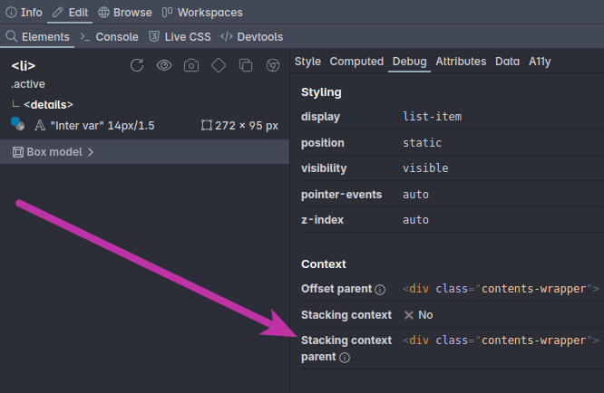
Instead of that, the 'debug' tab in the Polypane Elements panel shows you two bits of information:
- If the current element creates a new stacking context
- What stacking context the current element is in

Like the offset parent you can hover the stacking context parent to highlight it in the page and by clicking it the elements panel immediately jumps to it so you can edit it, in sync across all the panes in your tab.
Conclusion
Offset parents and stacking context are two important concepts in CSS positioning. They can be a bit confusing at first, but once you understand them they can help you debug positioning issues (in all three dimensions much faster. The Elements panel in Polypane makes it easy to find them both so you can immediately inspect and fix the issues as you work.
Want more?
If you want to learn even more, check out our full guide on Understanding the fundamentals of CSS Layout. It also covers offsetParent and stacking context, but goes much deeper into other layout concepts like block and inline, normal flow, flex and grid.
