Documentation
Learn how Polypane improves your workflow
Elements Panel
The "Elements" tab in the panel lets you inspect and edit elements in all panes at once. That means you know exactly how your changes will look in all your panes, and prevents changes in one size from unexpectedly affecting the others.
It can also be used to get quick information on element dimensions, font, colors and accessibility info.
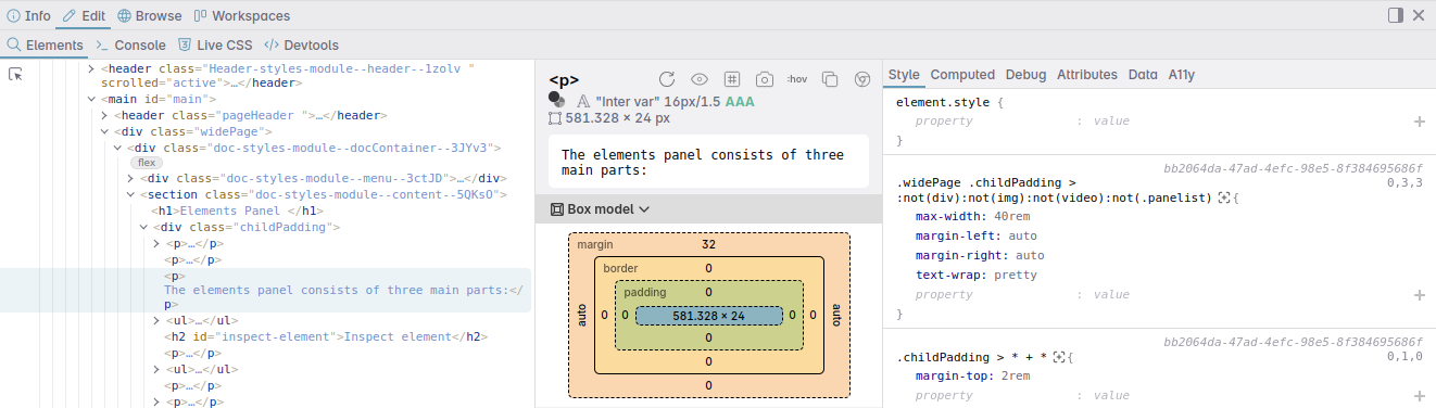
The elements panel consists of three main parts:
- the DOM tree view
- the Navigator
- and the Editor
Inspect element
Inspecting elements in Polypane is made as easy as possible, and there's multiple ways to inspect elements:
- Hold ⌥ and hover over + click the element you want to inspect (This feature is called Polypane peek).
- Click the inspect element button in the elements panel.
- Click the inspect element button in the Address bar.
- Press ⇧ ⌘ C
- Right-click an element and select "inspect element" in the context menu.
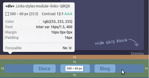
Any element you hover on will be highlighted in all panes, with areas drawn for the content, padding, border and margin, as well as guides for the sides of the element. Clicking it will inspect it in the Elements panel.
To cancel out of inspection mode, press Esc or ⇧ ⌘ c or when you're holding ⌥, just release it.
To inspect elements that have pointer-events: none, also hold the ⇧ key.
When hovering over elements a tooltip will show information like element dimensions, color and font info as well as other relevant element information. For more on the contents of the element tooltip, read about Polypane peek.
Polypane will keep the currently inspected element selected when you reload the page, so you can continue inspecting it, or fall back to inspecting the body element when the selected element is not in the DOM on reload.
Dom Tree view
At the top of the elements panel is the document source tree view ("DOM tree"). Hover over these to highlight the element in all panes and click them to inspect them. The selected element will be available as $0 in the Console panel and focused in the Elements panel.
Hidden elements, like <head> and <script> elements, are dimmed in the tree view so they don't distract you.
You can double click an attribute in the tree view to copy its value, instead of entering a modal state to edit it. To edit an attribute, use the attribute tab. This will autosuggest valid attributes and values, and doesn't require you to keep the modal view focused.
As you inspect elements on the page, the elements will also be highlighted in the DOM tree view.
Drag the bottom or right side (depending on where the panel is) of the DOM Tree to resize it.
Context menu
Righ-click an element to open the context menu with options to:
- Inspect that element (The element panel will not focus it so you can keep your current selection)
- Duplicate the element or delete the element
- Quickly hide the element
- Copy a unique CSS selector, XPath selector, outer HTML or inner HTML for the element
Keyboard and Arrow keys
When the DOM tree view has focus, you can use the arrow keys to navigate through the elements:
- Down: Move to the next element in the list
- Up: Move to the previous element in the list
- Right: Expand the selected element (if it has children) or move to the first child element
- Left: Collapse the selected element (if it has children) or move to the parent element
- h: Hide the selected element (same as "Hide element" in the context menu)
- Del: Delete the selected element (same as "Delete element" in the context menu)
- ⌘: Hold to disable the [info popup](polypane-peek) when hovering elements in the tree, and only show the border, padding and margin overlays.
Duplicate IDs
Each ID can only be used once on a page, and using more than one can cause issues with accessibility or link targets. If Polypane finds a duplicate ID, it will show a warning icon next to the ID in the DOM tree view.
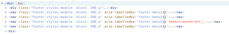
IDrefs
Attributes that refer to another element's ID (called "idrefs") like aria-labelledby or target will automatically be tested for the target element's existence and validity. If the target element doesn't exist, the attribute will be struck through and a warning icon is shown. If the element exists, a crosshair is show and you can hover over the attribute to highlight the target element in all panes, and click it to inspect the target element.
Element badges
When applicable, elements will have badges for things like Flex, Container and Scoping root/limit. These badges can be activated to show an overlay in all panes that shows the layout or container. Click the badge again to hide the overlay.
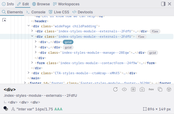
Polypane will show badges for:
- Flex layout
- Grid layout
- Subgrid layout
- Container elements
- Scoping root/limit
- Scrollable elements
- Scroll snap elements
- Events attached to an element
Scroll button
Quickly find elements that have scrollbars by checking for the Scroll badge in the dom tree view.
Flex and Grid layout overlays
Elements that have a grid or flex display value will have a badge next to them. Clicking the badge will show a persisted overlay in all panes that shows the grid or flex layout. Click the badge again to hide the overlay.
Container overlays
Container elements are given a "container" badge. Clicking the badge will show an overlay in all panes that shows the container. Click the badge again to hide the overlay.
Hover the badge to get information about the container like the name, type, current dimensions and the dimensions of 1cqi (and 1cqb when available) so you know what the various container query units are based on.
Scroll snap overlays
Elements with Scroll snapping have a "scroll-snap "badge. Clicking the badge will show an overlay in all panes visualising the scroll snap container and scroll snap items. Click the badge again to hide the overlay.
Navigator
Right below the dom tree is the navigator. The Navigator is a unique area compared to other browsers that shows you a lot of information about the currently selected element. It's a quick way to get information about the element you're inspecting.
Element info
At the top of the Navigator is the currently selected element, along with any classes or IDs it has. Click a class or ID to copy it as CSS, or hover the element to highlight it in all panes.
The icons to the right of the element name let you, from left to right:
- Reload the element styles
- Toggle the visibility of the element ( Ctrl h )
- Edit the HTML of the element
- Toggle layout debugging of the element
- Create an Element screenshot of it in the selected pane
- Toggle the element state (
:hover,:focusetc) - Copy a unique CSS (when it can be created), Xpath selector, outer HTML or inner HTML for the element
- Open the same element in the Chromium devtools.
If the element has children those are shown below it. Hover them to highlight in the panes, and click on any to drill down and inspect them.
On the next line, the navigator shows the foreground and background color (if defined) of an element. Click on them to copy them. You can configure the color format in the global settings.
The rendered font is shown next, along with the rendered font size and line height. Clicking it will copy the CSS font declaration.
After the font information you'll see a red cross, green AA or green AAA. This indicates whether or not your text is readable according to WCAG standards at AA or AAA level.
Calculations use the resolved background color, taking element opacity and ancestor backgrounds into account. Hover the score to show a tooltip with a preview and the specific contrast ratio. Click the contrast info to open the background and foreground color in the color picker where you can further inspect and edit them.
At the right side, the navigator displays the dimensions. If the element has a specific aspect ratio, that is also shown. Click it to copy the dimensions to clipboard.
Reload the element styles
Click this button to explicitly reload the styles for the selected element. The elements panel requests style updates on every DOM change, but you can request an additional reload by clicking this button.
Toggle visibility
This button toggles an elements visibility, so they are hidden but still take up space. This works the same as "Hide element" in other browsers.
Press Ctrl h with the Elements panel open to toggle the visibility of the selected element.
Edit the HTML of the element
Click the edit HTML button to open the HTML editor. This lets you edit the full HTML of the element, including its children.
After making your changes, click 'Apply changes' or ⌘ Enter to update the DOM, or "Discard" to discard the changes.
When updating the DOM with your changed, Polypane will preserve any events you have added to the element or its children.
Toggle layout debugging
The layout debugging icon (the grid icon) lets you toggle layout debugging for the selected element. This works the same as layout debugging only for the selected element and its children.
When layout debugging is active for an element you'll see a blue dot in the tree view.
If you've turned layout debugging on for a number of elements, you can middle click the icon to remove them all at once.
Screenshot element
Creates an element screenshot of the current element. right-click the button to set the padding around the element.
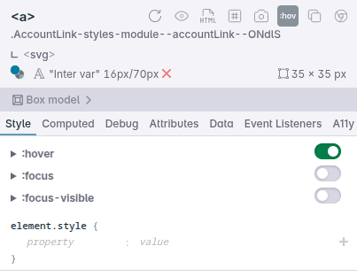
Toggle element state
With Toggle element state (the :hov icon) you can force an elements pseudo state style, useful to check the styling of that state.
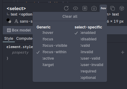
You can toggle the following styles on all elements:
:hover:focus:focus-visible:focus-within:active:target:visited
In addition, you can toggle the following states depending on if they are applicable to the element and its attributes:
:enabled:disabled:valid:invalid:user-valid:user-invalid:required:optional:read-only:read-write:in-range:out-of-range:visited:checked:indeterminate:placeholder-shown:autofill:open
When an element has a state applied, the button will be filled in and a yellow dot will show in the tree view. Hover that yellow dot to see which pseudo states are being applied.
All pseudo states are reset when you reload the page.
If an element has styling applied to any of the pseudo states, you can also find quick toggles next to the CSS styles in the elements panel:
Toggle starting-style
When an element has a @starting-style rule applied to it, an additional "@starting-style" option is available in the toggle element state menu to force apply the style in your starting-style declaration. Learn more about @starting-style and how to debug it in our article How to debug the @starting-style at-rule in Polypane.
Copy selector and HTML
The copy icon opens a submenu that lets you copy a CSS selector or an XPath selector to the element. These are both unique so can be used for automated testing.
The CSS selector option might not be available when it is not possible to reach an element through CSS, such as elements inside shadow DOM.
OuterHTML copies the entire element, including its children, to the clipboard. InnerHTML copies only the children of the element.
Open in Chromium devtools
The Chromium devtools icon opens the same element in the Chromium devtools. This is useful when you need something available in the Chromium devtools.
Content editor
If an element has only text content, you can edit the content directly in the navigator and it will be automatically applied to all panes. If an element has a mix of text content and elements as children, you will be able to select the text as "text" in list of child elements and edit it then.
Editing here is ideal because you can see how your text will look in all panes at once without having to double click in the dom tree view.
The content editor will automatically resize to fit the content (up to a certain height) and when you hover it a copy button will appear in the lower right that will allow you to copy the content in one go.
Style differences between panels
Polypane will show the styles applied to the pane you selected the element in. You can use the "Pane" dropdown below the navigator to switch to the styling of the element in a different pane.
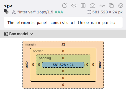
Box model
Click the "box model" button to toggle showing the box model information for your element.
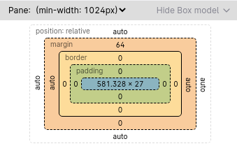
Because an element can have different dimensions in each pane, you can select which pane to show the box model for. Hover over any part of the box model (margin, border, padding or content) to highlight just that part of the element in all panes.
The box model overview in Polypane shows more than you might be accustomed to in other browsers:
- If your element has positioning, that's shown in the box model too, along with the offset.
- A box shadow is rendered for elements that have one.
- The border radius for elements is shown (in pixels).
- If an element has a specified
overflowvalue, that's shown in the bottom right.
This gives you a glanceable overview of what your element looks like.
You can click the arrow to the right of the box model to hide it so you have more space for the element editor.
Cascade Layer overview
When your page uses @layer, Polypane contructs a layer tree that shows you the structure of your layers.
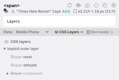
Layers that are active for the currently selected element are displayed as normal, while layers that do not contain styles for the selected element are dimmed. This way you can quickly see which parts of your layer structure you'll have to inspect.
Editor
The Editor lets you see and change the style, computed style, attributes, dataset and accessibility info of the selected element, all synced between panes.
- Style shows you all the CSS rules that apply to the element.
- Computed shows you the computed styles for the element.
- Debug shows you CSS and element properties that often cause issues.
- Attributes lets you see and edit all the attributes of the element.- Data lets you see and edit all the values stored in the element's
dataset. - A11y shows you the accessibility info in one overview.
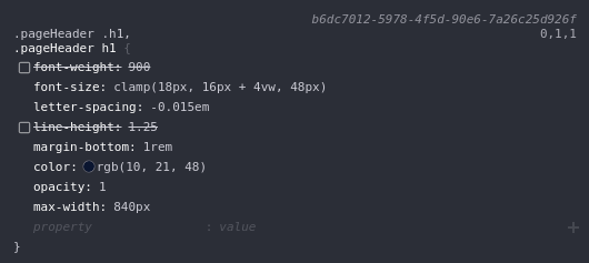
Style
The Style tab shows all CSS that applies to the selected element. This includes styles from the element itself and inherited styles. It also shows the styling for pseudo elements (like ::before and ::first-line) and pseudo classes (like :hover and :any-link), as well as @keyframe, @starting-style and @font-face declarations that are applied to the element.
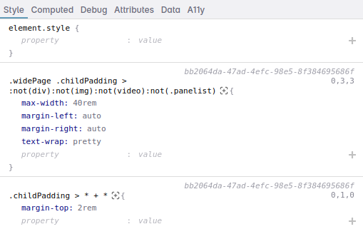
Each style block shows you the selector(s), highlighting the matching selector for the selected element, the stylesheet it comes from and it's line number when available, the specificity of the selector and the CSS properties and values, as well as any at-rules (like media queries or container queries) that apply to the element.
The [+] icon next to the selector can be used to highlight all elements matching that selector.
Click the stylesheet to open it in the browse panel if it's an external stylesheet, or to focus the style element.
Click the specificity to get the selector explained using our css specificity calculator in the browse panel.
Editing selectors
Click a selector to switch it to editing mode. Type a new selector and press enter or tab to apply it. While editing, press Esc to cancel out of editing.
Editing CSS Styles
Edit values by clicking the value and changing it. Pressing enter or tab applies them.
Polypane automatically suggest associated values and custom properties. Use the up/down arrow keys to go through the suggestions and press enter to apply them. As you focus suggestions, a live preview is shown.
When hovering over a block of CSS, checkmarks before each rule are shown. Clicking the checkmark will disable this CSS rule until you click them again or reload the page.
You can add CSS at the bottom of each selector. CSS Properties and values will be suggested as you type. The inline-suggestion is based on the most frequently used property, and you can press enter to apply it. For the other suggestions use the arrow keys and enter to select them.
Typing : will move you from the property to the value, pressing enter will add the line and let you type a new property.
You can paste a full declaration (color: red) or even multiple declarations (color: red; background: blue) into the property field and Polypane will split them up for you and add them to the style block.
Numerical values
If you're editing any numerical value, you can use the up and down keys or your scroll wheel to change the value by 1. Holding ⇧ will change the value by 10, holding ⌘ changes the value by a 100, while holding ⌥ will change the value by 0.1. This works for all numerical values, including inside colors.
Colors
Properties with a color get a preview of the color before the value.
Click it to open a color selector that will let you live edit the color or let you pick a new color from anywhere on the screen.
The color picker will show three lines: one for a 3:1 contrast ratio, one for a 4.5:1 contrast ratio and one for a 7:1 contrast ratio. The line that is highlighted is the one you should meet for AA compliance for this particular attribute and font size. The color picker will also show you the contrast ratio between the two colors by hovering the X, AA or AAA badge.
Shift click the preview to toggle between different color modes: hex, rgb, hsl, hwb and (when possible) named colors. The color picker will also change along with this color mode.
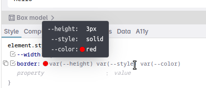
CSS Custom Properties
Hover over values with one or more custom properties to show a tooltip with their values. For custom properties that resolve to colors, we show a color preview.
Inherited styles
For rule sets within the inherited styles, css properties that are non-inherited are faded out.
If an inherited style has a large number of CSS Custom Properties, the list is filtered to show only the custom properties that are used by the current element and a button is shown to Show all unused custom properties.
Easy copying of CSS Styles
Copy an entire CSS rule set (selector and all declaration) by placing your mouse to the left of the selector. A copy icon will appear. Click that to copy a ready-to-use CSS rule set. You can also copy individual lines by clicking the same icon before each line.
Polypane will format the CSS snippets with Prettier and you can change the Prettier configuration to match your project's coding style.
You can also right-click in the style block to copy the entire rule or all declarations, or right-click a specific part to copy the selector or a single declaration, propert or value.
Container queries
When the styles are wrapped in container queries those are shown just like media queries, support queries and layers. In addition, after the container query you'll find the containing element, which you can hover to highlight in all panes, and click to inspect.
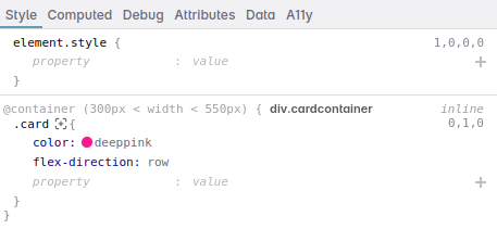
Hovering the container query or the containing element will give you the container query's name, type, size and the size of 1cqw and 1cqh so you know what the various container query units are based on. This info is also available in the dom tree view when hovering the container badge.
Computed
The computed tab shows the computed style of an element. By default, it will hide all CSS properties that you didn't explicitly set on this element.
You can show all the CSS properties by clicking "Show all", or filter them down by typing in the filter input.
Edit the values by clicking on them just like in the style tab and click "Copy styles" to copy all visible CSS declarations, or copy a single declaration by clicking the copy button before the line.
Debug
The Debug panel has a convenient overview of specific CSS properties and element properties that often cause issues, so that you don't have to hunt through the style or computed tab to find, for example, if your element has a position.
x
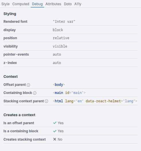
The Debug panel also shows what the offset parent (from which your element will be offset when using top/left/bottom/right), containing block (from which your element will determine its dimensions) and the stacking context parent (from which your element will be offset when using z-index) for this element are, along with if the element itself can be one of those three types.
Learn more about the offset parent and stacking context here: Offset parent and stacking context: positioning elements in all three dimensions.
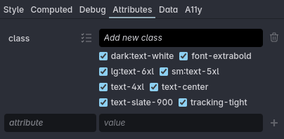
Attributes
The attributes tab will list all the attributes of an element, like class and value and lets you edit them live for all panes. Values will automatically wrap over multiple lines if they become too long (if you use atomic CSS for example). You can also add new attributes here. Keep the value empty for boolean values. You can delete attributes by clicking the trashcan icon.
When you add a new attribute, Polypane will suggest attributes appropriate for the element you're editing. For example, an img will get a suggestion for an alt
attribute, but a span will not. While editing or adding an attribute, valid values will be suggested as well.
The lang attribute is checked for invalid syntax (a WCAG SC 3.1.1 failure), and a suggestion is given for language codes that include the region, as those are usually not needed and you are discouraged from using them.
Classes
Polypane automatically suggests classes as you type in the class value editor. These classes are compiled from your CSS and HTML. Use the arrow keys to select the one you want to add and press enter to add it, or use your mouse to click them.
Classes list
Click the "list" icon next to the class attribute to switch to a list of all the classes that allows you to quickly toggle off (and back on) classes to see the effect in all panes. Polypane will remember your preference for the input or list.
Classes in this list are alphabetically sorted. Use the input above the list to add classes to the list.
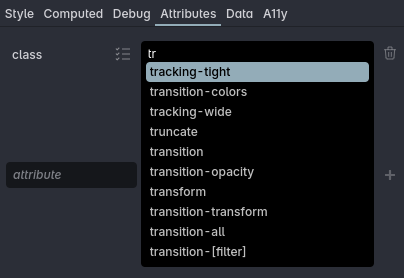
In both the list and normal mode Polypane will suggest classes as you type. Use the arrow keys to select the one you want to add and press enter to add it, or use your mouse to click them.
Idrefs
Attributes that refer to another element's ID (idrefs) like for are automatically checked for the existence and validity of the target element, and will show a warning if the target element doesn't appear in the page.
Data
The Data tab will list all the values stores in an elements dataset. Values will automatically wrap over multiple lines if they become too long. You can also add new items or delete them.
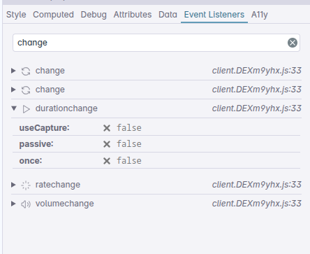
Event Listeners
If an element has event listeners attached to it, the event listeners tab will show you all the event listeners and their associated properties.
If an element has many listeners you can filter them down by typing in the filter input.
A11y
The A11y (Accessibility) tab shows you relevant accessibility information and aria attributes for the s elected element:
- The role of the element
- The accessible name of the element and, if applicable, what elements are used to construct it
- The accessible description of the element and, if applicable, what elements are used to construct it
- Whether the element is keyboard accessible
- The contrast for this element
- All accessibility attributes (like
aria-labelledbyset on the element) - All accessibility attributes (like
controlsanddisabled) as set in the AOM (Accessibility Object Model) visible in the Accessibility tree in the Outline panel.
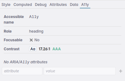
When the selected element is expected to have an accessible name but that is missing, Polypane will show a warning.
When the accessible name has repeating substrings, which commonly happens when you have e.g. a link with an icon, and that icon has an alt attribute with the same text, Polypane will show you a warning and the repeating substrings.
For aria attributes, values will automatically wrap over multiple lines if they become too long. You can also add new items or delete them. When adding new aria attributes the Elements panel automatically suggests valid attributes and valid values for the chosen attribute when applicable.
Attributes that refer to another element's ID (idrefs) are automatically checked for the existence and validity of the target element, and will show a warning if the target element doesn't appear in the page.
Click the copy button for role, accessible name or accessible description to copy them.
Click the contrast info to open the background and foreground color in the color picker where you can further inspect and edit them.
Have a question about Polypane?
Reach out via (real human) chat, Slack or our contact form:
Contact SupportBuild your next project with Polypane
- Use all features on all plans
- On Mac, Windows and Linux
- 14-day free trial – no credit card needed

