If you want to be kept up to date with new articles, CSS resources and tools, join our newsletter.
On a desktop, websites have the space to show the full menu or navbar. On a mobile device that space isn't there and you want to hide the menu behind a toggle (like a hamburger icon), then show it when people click that toggle. How do you offer both in an accessible way that keeps your HTML simple, without duplicating your menu? That's what the perfect responsive menu does.
Though the hamburger icon is well known by now, to better help people that are not familiar with it you can show the icon alongside the word "Menu".
In this article, we'll show you how to create a responsive menu that uses the same HTML on all viewports, is responsive and looks great. The perfect responsive menu.
The HTML
We start with the HTML.
<nav class="navigation">
  <button aria-expanded="false" aria-controls="menu">Menu</button>
  <ul id="menu" hidden>
    <li><a href="/">Home</a></li>
    <li><a href="/benefits">Benefits</a></li>
    <li><a href="/pricing">Pricing</a></li>
    <li><a href="/blog">Blog</a></li>
  </ul>
</nav>
The basic menu is as you've probably written before. It's a list of links (an ul) wrapped in a nav element. But two things are different.
First, there's an extra button. The button has some attributes you might not be familiar with: Aria attributes. With these attributes we can help assistive tools like screen readers know the purpose of the button. In this case, the button controls the element with id "menu", and it's currently not expanded.
Second, the menu is initially hidden, using the hidden attribute. We hide it initially because we develop mobile first, and on mobile we only show the button.
The JavaScript
The button by itself won't do anything. For that, we use JavaScript.
const toggleMenu = document.querySelector('.navigation button');
const menu = document.querySelector('.navigation ul');

toggleMenu.addEventListener('click', function () {
  const open = JSON.parse(toggleMenu.getAttribute('aria-expanded'));
  toggleMenu.setAttribute('aria-expanded', !open);
  menu.hidden = !menu.hidden;

  if (!menu.hidden) {
    menu.querySelector('a').focus();
  }
});
When you click on the button, we call a function that will get the current value of the "aria-expanded" attribute, and invert it. It will do the same for the "hidden" attribute on the menu. When the menu is visible, we'll focus the first link so it gets properly announced.
The JSON.parse function helps us convert the attribute from a string to a real boolean.
At this point, the toggle is functional:
The CSS
Support for the hidden attribute goes back to IE11, but if you need to support older browsers, then adding the CSS below will let you support them. (keep in mind you might need to change the javascript above too)
[hidden] {
  display: none;
}
At a certain width, the viewport will be wide enough to hide the button and show the menu:
@media (min-width: 40rem) {
  #navigation button {
    display: none;
  }
  #menu {
    display: block;
  }
}
The width at which this happens depends on your design and the length of your menu, so while 40rem works for me, it might not work for you.
To show this in action, toggle the "CSS" panel in the pen below, it will switch between showing just the button and just the menu.
The finishing touch: styling
At this point, it's up to you how you want to style the button and the menu. You can make it as simple or complicated as you want.
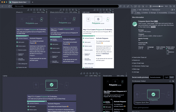
For example, the mobile menu on the Polypane website uses an svg icon for the menu with an animated growing background and a staggered animation of the menu items. I switched to PostCSS (which allows nesting) to make things a little more readable.
It doesn't have to look like this though! With just this skeleton HTML and JavaScript, you can use CSS to style it in many different ways. You might choose to slide open the menu like a dropdown, pushing the rest of the content down, or you could have it slide in from the left like a side panel. And using css transforms you can animate the transition in any way you like.
As long as you keep the HTML and the core functionality of the JavaScript intact, you will have an accessible, responsive menu that uses the same HTML on both mobile and wider viewports. The perfect responsive menu.
