
Table of contents
Skip table of contentsIf you want to be kept up to date with new articles, CSS resources and tools, join our newsletter.
When developers say that CSS is hard, they're usually talking about CSS layout. What often gets omitted though is that developers are assumed to understand and effectively use CSS without being taught how it works in the first place.
I think this is because the syntax of CSS is simple, especially compared to JavaScript and even to HTML.
select-thing-here {
  guess-a-property: give-it-a-value;
  /* ...and repeat */
}
It leads to the impression that all you need to write CSS is to understand the syntax and have a reference for the properties and values.
That, of course, is not true.
Imagine if you were assumed to learn JS by just looking at its syntax. How would you ever learn what this refers to, or how closures work, or how prototypal inheritance works? It would make no sense!
CSS is no less deserving of understanding its underlying concepts, so let's build that foundation.
Prefer video?
This article is a written version of a talk by Kilian Valkhof, Polypane's creator. You can watch the video here:
Interested in having this talk at your conference or meetup? Get in touch!
Gall's law
When you look at CSS as a whole, it's a complex system that is hard to understand. But it's also a system that works.
We have a programming principle that covers that:
All complex systems that work, evolved from simple systems that worked.
This is known as Gall's law, and it applies to CSS layout as well. At its core, CSS layout is built on a few fundamental concepts that work together to create the complex layouts we see on the web today.
CSS Layout started out with a single layout algorithm called normal flow.
Normal flow has a few basic rules, which all subsequent layout algorithms built upon. Indeed, that's the first lesson:
CSS has multiple layout algorithms.
Specific properties in CSS let you opt into different layout algorithms, each with their own rules and behaviors.
Once you understand the foundation of normal flow, you can start to understand how other layout algorithms like positioning, Flexbox, and Grid build upon it.
In other words, this article will help you go from this:
…to this:
Are you ready?
Everything is a box
The most fundamental concept in CSS is that everything is a box. Every element creates a rectangular box, and the x and y position of the box, along with it's width and height create the combined layout on the page.
CSS is:
- A bunch of boxes,
- placed on the screen,
- according to layout algorithms.
This might seem like an obvious statement, but it's important to understand: before screens became ubiquitous, the idea of a "live" layout algorithm wasn't really needed. Boxes didn't interact with each other. They were put in a place and then just ...stayed there.
Print pages are laid out of course, and have been for centuries, but that didn't really happen in real time by a system of rules, an algorithm.
So, CSS is a bunch of boxes. The initial layout algorithm that places them on the screen is:
Normal flow
Normal flow is the default layout algorithm in CSS. It's what you get when you don't explicitly opt into any other layout algorithm.
It comes from when the web was made for document sharing, and "normal flow" refers to the way text flows across a page: from left to right, from top to bottom (for western languages).
/* Normal flow is the default - no CSS needed! */From left to right is the inline direction, from top to bottom is the block direction. So text characters will be inline, side by side, and wrap to the next line. Paragraphs and headings are block, and they stack vertically.
Inline →
Block →
Browsers ship with a default stylesheet that dictates which elements are block and which are inline: <p> is block, but <em> is inline.
So that's why, if you write semantic HTML, the browser already makes your page look like a document.
Non-western languages
Not all languages are written left to right, top to bottom. Some languages are written right to left (like Arabic and Hebrew), and some are written top to bottom (like traditional Chinese and Japanese).
This is why CSS has a writing-mode property that lets you change the inline and block directions to fit the language you're using.
Along with that writing mode, many of the explicit directional and sizing properties, like "left" or "height" now have logical equivalents. Instead of left, which for western languages is the start of inline text, the property name is inset-inline-start. Instead of height, which is the size in the block direction, the property name is block-size.
Writing CSS with these logical properties makes them more portable. For this article though, we'll stick to the physical properties like left and width for simplicity.
Formatting context and anonymous boxes
Block and inline tell you how a given element lays out in comparison to the elements around it. This state of being block or inline is called the formatting context, and each element has a formatting context.
But not everything is an element. Consider this HTML:
<p>This is <em>emphasized</em></p><p> is a block element and <em> is inline.
But what about the words "This is"? How does that work?
Earlier I wrote that in CSS, everything is a box, and that's also how normal flow solves this. The browser creates something called an anonymous box around that text. In this case because <em> is an inline box, the anonymous box will also be inline: it will be an anonymous inline box.
<p>This is <em>emphasized</em></p>With that, the browsers now has two inline boxes, and it knows what do to with that. It can lay them out next to each other.
If the code was this though:
<div>
  This is
  <p>a new paragraph</p>
</div>
Both the <div> and <p> are block-level, so the anonymous box generated for "This is" will be an anonymous block box, and the browser can lay out the two boxes on top of each other:
<div>
  This is  <p>a new paragraph</p></div>
Whitespace and anonymous boxes
This anonymous box generation is why some things you might expect to work don't. Take this example.
<div>
  <div class="half">First</div>
  <div class="half">Second</div>
</div>.half {
display: inline-block;
width: 50%;
background: hotpink;
}
.half + .half {
background: dodgerblue;
}Both divs are 50% wide, but they don't sit on the same line. Even though 50% + 50% is 100%.
This is caused by an anonymous inline box created by the newline, the whitespace, between the two divs. That inline box takes up space (the width of a single space character) to the right of the first div, and so the second div no longer fits on the same line:
It would be great if we can select that anonymous box and hide it but unfortunately that's not something we can do with CSS.
We can only target named boxes.
Solving the whitespace issue
We can solve this whitespace problem in several ways:
Remove the whitespace
Remove the character space between the two divs, and the anonymous box is never created (...until you run prettier on your code).
<div>
  <div class="half">
  </div><div class="half">
  </div>
</div>Disable wrapping
.container {
  white-space: nowrap;
}When you disable wrapping, you force both divs on the same line regardless of the width of the container. Notice that there is still that space between the two divs, they don't sit flush against each other and that the second div overflows the container.
Since the total width is still 50% + the width of a space character + 50%, the second div overflows the container.
Set the font-size to 0
.container {
  font-size: 0;
}
.container > div {
  font-size: 16px; /* Reset for children */
}If you set the font-size of the parent to 0, the anonymous box will still be created, but it won't have any width since the width of a space at font-size 0 is 0.
If your child elements have text in them, you will need to reset the font size in them or your text won't show up either.
White-space-collapse: discard (in the future!)
.container {
  white-space-collapse: discard;
}To show you how much CSS is still being worked on, white-space-collapse is part of the newest CSS specification, text level 4.
The value we mention above, 'discard', isn't even supported in any browser as of January 2026. So this is a feature for the future and doesn't work yet.
Even normal flow, which has been around since literally the beginning of CSS, is still being worked on!
The box model
We're not done talking about boxes interact by a long shot, but for the next few concepts we need to understand how boxes themselves are built up. For that we need to talk about the box model.
You have probably seen a version of this diagram before. A box in CSS actually consists of a few distinct areas.
The center area is where you content is, the text or child elements. This content is pushed inwards by the padding. The edge of a box is called the border, and outside of the border is the margin which pushes a box away from other boxes.
For stupid browser reasons there are two models when it comes to determining the size of a box when you give it a width: content-box and border-box.
One of those is the default in browsers, and the other one makes sense.
Content-box
The default is content-box. In that model, width is applied to the content-box, and padding and borders are added to it for the final rendered width.
Actual width = width + padding + borderThis is confusing because when you set width: 200px, the actual rendered width might be 250px after padding and borders.
Border-box
To improve this situation, most modern CSS resets include the following CSS
* {
  box-sizing: border-box;
}
With border-box, the width you set is applied to the border-box of the element, so it includes the border and padding layers. The space for the content is width minus padding minus border.
Actual width = widthThis means that when you see width: 200px in your CSS, you know the element is actually 200px wide regardless of the padding and border. It's much easier to work with.
Try editing the values in the example below to see how content-box and border-box differ. Notice that both boxes have the same width value (200px), but the content-box is physically larger because padding and borders are added outside the content width.
<div class="content-box">Content Box</div>
<div class="border-box">Border Box</div>div {
width: 200px;
padding: 20px;
margin-bottom: 1rem;
}
.content-box {
box-sizing: content-box;
border: 5px solid blue;
background: lightblue;
}
.border-box {
box-sizing: border-box;
border: 5px solid green;
background: lightgreen;
}With this understanding of the box model, we can go back to talking about how boxes interact.
How inline boxes work
Everything in CSS is a box, but "box" isn't always what you expect.
A block box makes sense: the element is a rectangle, and the border sits on all edges.
But inline elements can wrap to the next line without becoming a block element, and so the box around an inline element is split up and looks, well, kind of broken:
The top and bottom borders are drawn for each line the element spans, while the inline borders and padding (left and right) are only drawn at the very start and very end.
That looks really broken, doesn't it? Browsers render an inline element as one, long, single line (it's inline after all), and then they slice that up into different line segments where it wraps. Thinking about it in that way makes it a bit easier to visualize what is happening and why it's happening. The box is sliced up into different parts.
Decorations
If you have "decorations" (which is what borders and padding are called) on an inline element, you probably expect those to be applied to each line segment.
Luckily, we can tell browsers how to treat each broken-up line with box-decoration-break. The default value is slice, which is quite literally slicing up the box into different parts.
But you can also tell the browser to treat each line as its own box with clone. Each line becomes its own box with borders and padding on all sides.
span {
  box-decoration-break: clone;
}Placement of inline elements
Some things like vertical margins, explicit widths and height don't apply to inline elements. This is because when an element is "in line", it's placement on the page is determined by the line it's in. So we know text is "in line", but what's a line?
Lines and baselines
Browsers started out as a way to lay out lines of text. The inline text inside a box is laid out in a number of lines, and these lines are laid out based on the line-height:
Within each of these lines there is a baseline. The baseline is determined by the font you use, and it's the bottom of your text characters (except for descenders, which go below the baseline).
What you should understand here is that:
- Inline elements are laid out in lines
- Each line has a baseline
- The baseline is determined by the font
- All inline elements align with the baseline by default.
IF you want your text to be in a different place (vertically) in the line, you can change the vertical alignment of an inline element with vertical-align.
span {
  vertical-align: baseline; /* default */
  vertical-align: top;
  vertical-align: middle;
  vertical-align: bottom;

  vertical-align: text-top;
  vertical-align: text-bottom;
}
The top and bottom values are determined by the line height you set on the element:
The text-top and text-bottom are determined by the font. Text-top will align the x-height with the top of ascenders (the parts of letters like b, d, f, h that extend above the x-height), and text-bottom will align the bottom of normal letters with the bottom of descenders.
Lastly, middle is weird.
It's calculated from a combination of the font metrics and the line-height, and that causes it to not always mean the exact middle of the line:
middle = baseline + (x-height / 2)
In the example below, you can see that the word "middle" is actually closer to the bottom of the line than to the top.
I'd like to apologize for that on behalf of CSS.
For practical purposes, just know it exists but might not behave exactly as you expect.
From the explanation above, what you need to remember is that, by default, all inline elements sit on the baseline.
Inline elements sit on the baseline
With that knowledge, does the following situation already make sense?

If you now find this obvious, then good job! The inline image is sitting on the baseline, and that's why there is 'unexpected' whitespace below it.
In the past, you might have fixed that by setting display: block on the image, but this has other layout effects too:
img {
  display: block;
}
The whitespace is gone, but the image now also no longer sits inline with any text, nor does it follow the text align.
Another way you could have fixed this is by setting line-height: 0 on the parent:
div {
  line-height: 0;
}
If the line-height is 0, then the space below the baseline is also 0, so the whitespace is gone. If you have other text in the parent, that text will also be affected and could even start overlapping.
'Fixing' images
The easiest 'fix' in this case it to simply move the image off the baseline, for example by aligning it to the top or bottom of the line instead:
img {
  vertical-align: top; /* or bottom */
}
The bottom of the image no longer sits on the baseline, so there is no longer whitespace reserved below it!
Now that we have discussed inline behaviour and understand how layout happens inside boxes when they're in normal flow, lets move outside the box and see how the space between boxes works.
Margin behavior
Margins are outside of an element and you can use them to push boxes away from each other.
For block elements, this happens in all directions. For inline elements, as we previously mentioned, it's the line they sit on that determines their placement. Adding margin to inline elemens will only apply in the inline direction (left and right).
Margin collapse
When there are two block elements with margins stacked vertically and there are no other box parts (like border or padding) between them, the larger margin of the two is picked and they 'collapse' into each other.
.hotpink {
  margin-bottom: 1rem;
}
.dodgerblue {
  margin-top: 2rem;
}
We've made the margins semi-transparent here so you can see how they actually overlap, or 'collapse', rather than add up.
This happens when any two elements in the same formatting context (remember that one?) have margins that interact.
Margin collapse between parents and children
Elements and their children also share a formatting context, and that is why you also get margin collapse between parents and children.
You might add a margin to the first element inside a parent with the idea of pushing that element down from the top of the parent element, but due to margin collapse that margin is applied outside of the parent, rather than pushing down the first element.
.parent {
  margin-top: 1rem;
}You'll frequently want to prevent this, and while there is no explicit margin-collapse: none property, You can instead prevent margin collapse or create a new formatting context.
Firstly, adding a padding or a border, no matter how small, to the parent element will prevent margin collapse since the margins are no longer adjacent.
.parent {
  margin-top: 1rem;
  padding-top: 1px;
}
.child {
  margin-top: 3rem;
}And while this works, you can see that 1px of padding is affecting the layout. This might matter, or it might not.
another way is to use overflow: auto (or hidden) on the parent element. This creates a new formatting context inside the element, and now the element and the child element are in different formatting contexts, which prevents margin collapse.
.parent {
  overflow: auto;
}
.child {
  margin-top: 3rem;
}Overflow auto will prevent other elements from being shown outside of the parent element, and when you have restrictions on the width or height of the element, it will show a scrollbar when the content overflows.
The explicit option is to define the parent as a new formatting context, which you can do with display: flow-root.
.parent {
  display: flow-root;
}
.child {
  margin-top: 3rem;
}flow-root is a bit of a magical property that creates a new block formatting context without affecting other layout aspects of the element. It's a great way to prevent margin collapse without side effects.
Negative margins
Margins can also be negative. When you use negative margins you're not adding space between element, but you're changing the position of the element itself in a way that no longer interacts with the elements around it.
.top {
  margin-bottom: 1rem;
}
.overlap {
  margin-top: -2rem;
}
The way they get calculated is by taking the margin value, which can also be collapsed, see how the two margins overlap, then subtracting the negative value and starting the new element there.
Negative margins exist, but you're better off ignoring them and using positioning instead for overlapping layouts. (More on positioning later.)
Centering block elements with margin: auto
You can use margins to center elements horizontally by setting the left and right margins to auto:
.block {
  width: 200px;
  margin-left: auto;
  margin-right: auto;
}
This element gets centered because the layout for horizontal margins uses a constraint-based layout when either width or margin is set to auto.
A constraint-based layout means that there is a formula that gets solved to determine the layout. The rule is:
total width = margin-left + border-left + padding-left + width + padding-right + border-right + margin-right
Because borders and paddings are fixed values we can leave them out and instead simplify it to this:
available space to fill out = margin-left + width + margin-right
Let's see what happens when we plug in different values for the width and margins into this formula.
Case 1: everything is set to auto
When all three values are set to auto, the width takes up all available space, and both margins are set to 0.
.block {
  margin-left: auto;
  margin-right: auto;
  width: auto;
}
This is because the "preferred width" of a block element is 100%. So the equation becomes:
total width = 0 + 100% + 0
Case 2: the width is auto
If you have values for both margins but aren't defining with, then the width takes up all remaining space between the two margins.
.block {
  margin-left: 2rem;
  margin-right: 2rem;
  width: auto;
}
This is because the preferred width is still 100%, and the constraint then makes this formula:
total width = 2rem + (100% - 4rem) + 2rem
Case 3: the width is fixed
When the width is fixed and both margins are set to auto, the remaining space is divided equally between the two margins.
.block {
  width: 50%;
  margin-left: auto;
  margin-right: auto;
}
This is because the equation becomes:
total width = 25% + 50% + 25%
Case 4: width and one of the margins are fixed
When the width is fixed and one of the margins is also set to a fixed value, the other margin is set to the remaining space.
.block {
  width: 200px;
  margin-right: 50px;
  margin-left: auto;
}
The equation becomes:
total width = (100% - 250px) + 200px + 50px
The browser calculates the remaining space as 100% - 250px and adds it to the left margin, and so even though block elements normally start at the left edge of their container, this one is pushed to the right even though it doesn't have a specific value for margin-left.
Inline-block: The hybrid
There's one last trick normal flow has: display: inline-block.
Given all the time we spent figuring out the differences between inline and block elements and how their specific behavior differs, what even is inline-block?
Inline-block tells the browser that an element behaves as inline for the formatting context around it, but is &rendered as a block box, creating its own formatting context.
.tag {
  display: inline-block;
  padding: 5px 10px;
  margin: 5px;
  background: dodgerblue;
  width: 250px;
}You can see that the element sits inline with the rest of the text and you can even see that the text is placed on the same baseline, but the element itself behaves as a block element, since it has a width, padding on all sides and the content inside of it wraps to multiple lines.
The CSS specification calls this behavior "shrink-to-fit". Before Flexbox, this was a great way to render things like a list of tags or navigation items:
.nav-item {
  display: inline-block;
  padding: 5px 10px;
  margin: 5px;
  background: dodgerblue;
}Display values: outer and inner
The display property can have two parts: an outer and an inner value. inline-block as a value is from before this was introduced, but in "modern" CSS it's equivalent to:
display: inline flow-root;The outer value is how the element behaves in relation to other elements, so inline, and the inner value is how the element behaves in relation to its own content. We want that to have a block formatting context. You don't set that with "block", but with flow-root. Think of it as "a new 'normal flow' starting point".
When you set a single item, that item is either for the inner or outer value depending on the value: some are inherently outer values, and some are inherently inner values. For example display: grid creates a grid for the content, and the outer value is inferred to be block, making it the same as display: block grid. display: inline on the other hand is inherently an outer value, so the inner value is inferred to be flow, making it the same as display: inline flow.
flow-root and flow are the two new keywords here and they are roughly equivalent to block and inline, but only for the inner value.
That's Normal Flow
CSS's simplest layout algorithm! Would you have expected that there was so much behind something that you can essentially describe as "text goes from left to right, top to bottom"?
The good news is that all other layout algorithms build upon these concepts. In fact, unless you explicitly take an element "out of flow", elements are still considered "in flow" regardless of what other layout algorithm you use, and the normal flow algorithm is used in addition to it.
Key takeaways for normal flow
- Block elements stack vertically (↓)
- Inline elements flow horizontally (→)
- Everything is a box
- Anonymous boxes get created for text outside of elements
- Margins collapse vertically
- All inline elements sit on the baseline
Other layout algorithms
To get any other layout algorithm, you need to opt into them. There are three main layout algorithms in CSS:
- Positioning (relative, absolute, fixed, sticky)
- Flexbox
- Grid
There's a few more, like table layout, floats and multi-column, but the first two are hacks that we haven't needed in well over a decade, and multi-column is too niche for this already long article (and indeed, might soon be replaced by the masonry-style grid layout algorithm).
A small detour: sizes in percentages
Before we dive into the other layout algorithms, we need to talk about percentages. When you use a percentage value for a size or a margin, padding etc, what is that percentage based on?
div {
  width: 50%;
  height: 25%;
  margin: 10% 5%;
  padding: 5% 2.5%;
}
Well, for width and height (and their min and max and logical equivalents), percentages are based on the size of the containing block. So 50% width is 50 percent of the width of the containing block, and 25% height is 25% of the height of the containing block.
Hold up, containing block?
So we have offset parents, stacking contexts and now also "containing block".
The containing block is the box that contains the element. For most elements, this is the content-box (remember the box model) of the first parent element that is display: block.
For position: absolute elements, it's the padding-box of the closest stacking context, and for position: fixed elements, it's the viewport.
Those last two are exceptions but in practical use those exceptions actually result in elements sizing in ways you would expect.
Percentages for margin and padding
For margins and paddings, percentages are always based on the width of the containing block, even for margin-top and padding-bottom.
That's a bit confusing, but it's because of how the rest of CSS works. Most elements have a vertical size that changes based on their content: the more lines of text you add to a paragraph, the taller it gets.
If you were able to add a padding-top based on a percentage of the height, then that would increase the absolute height of the element, which in turn would increase the padding-top's absolute value, which would then update the height of the element and so on: it would create an infinite loop.
Instead, having percentages for vertical margins and paddings based on the width of the containing block gives you a predictable value that doesn't change when it causes the height of an element to increase.
Positioning schemes
With positioning, we can tell the browser how to place an element either in relation to its calculated flow position, or explicitly take it out of normal flow. It's also where the third dimension is introduced with z-index. That concept doesn't exist in normal flow, and adding z-index to an element without a position does nothing.
Elements by default have position: static, which means no explicit positioning. To activate the positioning layout algorithm, pick a different value:
static(the default)relativeabsolutefixedsticky
Each of these are their own little layout algorithm, so let's go through them one by one.
Position: relative
relative is the basic value that lets you opt in to positioning layout. A relatively positioned element has a box placed in the same spot as normal flow, but you can move the element away from that box using top, left, bottom, and right, which are called inset properties. There's also a inset shorthand property that lets you set all four inset properties at once.
.box {
  position: relative;
  top: 40px;
  left: 40px;
}Notice that the original box is the one that takes up space and pushes the text away, but the element itself is elsewhere. The original box is used for the rest of the layout.
This pushing away of the element from it's original box is something you'll rarely want, or need. What you mainly use position: relative for is to make an element an offset parent for absolutely positioned children. Before we get into what an offset parent is, let's explain position: absolute.
Position: absolute
Where elements with position: relative are still in normal flow, position: absolute elements are not. This means they do not interact with other elements: they don't take up space and don't push other elements out of the way.
Inset properties don't move them away from their initial box like relative, they instead position the element in relation to the offset parent.
.box {
  position: absolute;
  top: 40px;
  right: 40px;
}
text text text
text text text
The offset parent
The offset parent is the first element in the list of ancestors that is itself also positioned (any position value other than static). By default, the body is the only offset parent. So position: absolute; top: 0; will place an element at the top of the page.
If you add positioning to any parent element, it becomes an offset parent, and now top: 0 no longer means the top of the body element, but of that parent element.
Any element that is positioned will become an offset parent, so you can have many offset parents inside of other offset parents. You're always positioning against the nearest offset parent up the DOM tree.
Finding the offset parent
Layout issues where your absolutely positioned element isn't where you expect it are almost always because what you think the offset parent is is different from what the browser thinks.
To find the offset parent in Chrome, Safari, Firefox etc
- Find the element in the element inspector
- Switch to the console panel
- Type
$0.offsetParentand hit enter
In Polypane, you can see the offset parent directly in the element inspector's debug panel.
- Find the element in the element inspector
- Switch to the debug tab
- See Offset parent under "contexts"
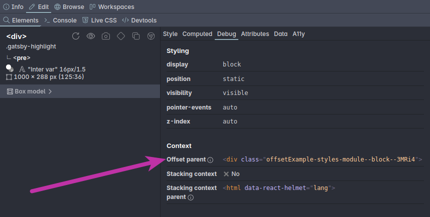
Learn more about that in our dedicated article on Offset parent and stacking context (more on that second one later).
Position: fixed
position: fixed is a lot like absolute. Elements are taken out of the normal flow, but in this scheme, the offsetParent is always the viewport, and inset properties are used to position from the edge of it.
.header {
  position: fixed;
  top: 0;
  left: 0;
  right: 0;
}
That means that while absolutely positioned elements scroll along with the rest of the page, fixed elements will always stay in view.
Position: sticky
The last scheme is position: sticky. It was added to CSS much later than the other ones, and it's for elements that you like to keep in view for some part of the time, but still want to scroll along with their offset parent.
With position:sticky, the element will be placed the same way as position: relative, but the top/left/bottom/right values don't move the element. Instead they determine where an element gets stuck relative to the scrolling context, which is usually the viewport.
.sticky-header {
  position: sticky;
  top: 50%;
}As an element scrolls it will behave like a relatively positioned element, until it hits that inset value where it gets stuck.
Then it will stay stuck, until the offset parent's bottom catches up with it, at which point the element will get unstuck and continue scrolling with it's offset parent.
A tricky thing here is that it will only get stuck if the browser determines it can get stuck. To learn more about debugging sticky positioning, check out our article: Getting stuck: all the ways position sticky can fail
Overview of positioning schemes
So to compare the different positioning schemes, here's a quick overview:
| Position | In Flow? | Offset Parent |
|---|---|---|
| static | Yes | Not applicable |
| relative | Yes | Nearest positioned |
| absolute | No | Nearest positioned |
| fixed | No | Viewport |
| sticky | Yes* | Scrollport |
* until it gets stuck, then it becomes like fixed.
The stacking context
Remember how I said that with positioning, we introduce the third dimension? Well we haven't talked about that yet.
While the offset parent tells you how an element is positioned in the x and y directions, the stacking context tells you how it's positioned in the third dimension, the z-axis. Or in other words, how close it is to the "front of the screen". And like offset parents, you have stacking contexts inside stacking contexts.
The default stacking context is not the body element, but the html element. So all elements are stacked in relation to the html element by default.
Default stacking order
Elements by default have a stacking order that's the same as source order andz-index lets you reorder them.
div::before {
  background: hotpink;
  z-index: 1;
}
div::after {
  background: rebeccapurple;
  z-index: -1;
}
/* Flip them around: */
div::before {
z-index: -1;
}
div::after {
z-index: 1;
}Reordering happens inside the stacking context
In the example below, the purple element has a z-index of 99, which is (much) higher than the blue element's z-index of just 2. So you'd expect the purple element to be in front of the blue one. However, because the purple element is inside of the pink element with a z-index of 1, it's stuck inside the stacking context of the pink element.
.first {
  background: hotpink;
  z-index: 1;

  .inner {
    background: rebeccapurple;
    z-index: 99;
  }
}

.second {
  background: dodgerblue;
  z-index: 2;
}So instead of 99 being more than 2, you should actually think of it as (1,99) which is less than 2. No matter how high your z-index is, it will never win from elements in a stacking context with a higher z-index than the stacking context you're currently in.
Creating a stacking context
There's just a few CSS properties that can create a stacking context:
positionoffixedorstickyz-indexother thanauto(with apositionother thanstaticor when in a flex or grid layout)opacityless than 1mix-blend-modeother than normalfilter,backdrop-filter,transform,perspective,clip-path,mask,mask-imageormask-box-imageother than noneisolationset to isolatecontainer-typeset to size or inline-size (so any container element)will-changeproperty set tomix-blend-mode,filter,transform,perspective,clip-path,mask,mask-imageormask-box-imagecontainset tolayout,paint,strictorcontent
… This makes offsetParent sound easy right? It's quite a lot if you list them all out. Most of these properties aren't used very often though.
The most common ones are:
positionz-indexopacitytransform
Explicit stacking context
Out of the entire list, isolation: isolate is the most explicit way of indicating in your CSS that you're creating a new stacking context:
.container {
  isolation: isolate;
}
A practical stacking context example
Here's a practical example, a simple block quote design with a decorative quote mark. After positioning the quote mark correctly in the X and Y axis we can now see that the quote mark is in front of the text. Because the text itself isn't an element (it's an anonymous box), we can't bring it forward using z-index.
blockquote {
  /* offset parent */
  position: relative;
}

blockquote span {
  position: absolute;
  top: 0;
  left: 0;
}<blockquote>
<span>“</span>
Lorem ipsum dolor sit...
</blockquote>“Lorem ipsum dolor sit amet consectetur adipisicing elit. Tempora tenetur molestias consequatur, quidem nam ipsum minima aliquid recusandae delectus enim.
Instead, we need to bring the quote backwards with z-index: -1:
blockquote span {
  position: absolute;
  top: 0;
  left: 0;
  z-index: -1;
}“Lorem ipsum dolor sit amet consectetur adipisicing elit. Tempora tenetur molestias consequatur, quidem nam ipsum minima aliquid recusandae delectus enim.
When you do that however, the quote mark disappears behind the background of the blockquote. That's because the current stacking context is still the HTML element. So we need to make the parent element the stacking context.
blockquote {
  isolation: isolate;
}“Lorem ipsum dolor sit amet consectetur adipisicing elit. Tempora tenetur molestias consequatur, quidem nam ipsum minima aliquid recusandae delectus enim.
The blockquote is now a new stacking context, and the quote mark can no longer go behind the background. Instead, it sits at the beginning of the stacking context inside the blockquote: behind the text but in front of the background.
Finding the stacking context
Finding the stacking context of an element is not as easy as finding the offset parent. Unlike element.offsetParent, there is no element.stackingContext property.
That's why we built a debug panel into Polypane that not only shows you the offset parent, but also the stacking context of the selected element, along with whether the element itself creates a stacking context. It's very neat, and you can learn more about it in our article on Offset parent and stacking context.
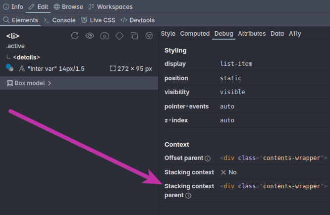
The Polypane debug panel
The top section in the debug panel shows you CSS attributes that commonly cause issues, like display, position and z-index.
Below that, it shows the different contexts that the element is in: the offset parent, the containing block and the stacking context.
Lastly, it shows whether the element itself is an offset parent, containing block or stacking context.
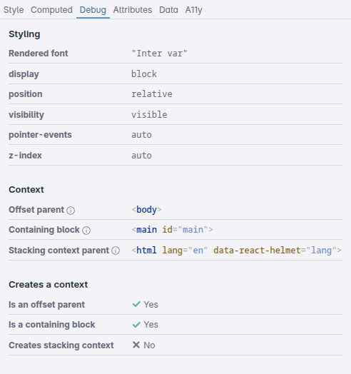
These three sections make it very easy to figure out what's going on with the layout of an element, and really speed up your CSS layout debugging.
Grid and Flexbox
That leaves Grid and Flexbox. I'm not going to spend any time on the syntax or specific features of either layout algorithm, instead focusing on how they interact with the previous layout algorithms and concepts like offset parent and stacking context.
For Flexbox, check out Every Layout by Heydon Pickering and Andy Bell or Flexbox Simplified by Kevin Powell. For Grid, check out Grid by Example by Rachel Andrew.
Both Flex and Grid are significantly different from the layout algorithms that came before. That's because they were developed not as a way to lay out web documents, but as a way to lay out web apps.
The key differences
When you look at Flex and Grid, they each approach layout from a different direction.
Flexbox is "bottom up"
- Get a bunch of elements
- Order them in a row or column
- Distribute them according to rules you provide
Grid is "top down"
- Create a bunch of areas
- Determine their sizes and positions of those areas according to rules you provide
- Place elements inside those areas
So Flexbox starts with the elements you have and distributed them, while Grid starts with defining the available spaces and then adding the elementes to them.
Additionally, Flex is fundamentally one-dimensional (though it can wrap to a next line) while Grid is two-dimensional.
Flex and Grid versus normal flow
Both are replacements of sorts for normal flow. They reason about the distribution of multiple elements in a specific way, rather than the positioning of a single element in relation to other elements.
A very big difference between Flex and Grid on one hand and previous positioning on the other hand is that Flex and Grid no longer depend on font properties. The layouts you make and their alignment are based on the generated boxes, not on the font properties of the elements.
This makes a lot of things much simpler.
Both also try to make sure that regardless of the elements inside of them, the layout will be adhered to. In Flexbox this means that if an element has a fixed width, but that width doesn't fit in the space the Flex container has available for it, the elements size will be overwritten to make it fit the Flex layout. In Grid, an elements width and height are constrained by the grid area they're placed in.
Flex and Grid combined with positioning
Both flex and grid are display properties, separate from the position property. This means that the way to determine offset parents and stacking contexts doesn't change.
You can take an element out of a flex or grid layout with position: absolute or position: fixed. Likewise, each element inside a flex or grid container, including the container itself, can be made an offset parent with position: relative or a stacking context with isolation: isolate.
What not being dependent on font properties means
Unline vertical-align: middle which uses the line-height and font properties (as mentioned above) to determine the middle of a line, both flex and grid align based on the boxes they create.
align-items: center in both layout algorithms will align the boxes of the elements in the middle of the flex or grid boxes, regardless of the font properties or line height of the elements.
.grid,
.flex {
 align-items: center;
}This new type of alignment logic is the same in Flex and grid and it worked so well that it was actually added to display: block as well.
The align-content property lets you vertically center content in block elements, as long as they have a determined height. It was added to CSS Box Alignment level 3 and works across browsers.
.block {
  align-content: center;
}<div class="block">
<div>1</div>
<div>2</div>
<div>3</div>
</div>*-items and *-content
Flex and grid both have align-items, align-content and justify-content properties. Grid also has justify-items. So what is items and what is content?
*-itemsproperties align the individual items, for example inside a grid area.*-contentproperties align the items as a group (usually as a row or column).
In the example below, we have a simple grid that has repeating rows of 50px high, and three 1fr columns. In the first/left example, we have align-items: end which aligns the items to the end of their grid area. In the second example, we set align-content: end. This keeps the items the full size of their grid area, but aligns the entire group of items to the end of the container
Grid and position: sticky
Though the way to determine offset parents and stacking contexts doesn't change with Flex and Grid, when you combine Grid and position: sticky, that won't work as you might expect.
The reason for that is the default value that grid has for align-items, which is stretch. That means that the element with position: sticky already is as tall as the grid area and that means that when it reaches that inset value to get stuck, the bottom of the element is already at the bottom of the grid area and so it never gets stuck.
It's easy to miss that, because elements in a grid area without a background or border look like they are not filling the entire area.
An element doesn't have to fill the entire grid area though. You can set align-items: start on the grid container to have all items align to the start of their grid area instead of stretching to fill it, or align-self: start on the element itself
.grid-container {
  /* the default */
  align-items: stretch;

  div {
    position: sticky;
    top: 50%;
  }

  .start {
    align-self: start;
  }
}Check out our article: Getting stuck: all the ways position sticky can fail for more on this.
The final boss: centering a <div>
An age old joke about CSS is that it's impossible to center a <div> vertically.
Now that you know the fundamentals, you know that's not true.
The reason vertical centering is 'hard' is because CSS is built on normal flow, where the height of elements is determined by their content.
If the height is determined by the content, and the content is a single line of text, then the height of the element is the height of that line of text. It's already vertically centered, it's just not the height you want.
With that knowledge, there are actually dozens of ways to vertically center a <div>. But modern CSS gives us one way that's definitely the simplest: place-content.
place-content is a shorthand for the combination of align-content and justify-content and as we mentioned earlier in the article, that works in Flex, Grid and Block elements. For it to work, your element does have to have a defined height (because if not, the contents define the height).
.container {
  height: 400px;
  place-content: center;
}That's all it takes. Vertically centering is trivial.
Things we left out
The purpose of this article is to explain the fundamentals of CSS layout, but there are more concepts that can help you understand your layouts that we didn't cover:
- Content sizing: how
min-content,max-contentandfit-contentwork, and how intrinsic sizing works. - Container queries: how they create new layout contexts.
- Aspect-ratio: how it affects sizing of elements.
- Subgrid: how it works and how it relates to grid.
- Honestly, a deeper dive into both Flexbox and Grid.
Each of these topics deserve their own article and we might cover them in the future.
Conclusion
When you get started with CSS layout, it can feel overwhelming. There are a lot of concepts to learn, beyond the mere syntax and available properties. If you don't take the time to understand those concepts, you'll end up always fighting or guessing your way around designing pages.
CSS is built on a set of small, logical concepts that each are easy to understand, from "text goes left to right, top to bottom" to "everything is a box" to "elements can be taken outside of flow". Each layout algorithm builds upon these concepts, adding new ways to position and align elements to handle more and more complex situations. But the building blocks remain the same.
Understanding these building blocks of layout makes it easier to reason about CSS, to visualize how the browser is going to lay out your page and how to fix layout issues when they arise.

