
If you want to be kept up to date with new articles, CSS resources and tools, join our newsletter.
When you get started with responsive design, you wouldn't be wrong to think it's all about devices. Questions like "which size to use for mobile" quickly come up, and most testing is done on developers' own devices. "Does it look good on my iPhone? Does it look good on my Samsung Galaxy Tab?"
But reality is different.
Device sizes are not browser sizes
In the last 30 days, this website was shown on 485 unique devices, but well over 3000 unique browser sizes.
The browser size is not the same as device size, even on mobile and tablets. But browser size is what your site is actually shown at.
If you only test device sizes you miss the in-between sizes your real visitors use. On mobile, different browsers have different viewport heights. On tablet a browser might be shown at any size in split view. And on desktop, many people simply don't run their browser full screen all the time.
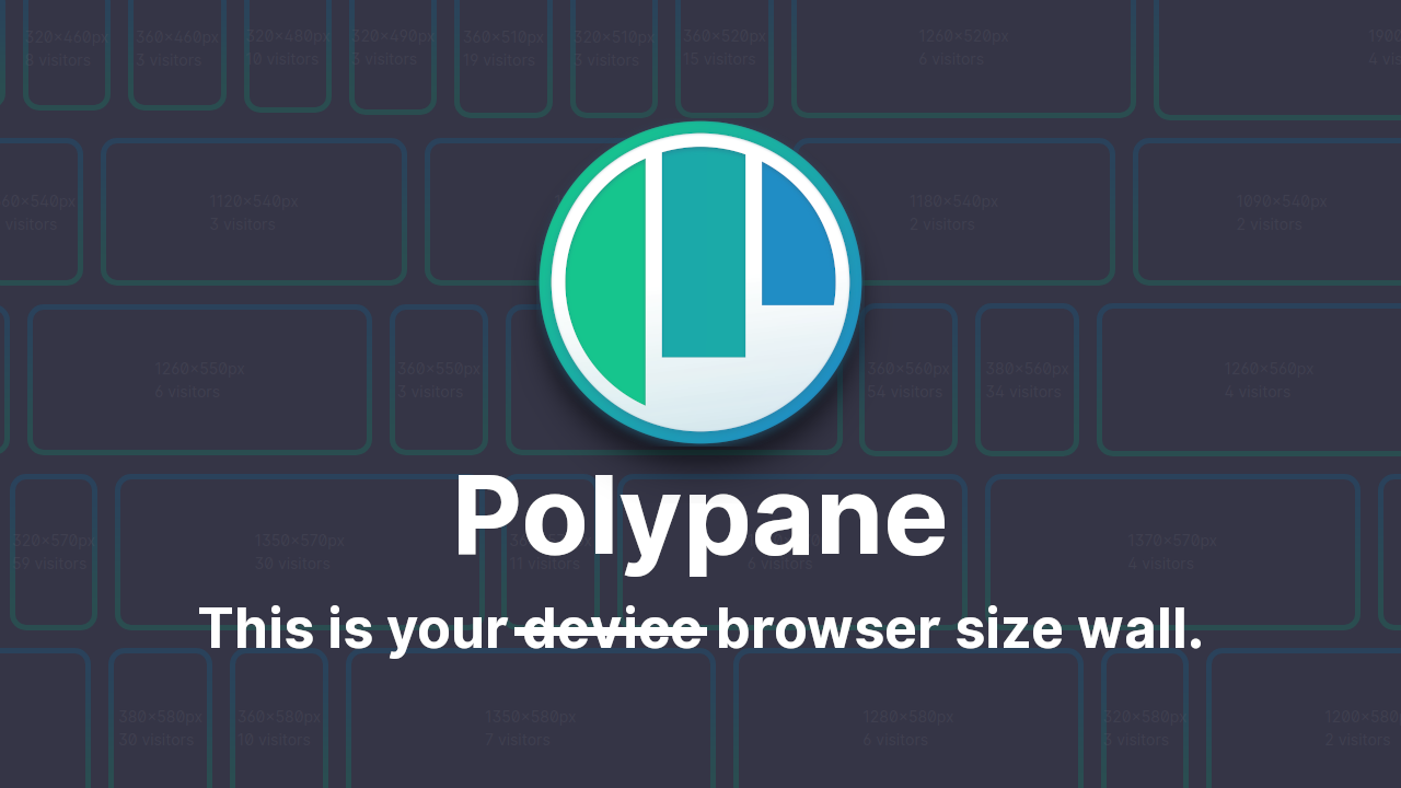
You need a browser size wall
Good responsive design doesn't care about devices, and neither do your website visitors. So whatever tool you use to test responsive designs should not force you to only use device sizes. Unfortunately, most only support devices.
Device sizes are not browser sizes. Testing only devices makes no sense.
To prove this to you, we built a tool that gives you an overview of all the browser sizes your real visitors use:
Connect with it to your Google Analytics and we'll show you an overview of the actual browser sizes used by your visitors in the last 30 days. You'll quickly see how many different sizes your site is being shown at, and how much variance there is even on mobile sizes.
We're only showing you the top 100 most used browser sizes, since scrolling through hundreds, let alone thousands of them is is not great (believe us, we tried).
Optimizing your site for just a few devices is a losing strategy, and doesn't fit how real people experience your website.
Check out your browser size wall
Match reality by using Polypane
Checking just devices will have you missing all the in-between sizes that your real users use. You need a different model if you want to build sites that work for all your users. You don't need devices, but panes.
Panes in Polypane are freeform, and you can add however many you want. You can size them in many different ways:
1. Yes, you can select from any of our 25+ devices (with full emulation)
Our devices are divided into separate categories and are always up to date with full emulation and the ability to switch between device size and viewport size.
2. Base them on on your @media query breakpoints
Polypane parses your CSS as the page loads and extracts all the breakpoints from your CSS media queries. With a single click you can get an overview of all the sizes the site has been styled for, or you can add them one by one.
3. Built-in and downloadable pane workspaces based on CSS framework sizes
CSS frameworks like Bootstrap and Tailwind come with a set of built-in media queries. We have ready-made overviews for the 11 most used CSS frameworks.
4. Drag to resize any pane on screen!
Panes in Polypane are freeform. If you need one to be a little big, grab the edge and resize it.
But we have one more way: take the browser size wall one step further and create your own Polypane workspace from the sizes your actual visitors use the most.
Create your own browser size workspace
After you checked your browser size wall, you'll want to get that info into Polypane. Use our create workspace tool to create a workspace based on the browser sizes used by your visitors.
Create your own browser size workspace
The best sizes to use are the sizes your own visitors use
Add a little random to your panes
Even when you've done all of that, you still won't get to the hundreds or even thousands of unique sizes and of course, you don't have to check them all. But we have one last neat trick up our sleeve.
With Shift ctrl n you can slightly tweak the size of all the panes on your screen. Do this a couple of times and you've checked effectively all variations.
What's next? Try Polypane.
Device sizes are not enough, and you want a responsive design tool that doesn't force you to use only devices.
With panes in Polypane, you can use your own CSS breakpoints, your visitors sizes, freeform sizes and yes, even devices. Test your site in all the hundreds or thousands of ways real people experience your site.

