Table of contents
Skip table of contentsIf you want to be kept up to date with new articles, CSS resources and tools, join our newsletter.
CSS is getting a random() function that lets you set properties with a random value, opening up a ton of interesting creative possibilities. In this article, I’m taking an early look at the function to see how it works and where the gotchas are (and there are a few) and really putting it through its paces.
I built seven different demos that you can play around with and edit yourself in the interactive examples below: bokeh, falling petals a stack of fling-able polaroids, a visual poem, a shaky grid, rotating rectangles and finally, recreating an aurora.
You probably don’t want your UI to be random every time someone loads the page. There are plenty of places where a little randomness, in for example a small animation, on a button click or something as simple as how a popup appears, can elevate the entire experience. Having it be easily accessible in CSS is really exciting, and a big win for designers and developers alike. The demos here are big and highly visual to show off the possibilities, I hope they inpire you to think about how you can use randomness in your own designs.
A note on the code examples
We're using random() directly in the code examples below, and don't have a fallback for browsers that don't support it yet. If you want to see the examples in action, you can get Polypane and try it for free.
The code examples have fully editable CSS, but only show the relevant CSS for each effect (for example the bokeh below does show the positioning, but not the border-radius).
You can edit the CSS in the examples to see how it works. In the code example we only show the most relevant CSS, but if you copy the code you'll get the full HTML and CSS for the example. Click the 'randomize' button to reload the example with a new random value for each property.
A note on browser support
We're using random() directly in the examples below without fallbacks, so many of these demos currently only work properly in Polypane, which we used to build and test them. Chromium 148+ also supports random() behind the Experimental Web Platform Features flag. Safari 26.2+ has partial support and several demos do not work correctly there yet. Safari 26.2+ support random(), but doesn't fully support all the demos I show in this article. Firefox currently has no support for random().
For the best experience, including the editable live demos and the most complete implementation, open this article in Polypane 29+ and try the examples yourself.
Some demos may behave differently or fail entirely outside Polypane right now. We'll keep the article updated as the spec and implementations evolve. If you're in the future right now and notice some of the demos no longer work, please let us know and we'll update the article!
My first experiment: Bokeh effect
I first learned about the availability of random() in browsers when I saw it listed in the newly available experimental features in Chromium 148, as I was implementing that in Polypane 29. Whenever I think of visual randomness, bokeh is the first thing that comes to mind.
Bokeh is a photography effect that creates out-of-focus light spots, and I find it absolutely mesmerizing to look at. I thought it would be fun to try to create a bokeh effect using random(). So I grabbed the MDN page on random() and got to work.
If you look at a bokeh effect, it's essentially a bunch of circles that differ in a few ways:
- the position of the circles
- the size of the circles
- the color of the circles
- the out-of-focus-ness of the circles
- the rate at which they change (if it's an animated bokeh)
Position
The position of the circles is easiest: set them to position:absolute, and then use random() in the left and top properties. This will place the circles at random positions:
Bokeh: Random Position
.bokeh {
  position:absolute;
  left: random(0%, 100%);
  top: random(0%, 100%);
  border-radius: 100%;
}The CSS in these examples is live and interactive. Want to experiment with these examples live? Open this article in Polypane.
The random() function in its simplest form takes a minimum (0%) and a maximum (100%) and returns a random value between those values.
Note: The minimum size here is 0, but it has to include the % to make sure both values are of the same type. If you just put
random(0, 100%), it would be invalid because the minimum is a<number>and the maximum is a<percentage>.
Size
Each circle in a bokeh effect has a different size, but it's still a circle. So if we want to use random() to set the size, we need to make sure that the width and height are the same value.
My idea was to 'store' the random value in a custom property (like --size: random(50px, 20vmin)) and then use that custom property for both the width and height. That way, the width and height will always be the same value.
Or so I thought.
Bokeh: Random Ovals
.bokeh {
  left: random(0%, 100%);
  top: random(0%, 100%);

  --size: random(50px, 20vmin);
  width: var(--size);
  height: var(--size);
}Yikes, width and height are different!
When you set a custom property to a random value, it will generate a new random value every time you use that custom property, not just when you declare it.
To fix this, we have to add a custom keyword to the random function called element-scoped.
This tells the browser to generate one random value per element. So each element gets a different random value, but the width and height of each element will be the same:
Bokeh: Size Fixed With element-scoped
.bokeh {
  top: random(0%, 100%);
  left: random(0%, 100%);

  --size: random(element-scoped, 50px, 20vmin);
  width: var(--size);
  height: var(--size);
}Note:
element-scopedis not the final name for this feature, but it's the one currently supported in Polypane and Safari. It will be renamed toper-element. Neither is yet part of the MDN docs, though a PR has been submitted to add it.
Position, revisited
I wanted to start with the position because it was simplest, but the position actually has an issue: if a circle starts at 99% from the left and has a size of 100px, it will overflow the container and cause scrollbars.
To fix this, we can use calc() to subtract the size of the circle from the position:
Bokeh: Size Fixed With element-scoped
.bokeh {
  left: random(0%, calc(100% - var(--size)));
  top: random(0%, calc(100% - var(--size)));

  --size: random(element-scoped, 50px, 20vmin);
  width: var(--size);
  height: var(--size);
}We don't know exactly what the size of the circle is, but because --size is the same for this element in each property, we can use it to be sure that the circles are always fully within the container.
The color of the circles
For the colors of the circles, I wanted all of them to be roughly the same lightness and saturation, but each circle to have a different hue. So I used the hsl() function with random() for the hue value.
Additionally, when you look at images of bokeh, some circles are more visible and some are less visible. So I also added a random opacity:
Bokeh: Color and Opacity
.bokeh {
  left: random(0%, calc(100% - var(--size)));
  top: random(0%, calc(100% - var(--size)));
  --size: random(element-scoped, 50px, 20vmin);
  width: var(--size);
  height: var(--size);

  background: hsl(random(0, 360) 80% 50%);
  opacity: random(0.1, 1);
}The hue in HSL is just a number, so it doesn't need a unit. The same goes for opacity.
Note: We've increased the number of circles in this and the next few examples so the effect is more clearly visible.
Out-of-focus-ness
Next up, some of the circles in a bokeh image are really sharp while others are more blurry.
In CSS, we can achieve a blur effect with the filter: blur() function. When you add a blur you also lose some of the vibrancy that some of the colors have, so I also added a contrast() filter to make some of the circles more vibrant.
Lastly, I added a mix-blend-mode to make the circles blend together using "plus-lighter", That increases the brightness of the circles where they overlap, which makes it look more like real bokeh:
Bokeh: Blur, Contrast, Blend
.bokeh {
  filter: blur(random(2px, 6px)) contrast(random(50%, 200%));
  mix-blend-mode: plus-lighter;
}That blur helps make the circles look more like actual bokeh circles, and the contrast makes some of them look more vibrant and some of them look more dull, which adds to the effect.
For contrast we specifically chose a range where most random values would increase the contrast (the 100% to 200% range) and only a handful of circles would have a contrast value that decreases the contrast (the 50% to 100% range).
Animation
Finally, I wanted to add some animation to the bokeh circles. When you look at bokeh through a camera and you increase and decrease the focus, some circles become larger and more blurry, while others become smaller and sharper.
The easiest way to do that is with a simple pulse animation. We only need to define the 50% keyframe. The 0% and 100% keyframes will be the default state of the element (a scale of 1).
@keyframes pulse {
  50% {
    scale: 1.2;
  }
}
We can re-use this same animation for all circles, because we can set the animation timing and the animation delay to a random value for each circle. This way, each circle will pulse at a different rate and start at a different time, which makes the animation look more natural:
.bokeh {
  animation: pulse random(2s, 5s) ease-in-out infinite;
  animation-delay: random(-5s, 0s);
}
We let the animation run infinitely so it just keeps looping with an ease-in-out timing function to smooth out the start and end of each pulse. By setting a random negative delay, some circles will start the animation somewhere in the middle, which makes it look more natural as you refresh the page. If we only used no delay or a positive delay, all circles would start their animation by growing.
Combining it all
So when we combine all of these properties together, we get this:
Bokeh: Final Combined Demo
.bokeh {
  filter: blur(random(2px, 6px)) contrast(random(50%, 200%));
  mix-blend-mode: plus-lighter;
  animation: pulse random(2s, 5s) ease-in-out infinite;
  animation-delay: random(-5s, 0s);
}

@keyframes pulse {
  50% {
    scale: 1.2;
  }
}Note For animations like the one above that have animations, we show a "show demo" button to activate the preview, for two reasons: 1) the animation can be distracting or annoying and 2) it can be performance-intensive.
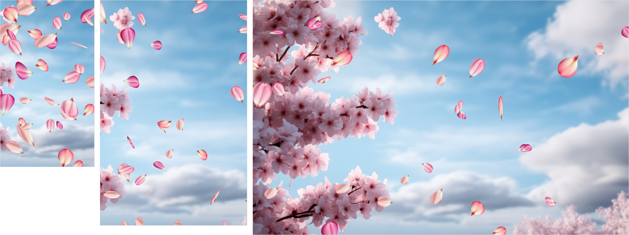
Falling flower petals
We have a cherry tree in our backyard, and when the wind blows in spring, the petals fall off the tree and float down to the ground. It's very soothing.
I thought it would be fun to try to recreate that effect using random(), and lets front-load the final animation so you can see what we're trying to achieve:
Falling Petals
Note In Safari sometimes you don't see any petals in the demos. If that happens, click randomize a few times. I don't know why this happens, but it seems to be a Safari bug.
Lets look at what parts need to be random to achieve this result.
- The petals all need to start at a different position off-screen
- They should all be a slightly different size and should look a little different
- They all need to move vaguely in the same direction as if blown by the wind, but each petal should fall slightly differently
- They should fall at different speeds
- They should randomly twirl as they fall
Starting position
The starting position of each petal should be above the current viewport, and then randomly across the width of the viewport so that they each fall from a different place.
For the top value we can use a fixed one so they all start at the same place, and then for the horizontal starting value, we'll use a custom property, since we're going to reuse it once we get to the falling animation.
We'll use element-scoped so that each petal has a different starting position, and we're not going to set left, but translate because we want to animate the petals falling down the screen, and animating translate is more performant than animating left:
.petal {
  position: absolute;
  top: -100px;
  --initial-position: random(element-scoped, -40vw, 100vw);
  translate: var(--initial-position) 0;
}
We'd show a demo, but they all start off-screen and don't animate, so you wouldn't see anything. That's our starting position sorted, lets move on to size and shape.
Size and petal style
For the size, lets use aspect-ratio instead of an explicit width this time so we can keep things simple:
.petal {
  width: random(30px, 50px);
  aspect-ratio: 1/1;
}
For the petals themselves I found four different petals by Pram Samnak that I liked and wanted to randomly pick one from.
Theoretically you would be able to use random-item() to randomly pick one of the four petals, but that function is not yet implemented in any browser. It would look like this, if it worked:
.petal {
  background-image: random-item(url(petals/1.png), url(petals/2.png), url(petals/3.png), url(petals/4.png));
}
I had to think a while on how to get around this, and I ended up realising that if each petal starts at a random place I could just use nth-child,
The repeating pattern of the nth-child() selector wouldn't be noticeable since each petal starts at a random position.
All of this still happens off-screen so there's no demo. Let's quickly add the falling animation and see something!
Falling animation
When petals fall down they also get pushed around by the wind, so they don't fall straight down. To achieve this, we can animate translate and move the petals down and to the right.
Because each petal catches the wind differently, we want them to fall at different speeds and at different angles. For the speed, we can vary the duration of the animation. For the angle we can set an end value for the translate that takes the --initial-position that we already had, and add a random amount.
Falling Petals: Fall Animation
.petal {
  --initial-position: random(element-scoped, -40vw, 100vw);
  --end-position: calc(var(--initial-position) + random(20vw, 50vw));

  translate: var(--initial-position) 0;
  animation: fall random(5s, 10s) linear infinite;
  animation-delay: random(-10s, 0s);
}

@keyframes fall {
  to {
    translate: var(--end-position) calc(100vh + 100px);
  }
}Just like with the bokeh example, Each petal has a different timing and we set a negative delay so that some petals start in the middle of their animation, which makes it look more natural as you load the page.
We only have to set the to keyframe to the end position at the bottom of the screen. When the petal leaves the screen, it jumps back to the top and starts falling again, creating a continuous effect.
Twirling animation
To achieve the idea of the petals twirling in 3D, we scale them randomly as they fall as if they are moving closer and further away from the camera, and we rotate them along the X, Y and Z axis.
We use two separate animations for that, so we can have both of these happen at different random durations and starting times to make a unique animation for each petal.
For the rotation we use transforms with perspective() to get a nicer looking 3D effect on the petals. We also want each petal to twirl at a different speed, so we also use random() in the animation duration.
Lastly, we set the transform-origin to the top center of the element, so that it twirls around that point rather than around the center of the petal.
Falling Petals: Twirling
.petal {
  --initial-position: random(element-scoped, -40vw, 100vw);
  --end-position: calc(var(--initial-position) + random(20vw, 50vw));
  --rotx: random(-45deg, 45deg);
  --roty: random(-45deg, 45deg);

  translate: var(--initial-position) 0;

  animation:
    fall random(5s, 10s) linear infinite,
    rotate random(2s, 4s) linear infinite,
    grow random(2s, 4s) ease-in-out infinite alternate;
  animation-delay: random(-10s, 0s), random(-10s, 0s), random(-10s, 0s);
  transform-origin: top center;
}

@keyframes fall {
  to {
    translate: var(--end-position) calc(100vh + 100px);
  }
}

@keyframes grow {
  to {
    scale: random(1.5, 2);
  }
}

@keyframes rotate {
  from {
    transform: perspective(300px) rotateY(var(--roty)) rotateZ(-30deg) rotateX(var(--rotx));
  }
  to {
    transform: perspective(300px) rotateY(calc(var(--roty) + 360deg)) rotateZ(330deg)
      rotateX(calc(var(--rotx) + 360deg));
  }
}To finish it off, we got a nice background image as a background.
A stack of Polaroids you can fling away
For the third example, I want to create an "untidy" stack of Polaroid photos, where they're all slightly rotated and offset from each other to create a natural looking pile. Additionally, i wanted to fling them in random directions when you click on them.
Let's look at how we can add interactivity to our randomness!
Building the stack
The easiest way to create a stack of elements is to use CSS Grid and place all the elements in the same grid cell:
.container {
  position: absolute;
  margin: 0;
  inset: 0px;
  display: grid;
  grid-template-columns: 1fr;
  place-items: center;

  .polaroid {
    grid-area: 1/1/2/2;
  }
}
And then we can style each polaroid. This time they all have the same dimensions but it's the transform that we're going to use to add some randomness.
The HTML structure of each polaroid looks like this:
<div class="polaroid">
  <div class="img">
    <img src="polaroids/1.jpg" alt="" />
  </div>
</div>
Because of the grid they're already all stacked in the same position on top of each other. We can use random() in the transform property to rotate and offset each card randomly:
Polaroids: Randomized Stack
.polaroid {
    grid-area: 1 / 1 / 2 / 2;
    position: relative;
    background: #f9f0db;
    border-radius: 3px;
    box-shadow: 0 0 10px rgba(0, 0, 0, 0.2);
    width: min(400px, 82vw);
    aspect-ratio: 2.1 / 2.5;
    padding: 25px;
    transform:
      rotate(random(-15deg, 15deg))
      translate(random(-10px, 10px), random(-10px, 10px));
}The transform here takes care of the entire effect: rotate it randomly between -15 and 15 degrees, and then translate it randomly by up to 10 pixels in both directions. This creates a nice "messy" stack of polaroids.
Adding interactivity
For the interactivity, we need to be able to set a state for each card when we click on it, and ideally we also want a way to reset the cards back to their original position.
Each card gets a checkbox that we overlay on top of the card:
<div class="polaroid">
  <div class="img">
    <img src="polaroids/1.jpg" alt="" />
  </div>
  <input type="checkbox" />
</div>
The CSS to make sure the checkbox is invisible and covers the entire card:
.polaroid {
  input {
    position: absolute;
    inset: 0px;
    opacity: 0;
    cursor: pointer;
  }
}
That gives us a :checked state for each card that we can use, but to uncheck it, we need to click each card separately again. If we want to be able to reset all cards at once, we're going to need use the platform.
By wrapping all the checkboxes in a <form>, we can use the native reset behavior of the form to uncheck all the checkboxes at once when we click the reset button.
By placing the reset button before the cards in the same grid stack, it will appear when the last polaroid is flung away:
<form>
  <button type="reset">Stack them back up</button>
  <div class="polaroid">
    <div class="img">
      <img src="polaroids/1.jpg" alt="" />
    </div>
    <input type="checkbox" />
  </div>
  <div class="polaroid">
    <div class="img">
      <img src="polaroids/2.jpg" alt="" />
    </div>
    <input type="checkbox" />
  </div>
  <!--- etc -->
</form>
A note on accessibility: This is not an accessible form and should not be used as-is in production. This is just a demo to show how you can use the
:checkedstate of a checkbox and the reset feature of a form to trigger animations.
Now we can use the :checked state of each checkbox to trigger an animation that flings the card away in a random direction.
Polaroids: Click to Fling
.polaroid {
    transition: transform 0.33s ease-in-out;

    &:has(input:checked) {
      pointer-events:none;
      transform:
      translate(random(-50vw, 50vw), -70vh)
      rotate(random(-120deg, 120deg));
    }

    &:has(input:active) {
      transform: scale(1.2);
    }
}When a card is checked, it's translated to a random position near the top of the screen and rotated by a random amount to make it look like it's being thrown. As you click a card we use :has(input:active) to scale the card up slightly so it looks like you're picking it up, and then when you release the mouse button, it flies away and scales back down to its original size.
When we click the reset button, all checkboxes are unchecked and all cards return to their original position in the stack.
Ordering
Now a keen eye might see that each item on the stack is flung below the previous one, which is what you expect from the HTML structure, but isn't exactly how a real stack of polaroids would work.
In a real stack, the latest polaroid to flung away would land on top of the other ones, not below them.
We can fix that with some clever use of animation values to store the time you clicked each polaroid and append that to the z-index (so the last clicked is always highest), but we're going to leave that out-of-scope for this article.
Let us know if you want to see a follow-up article where we go into how to do that!
Designing a poem with random-item()
I had this idea of a poem where I would randomly start words on a new line or with different offsets, just like some visual poems do. Something like display: random-item(block, inline-block) would be perfect for that.
But random-items() doesn't exist yet.
As I was watching Kevin Powell at CSS Day show off how he uses if() in CSS, I realised we could combine random() with style queries in an if() function to get a similar effect.
Note the
if()function is not supported in Safari yet, so the demos below won't work there.
random() gives you a value between two numbers, but if you want to get a random value like display: block or display: inline-block, you can't do that directly.
What you can do is use the step value in random() to create an integer value between 1 and 0, and use that as a toggle in an if() function.
Using the step value in random()
If you add a third value to the random function, it will only return values that are a multiple of that value.
If we set the step value to 1, it will only return whole numbers. If we also set the minimum to 0 and the maximum to 1, it will only return either 0 or 1.
Then we can use @property to cast that to an <integer>, and use that as a toggle in an if clause:
@property --discrete-number {
  syntax: '<integer>';
  inherits: false;
  initial-value: 0;
}

span {
  --discrete-number: random(0, 1, 1);
  display: if(style(--discrete-number: 1): inline-block; else: block;);
}
Combining that, we can essentially recreate random-item(). For example, if we wanted to randomly pick a different petal for our falling petals demo instead of looping through them, it would look like this:
@property --discrete-number {
  syntax: '<integer>';
  inherits: false;
  initial-value: 0;
}

.petal {
  --discrete-number: random(0, 3, 1);
  background-image: if(
    style(--discrete-number: 0): url(petals/1.png) ; style(--discrete-number: 1): url(petals/2.png) ;
      style(--discrete-number: 2): url(petals/3.png) ; style(--discrete-number: 3): url(petals/4.png) ;
  );
}
That's not too bad, is it!
Styling the poem with discrete random values
With this implemented I build a little demo of a poem where each word is randomly offset and randomly set to either display: block or display: inline-block to create a more interesting layout:
Poem: Discrete random() Toggle
@property --discrete-number {
  syntax: "<integer>";
  inherits: false;
  initial-value: 0;
}

.poem span {
  --discrete-number: random(0, 1, 1);
  display: if(
    style(--discrete-number: 1): inline-block;
    else: block;
  );
}Refreshing that demo a bunch of time I realised that with this discrete number, I had a 50/50 chance of a word being on a new line or not. That didn't look great.
I wanted to have more control over those odds, i wanted to be able to say "I want 70% of the words to be display: inline-block and only 30% to start on a new line".
Weighted random values
By increasing the max value to 10 and then using a style query that checks if the value is above or below 3, we can achieve that:
span {
  --discrete-number: random(0, 10, 1);
  display: if(style(--discrete-number > 3): inline-block; else: block;);
}
Currently, the proposal for random-item() does not include a way to weight the odds of each item being selected. That would be very useful though, so I opened an issue on the CSSWG repo. If you want to see that feature implemented, please go and comment on that issue.
A visual poem
Using that weighed value we can set a number of options based on that single discrete number and use different weighting for each value.
This ended up being a fun way to create a visual poem where each refresh puts the emphasis on different aspects of the same poem:
Poem: Weighted Visual Layout
@property --discrete-number {
  syntax: "<integer>";
  inherits: false;
  initial-value: 0;
}

.poem span {
  --discrete-number: random(0, 10, 1);
  display: if(
    style(--discrete-number > 2): inline-block;
    else: block;
  );
  margin-left: if(
    style(--discrete-number < 2): random(0rem, 6rem);
    else: 0;
  );
  font-weight: if(
    style(--discrete-number > 5): random(400, 800);
    else: 400;
  );
}We can even use random inside the if clause, so there is a higher chance of a word being on a new line, but if it is on a new line, it also has a random chance of being offset by a random amount.
More demos
I have a few more demos that I created but this article is already quite long and covered most of what I wanted to show, so I'll just show the additional demos below.
Make sure to also check out Randomness in CSS by Alvaro Montoro. Some of the terminology has already changed since that article, but it takes a more descriptive approach at introducing the new function that you might like.
Shaky Grid
No animation here, but I thought it would be fun to create a shaky grid pattern where each line is slightly offset and rotated.
Shaky Grid
.line {
  transform:
    scale(1.5)
    rotate(random(-10deg, 10deg))
    skew(random(-10deg, 10deg), random(-10deg, 10deg));
}
.vertical .line {
  width: random(5px, 10px);
}

.horizontal .line {
  height: random(5px, 10px);
}Randomly rotating rectangles
This was sort of a step-up to the petal example. Each rectangle sits inside a grid area and is randomly rotated and offset. The animation is continuous.
Randomly Rotating Rectangles
.tile {
  width: random(25%, 75%);
  height: random(25%, 75%);
  border-radius: random(10px, 20px);
  transform-style: preserve-3d;
  --rotx: random(-25deg, 25deg);
  animation: rotate random(5s, 10s) linear infinite;
  animation-delay: random(-5s, 0s);
}

@keyframes rotate {
  from {
    transform: perspective(500px)rotateY(0deg) rotateZ(-30deg);
  }
  to {
    transform: perspective(500px) rotateY(360deg) rotateZ(330deg);
  }
}Aurora
This one is quite interesting because it uses a few @property declarations to make things like the length portion of a linear gradient offset configurable.
It is however very similar to the bokeh example in terms of how the style is achieved, and it's also quite a bit more resource intensive. Dig in and play around with it, but be aware that it might be a bit heavy on your CPU.
Note This demo doesn't work well in Safari, presumably because it's using
random()inside animations.
Aurora
 @property --skew {
  syntax: "<angle>";
  inherits: true;
  initial-value: 0deg;
}

@property --length {
  syntax: "<percentage>";
  inherits: true;
  initial-value: 100%;
}

.beam {
  background: linear-gradient(
    to bottom,
    hsl(random(100, 280) 100% 50%),
    hsl(random(100, 280) 50% 0%) var(--length)
  );

  mix-blend-mode: plus-lighter;
  filter: blur(8px);
  animation:
    rotate random(3s, 8s) ease-in-out infinite alternate,
    grow random(2s, 11s) ease-in-out infinite alternate,
    move random(8s, 12s) ease-in-out infinite alternate;
  animation-delay: random(-5s, 0s), random(-5s, 0s), random(-8s, 0s);
  transform: perspective(300px) rotateX(20deg) skewX(var(--skew));

}

@keyframes rotate {
  from {
    --skew: random(10deg, 14deg);
  }
  to {
    --skew: random(12deg, 18deg);
  }
}

@keyframes grow {
  from {
    --length: random(20%, 50%);
  }
  to {
    --length: random(40%, 60%);
  }
}

@keyframes move {
  from {
    translate: random(-2vw, 0vw) -10%;
  }
  to {
    translate: random(0vw, 2vw) -10%;
  }
}A work in progress
random() in CSS is still very much a work-in-progress. Support across browsers is patchy, the specification is still evolving and there are quite a few bugs (that hopefully I've sneakily worked around in the examples above, while also reporting reduced test cases). Still, having the ability to use randomness in CSS opens up so much new possibilities for creative designs and effects, and i'm really only scratching the surface of what can be done with it.
There are a number of things you can do with random() that I left out:
- using custom identifiers to create a random value that is the same across multiple elements
- setting different scopes
- forcing fixed seed values
Things that I simply didn't find an immediate use-case for (or, to be honest, fully understand).
If you have an idea for a cool use-case for any of those features, or if you want to see a follow-up article where we go into some of those more advanced features, please let us know!
If, like me, you simply want to have a go at some fun and creative experiments with random(), you can get Polypane and play around with it before it lands in normal browsers.

