
If you want to be kept up to date with new articles, CSS resources and tools, join our newsletter.
field-sizing is wild. It's a new CSS property that makes input, textarea and select automatically scale to the size of their content.
That means it replaces a bunch of different techniques that all require JavaScript to some degree and I love it when that happens.
Syntax
field-sizing has two values:
fixed, which is the current behavior of inputs, textareas and selects where they have a fixed size regardless of the content.content, which makes the form element scale to the size of the content
When you apply it to an input or select it will scale to the width of the content. When you apply it to a textarea, it will scale to the height of the content.
A field-sizing demo
Here are three interactive demos for field-sizing: one for input, one for textarea and one for select. You can change the content and see how the input or textarea scales to the size of the content, and for the select you pick a different option to see it update.
You'll need Polypane or a Chromium based browser (at least 120 with experimental features turned on, or 123 when it's released later this year) to see this demo. If you don't have Polypane, you can try it for free.
An example using input:
<input
  type="text"
  placeholder="input"
  value="this sizes to its content"
/>input {
field-sizing: content;
}An example using textarea (with a fixed width):
<textarea>
Here is a
Multiline
Textarea
</textarea>textarea {
field-sizing: content;
width: 200px;
}And an example using select:
<select>
  <option>Short Option</option>
  <option>Longer Option</option>
  <option>Extra Long Option With Many Words</option>
</select>
select {
  field-sizing: content;
}How we use it
Polypane has parts of the UI where users can input content that should (up to a certain degree) scale with the content:
The width and height of each pane
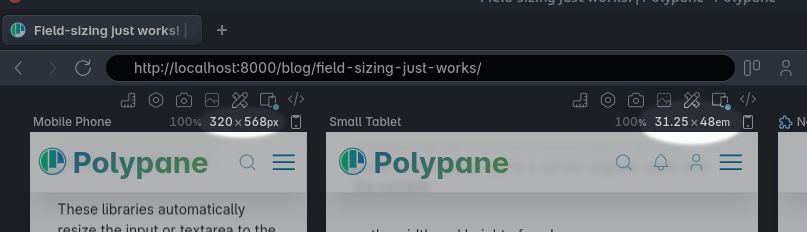
Having the inputs scale to their content means that they will always look correctly aligned, whether the dimensions are "320x568 px" or "31.25x48 em".
The content area in the elements editor
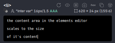
Autoscaling the content area means that you can always see the full content of the element so you're not scolling up and down (up to a certain height of course).
Polypane has been around for a few years and we actually went through a few different techniques to make both of these work. Let's go through them and see how field-sizing makes them all obsolete.
Input listeners: the all-JavaScript way
Being built in React, our first iteration used specific React packages: react-input-autosize and react-autosize-textarea.
These libraries automatically resize the input or textarea to the size of the content and also let you set some custom properties to determine the minimum and maximum size. They don't require you to add any custom styling.
<AutosizeInput
  value={value}
  onChange={(e) => setValue(e.target.value)}
/>
<TextareaAutosize
  style={{ width: 200 }}
  defaultValue="This textarea autosizes automatically to be as tall as needed"
/>
There are a number of these types of libraries and they work in one of two ways:
- They render a second element with the same content of the input, measure that size and then set the size of the input to that size.
- They measure the scrollHeight or scrollWidth of the element on any change, then set the size of the input to that size.
This works, but at the expense of another element and a bunch of listeners that make sure to listen on text input, take the placeholder value into account, handle window resizing, font loading and on a bunch of other events.
It's a lot of work to make sure it looks good. You'll see how the ones above aren't quite right on first load.
Grid-based: the semi-JavaScript way
Having all those listeners started to stack up, so I decided to switch out the approach for something that was a bit more performant: using a grid area that contains the input/textarea and replicating the value from it into a pseudo-element.
<div class="wrap">
  <textarea
    rows="1"
    onInput="this.parentNode.dataset.value = this.value">this textarea autosizes</textarea>
</div>.wrap {
position: relative;
display: grid;
width:150px;
font-size:14px;
}
.wrap::after {
display: block;
content: attr(data-value) " ";
white-space: pre-wrap;
visibility: hidden;
}
.wrap textarea {
resize: none;
overflow: hidden;
}
.wrap::after,
.wrap textarea {
font:inherit;
grid-area: 1/1/2/2;
padding:2px;
}By setting both the textarea and the ::after pseudo element to grid-area: 1/1/2/2 we essentially force them to be the same height. When the ::after pseudo becomes larger, the textarea will automatically size along with it.
The way the grid area works is that it scales both elements to the larger of the two. By default a textarea starts at two rows high. By adding rows="1" we make sure that the textarea can shrink down to a single row.
that ::after pseudo has a content property that is set to the value of the textarea as well as a single space. This space makes sure that when you enter a newline in the textarea, that newline also causes the textarea to expand.
With visibility: hidden we can make sure that while the ::after pseudo does its job of sizing the textarea, it's not visible.
This is a nice solution because it requires almost no listeners, especially if the form elements are already controlled by React: you only have to render the value into both the input and a data attribute, making it very light-weight on the JavaScript side. Otherwise, you can add one listener to the input event to replicate the value as you can see in the demo.
However as you can see on the CSS side, we need a lot more styling to make it work: the ::after pseudo element needs to behave exactly like the textarea: same font, same white-space handling, same padding etc. If you don't get this right, things can be off by a few pixels, causing lost text, scrollbars or cut off lines.
The New CSS-only way
Enter field-sizing. It's part of CSS Basic User Interface Module Level 4 which is still in editor draft state (meaning things can and will change) and for now its a Chromium-only feature. I expect it to land in other browsers sometime this year though, with Safari having alread given a positive signal, and Firefox will probably follow suit.
<input
  type="text"
  placeholder="input"
  value="this sizes to its content"
/>input {
field-sizing: content;
}field-sizing has all the benefits of the grid-based example above without needing the wrapper element, the input listener and all the work of making sure the CSS Styling stays exactly the same. And it works for inputs, textareas and select.
It's a single CSS property that really does all of that work for you, it even sizes to the placeholder when you clear it. When I was done implementing it (consisting of removing a bunch of code) I was in awe of how easy it was.
Notes
Aside from the lacking browser support, you'll also want to make sure that your input, select or textarea has some boundaries. If you don't, it will just keep growing and growing. You can do this by setting a max-width or max-height on the element.
Likewise, if you don't want it to shrink down to the width of a space or dot, add a min-width for your inputs and selects.

