Table of contents
Skip table of contents- Hey Maurits, can you tell us about yourself?
- What were you looking to improve in your workflow that made you search out a tool like Polypane?
- What did you use before?
- How was it for you to get started with Polypane and how do you use it?
- Tell us about Henri's, what do you use it for?
- Can you tell us about Brouwerij Victorie?
- Okay, back to web dev again. What results did you see with Polypane?
- What's next for you?
If you want to be kept up to date with new articles, CSS resources and tools, join our newsletter.
Maurits is a freelance front-end developer and co-founder of Brouwerij Victorie, a brewery in Amsterdam with a gorgeous website. We spoke with him about beer (naturally), e-commerce and Henri's, a Sass design toolbelt.
Hey Maurits, can you tell us about yourself?
My name is Maurits, 33 years old and have been an entrepreneur / freelancer since the beginning of my professional career. I’m that old skool developer that can tell you about supporting Internet Explorer 6 back in the days, that’s how old I am.
After owning and running an agency with 10+ employees, I decided almost two years ago to start freelancing again and do what I like best, developing solutions for end customers and clients. You can find me on Twitter and GitHub.
My main field of expertise is e-commerce development, on a freelance basis as a Magento 2 and Shopware 6 developer. Shopware 6 lets me develop Headless e-commerce solutions with Vue.js. (Sorry Kilian, I don’t hate React, I just like Vue.js better.) I’ve created a few extensions which are available via the Shopware ecosystem.
My preference of working is desktop down, instead of the popular mobile first approach. I think this has grown from working with designers that embraced this approach. I have a strong belief in hiding elements from the desktop size down instead of starting with a minimalistic design on mobile and adding experience to the page on desktop.
What were you looking to improve in your workflow that made you search out a tool like Polypane?
I have to say I wasn’t looking for workflow improvement, I just happened to know Kilian and saw his awesome product. One of the key challenges with the software of Polypane is that you don’t know what you’re missing until you try it.
What did you use before?
I normally just use Chrome development tools and emulate screens in that. One of the things you start to realize using Polypane is the amount of time you spent on resizing or emulating screens.
Besides the manual steps you need to take, I catch myself on being lazy and tending to forget to have a final check across multiple devices. Polypane solved that by becoming a part of my development to deploy process and always being the final check before deploying.
How was it for you to get started with Polypane and how do you use it?
I’m still figuring out all the possibilities Polypane has to offer. Right now I use it to check my work on many screen sizes at once, With the experience I have, I’m pretty aware of the output my code will bring on smaller screens.
But Polypane is much more than a window resizer, the meta info displayed in the sidebar, the a11y features make it easy to improve your website in a glance and have your site optimized and ready to ship. Better websites in less time, that’s what Polypane brings you.
Tell us about Henri's, what do you use it for?
At one of my previous companies a few of my coworkers created Henri's, (with a special shout out to Sil van Diepen who has done most of the work on this great library.) Henris is a modern Sass Tool belt that makes creating fluid web pages easy.
Henris is based on a “grid philosophy” and provides the tools to easily create a "pixel-pretty-close" version of the designer's vision. All of this probably feels really abstract so let’s use an example to clarify this approach:
Your designer loves working on a big canvas, let’s say 1920px by 1080px. They want to create a fluid full width experience for everyone so they design everything full width on 1920x1080. But a lot of our users don’t have these huge desktop screens and instead use small screens or, more likely, tablet or mobile devices so we need to have a tool that makes your design fluid.
This is where Henri's comes in, together with the designer we decide to work on an old-fashioned column kind of design, but instead of working on a 12 column grid we are using a 24 column grid without gaps, just because no one likes gaps right? Your designer starts being creative, designs an awesome page at 1920px width and now it’s time to implement his awesome design on your end-users small screen.
Working on a 1920px design means one column is 80px. Let’s say you have the following headings designed, what will be the translation to grid sizes?
| Designed on 1920px | Grid size | Translates to | On 1440px | |
|---|---|---|---|---|
| Heading 1 | 80px | 1 grid | 4,167vw | 60px |
| Heading 2 | 60px | 0.75 grid | 3,125vw | 45px |
| Heading 3 | 52px | 0.65 grid | 2,70vw | 39px |
| Heading 4 | 40px | 0.5 grid | 2,08vw | 30px |
| Heading 5 | 32px | 0.4 grid | 1,6668vw | 24px |
The great thing about this approach is your font will scale with all screen sizes and has the same word wrapping when changing your screen size.
But as you can see and probably notice things will get critical on smaller screens like phones. Let’s say you are watching the page on a device with a width of 375px, this means your H5 will have a font-size of 6,255px which is close to unreadable and not the style you would probably want.
In the past we used to have an explicit sass function to solve the min and max font-sizes, but the new css clamp() function is a much more elegant solution to the problem.
Henri's offers a bunch of other convenient tools, you can find out all about those on the website henris.style and the docs.
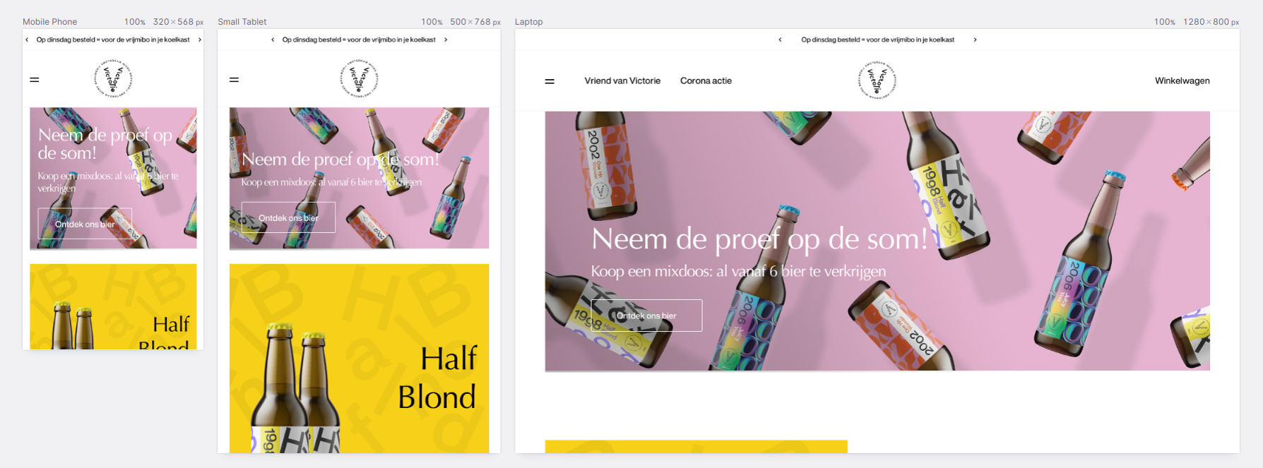
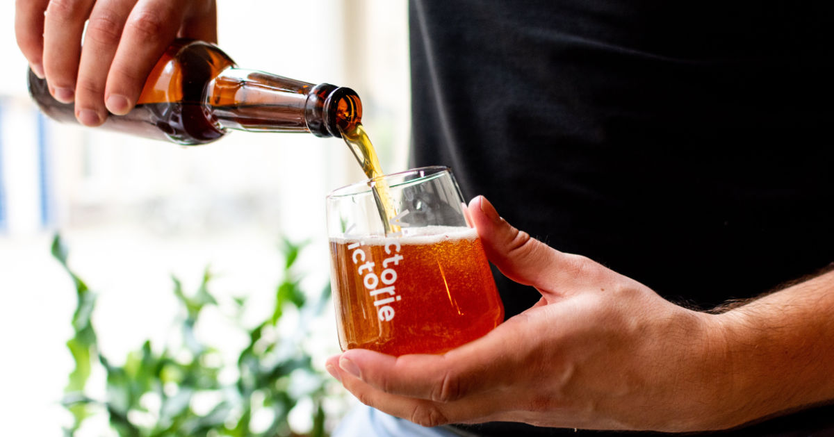
Can you tell us about Brouwerij Victorie?
In March of 2020, when the whole pandemic started in the Netherlands me and two friends decided to continue with our plans of starting a brewery: Brouwerij Victorie. With our first range of three beers, a Blond, Saison and Neipa we started a complete new and unknown adventure. Selling beers is something completely different from building websites. Our beers are made for people like ourselves, the creative industry. In the near future we want to have more explicit beers that serve this audience better.
Starting during Covid forced us to think differently and instead of using traditional channels we're selling it through our own e-commerce platform brouwerijvictorie.nl, built with Shopware and Nuxt.
As a special for Polypane users in The Netherlands, get our beer with the special discount code "friendsofPolypane" for 10% off.
Kilian: How awesome is that! I highly recommend Brouwerij Victorie's beers. Half Blond if you prefer a fresh blonde style beer and One Hit Wonder (a saison) if you like to sit with a beer a little longer. And I look forward to trying Juicy You, which is a fruity IPA. They also have a mix box so you can try them all.
Okay, back to web dev again. What results did you see with Polypane?
Being a freelancer I can say that this tool really helps, even if I don't really see that returned in hours saved. What I do notice is that everything I work on ends up looking better. You end up with higher quality output because of that different way of thinking about web development you get using Polypane.
I also frequently share screenshots made in Polypane with product owners so they can see the responsive design in one overview.
What's next for you?
At the moment I’m optimizing the website of our Brewery, we want to have better accessibility and better SEO, so Polypane is really helpful in discovering those pain points. In 2021 we want to introduce two new beers, become a sustainable brand and move our beers from traditional glass bottles to cans, which have a lower carbon footprint and are easier to recycle.
Like every other developer I don’t stop learning, with Vue3 and Vite coming up I would like to build an application completely relying on those new frameworks. I’m trying to be active in the communities I like, but sometimes find it hard to keep up with everything. You can find me on Twitter and GitHub.
Thanks Maurits for this interview! Henri's looks cool and I have nothing against Vue either ;) Go check out the Brouwerij Victorie site for some cool UI elements and responsive design inspiration. If you're in the Netherlands and like beer, I really recommend you give their beers a try.

