If you want to be kept up to date with new articles, CSS resources and tools, join our newsletter.
Polypane 3.1 is now available and with over 30 new and improved features it's our biggest release ever.
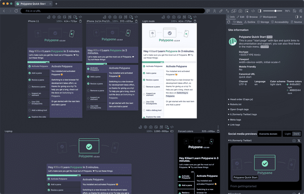
With Polypane 3.1 we're introducing the Polypane elements panel: A completely new elements panel written for Polypane that syncs between all panes letting you easily update styles, content and attributes.
But with 32 other new and improved features there's way more to explore. There are 2 other new panels: Storage and Outline. There's an updated Meta panel that highlights issues, a new Discord preview and updated Twitter and Facebook previews. We've added the ability to import and export workspaces and added some default workspaces for convenience. There's new overlays, updated existing ones and improved performance all around.
Polypane element inspector
In Polypane you've had access to the Chromium devtools element inspector and while it works fine it was never developed to support multiple panes.
So we built our own:

The Polypane element inspector is extremely fast and makes common tasks really easy. All synced with all panes, of course. Here's a quick video showing it in action:
The element inspector is filled with smart features and it's a joy to use. Listing all the features would make this announcement twice as long. Very quickly:
- select elements in all panes at the same time,
- live editing of content and attributes,
- custom widgets for styling,
- one-click copying of CSS rule sets,
- automatic contrast checking
- and so much more.
For a full rundown, read the documentation
Meta panel updates
One important theme in Polypane is that we want to help you create better sites. That's why we added warnings for common issues in the Meta panel. We show warnings for missing but important meta elements or when your title and description are too long or short.
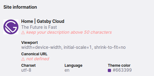
If you define certain meta values more than once, we'll show you a warning indicator for that too. Other new things are more prominent place for the canonical url, all icons are now downloadable and if your page supplies oEmbed information that information is now also shown.
Social media previews
All social media cards now have a background color that matches their websites for both dark and light mode, so the preview is even more accurate and you get a better idea of the context where your card is shown.
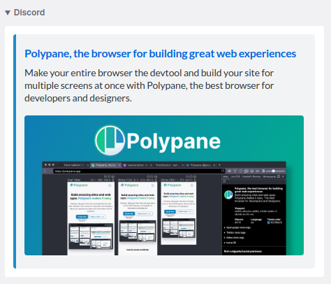
We added a new social media preview: Discord, in dark and light mode. One of the cool things in the Discord share card is that is uses your site's theme color for the border.
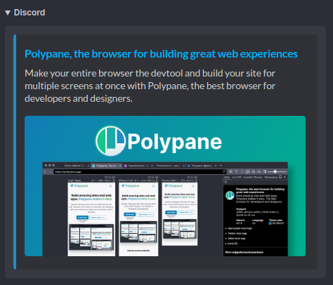
Since the last release of Polypane, Facebook updated it's design and added a dark mode, so that is now updated in Polypane. New (or rather, back again) in this design is that Facebook will show a part of your og:description again but only if your title fits on a single line.
Other new panels
We also added two new panels: Storage and Outline.
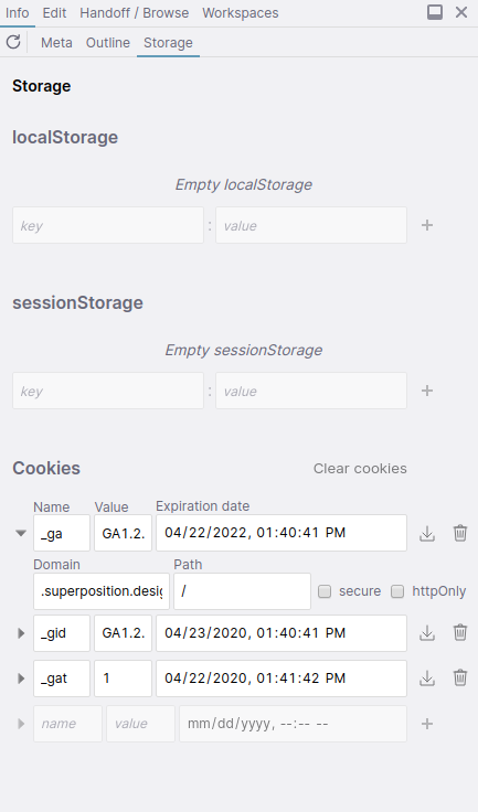
The Storage panel has been in the works for a while (I hinted about it in an article in December of 2019) and it makes it super easy to inspect and edit your localStorage, sessionStorage and cookies, including cookies that are httpOnly, which you don't have access to in your own JavaScript.
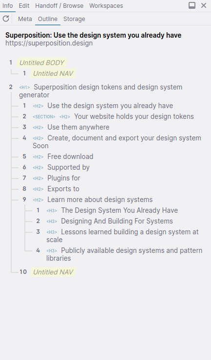
The Outline panel shows an outline of your headings according to the HTML5 outline algorithm. Easy to quickly check if your page has a logical heading structure or if you're missing steps or have sections that need a title but don't have one.
Workspace import and export
We heard from many of you that you wanted to share your workspaces with your colleagues, so we've added the ability to export and import workspaces. Export your favorite workspaces to Polypane workspace files, share them with your team and they can import them into their own workspaces.
Default workspaces
We've also added a new tab with default workspaces. They include our default three-pane layout, the device lab, all our iOS devices, all our Android devices (including a new Moto G4 preset), the 6 most common screen sizes used worldwide and the default breakpoint for Bootstrap, Material UI, Tailwind and Bulma.

New overlay
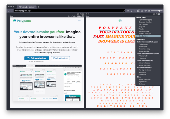
We added a new overlay, Hostile CSS. Hostile CSS will inject styling for all default elements. You can use it to check if your component styles are properly isolated from any default CSS.
Color overlay now suggests alternatives
Like our free online Color contrast checker, the Contrast checker overlay will suggest improved colors that have enough contrast. This makes fixing your colors really easy.

Set your own tab homepage
When you open a new tab we show the default 3 panes and the getting started page. in 3.1 you can now change this 'homepage' to whatever configuration you want. Arrange your tabs the way you like, pick a URL, then set the homepage to your current view from the main menu.
Full changelog
There's more new features, improvements and fixes in this release so read through the full changelog below. All new features are fully documented in our docs too.
- New Polypane Element Inspector
- New Storage panel
- New HTML5 Outline panel
- New Default workspaces
- New Exportable and importable workspaces
- New Meta Panel: Discord preview
- New Meta Panel: warnings for issues
- New Ability to set new tab layout + url
- New Hostile CSS overlay
- Improvement Color contrast overlay now suggest color
- Improvement Color contrast overlay supports testing numerical font-weights
- Improvement Meta panel: downloadable images
- Improvement Meta Panel: Facebook preview updated
- Improvement Meta Panel: Twitter dark mode preview updated
- Improvement Meta Panel: Social media previews are now shown on their real background color
- Improvement Meta panel: shows oEmbed info
- Improvement Panes no longer refresh when switching between horizontal and vertical mode
- Improvement Panel settings are stored per tab
- Improvement Updated default paneset
- Improvement Screenshots now include timestamp
- Improvement Disable cache now identical to devtools
- Improvement Right click to open links in side browser
- Improvement Support for Meteor devtools
- Improvement Dragging links or files to tab bar opens them in new tab
- Improvement Double click vertical resize to scale panes to 100%
- Improvement Polypane loading looks better
- Improvement Add Moto G4 pane preset
- Improvement On Mac, Polypane now keeps running after last window is closed
- Improvement Panel resizing is now faster
- Improvement Updated UI of devtools extension manager
- Improvement Urls with
target="_blank"now open in a new tab - Improvement Scroll position is now saved per tab
- Improvement Updated Electron
- Improvement Full page screenshot now works with more websites
- Fix Zooming shortcuts work again
- Fix F12 now turns on inspect element in Isolate pane mode
- Fix Figma sign in with Google now works
- Fix Screenshot in browser mode now has correct dimensions
- Fix No internet message in dark mode now has correct border color
- Fix Custom headers are also applied on first load when switching modes
- Fix Updated shortcut for fullscreen on Mac
3.1.1 (bugfix update)
- Improvement Crashes in the panel no longer crash Polypane
- Improvement Element inspector now understands CSS custom properties with fallback values
- Improvement Element inspector now understands currentcolor
- Improvement Updated Codemirror for Live CSS
- Improvement Updated Electron
- Improvement Support Google login for isolated panes
- Fix Setting panes from a workspace correctly sets pane names
- Fix Clicking on dimensions in device chooser sets correct device
- Fix Prevent crash when meta description exists but has no content
- Fix Live CSS shows Google Fonts as suggestions again
- Fix Issue where side panel sometimes disappeared
- Fix Opening links with target="_blank" in isolate pane mode no longer opens multiple tabs
Getting Polypane 3.1
Polypane will automatically update on Mac and Windows. Linux users need to download the new version from the download page and if you're on Mac and Windows but don't want to wait on the update popup, you can find your download there as well.
If you don't have Polypane yet there is a free 14 day trial available. Get it here.
