
Table of contents
Skip table of contentsIf you want to be kept up to date with new articles, CSS resources and tools, join our newsletter.
One of the most time consuming issues when it comes to web development is debugging horizontal scrollbars.
They're easy to overlook while developing (especially on macs) and if users scrolls horizontally, your layout will look broken to them.
On top of that it's hard to determine which element is causing the overflow.
What causes horizontal scrollbars?
There area few common causes for horizontal scrollbars and overflows:
Setting the width of the body to 100vw
The viewport width unit (vw) is a useful way to make things a certain percentage of the screen wide.
When you use 100vw however, you make something the full width of the viewport and this includes the width of scrollbars in all browsers except for Chromium 145 and up. Tthat means that your page is slightly wider than the available width (which is the full width of the viewport without the scrollbars).
In short: if you use width: 100vw on a page that has a vertical scrollbar you end up with a horizontal overflow.
The easy fix is to use width: 100% instead. Percentages don't include the width of the scrollbar, so will automatically fit.
If you can't do that, or you're setting the width on another element, add overflow-x: hidden or overflow: hidden to the surrounding element to prevent the scrollbar.
Fixed width elements
An image or element might have a width of 500px in your desktop layout. When you hardcode that in your CSS, it's going to cause a scrollbar on mobile screens that are only 375 pixels wide.
That might sound overly simple, but it's often the cause of overflow issues. Particularly when images are added through a CMS.
This happens more when you develop the desktop version first, so Mobile first design is a good prevention.
Using width: 100% instead of width: stretch
When you use width: 100% on an element, it will be as wide as its parent element (well, containing block). if that parent element then shows a scrollbar, that width 100% will be wider than the available space (which is 100% minus the width of the scrollbar) and cause a horizontal overflow.
The solution to this is to use width: stretch instead of width: 100%. Stretch will make the element as wide as the available space and will automatically adjust to the presence of a scrollbar. While "new" relative to other width properties, it has support in all evergreen browsers since the end of 2025, so you can probably use it in production today.
Not clipping off-screen elements or elements that are wider than the viewport
Some design elements might require you to place them outside of the viewport.
Like a menu that slides in the from the right or a wider-than-the-viewport-element with rounded corners to get a certain curve in your design like in this video:
The curve on that site extended past the viewport. Because it wasn't contained in an element with overflow: hidden, all of it was visible after you scrolled.
Finding horizontal scrolling issues
Now that we know some of the reasons overflow happens, lets look at how to find them.
Using the devtools
To find out which elements cause a horizontal scrollbar, you can use the devtools to delete elements one by one until the scrollbar disappears.
When that happens, press ctrl/cmd Z to undo the delete, and drill down into the element to figure out which of the child elements cause the horizontal scrollbar. That works in all browser devtools.
This is obviously very time consuming, so it helps to make all elements visible.
Adding outlines to all elements
By default, elements are "invisible". They're there and take up space, but unless they have a background or border you won't see where they are. So when you make all of them visible, it becomes easier to find the one causing an overflow. A common solution for this it to add outlines to all elements by adding the following style to your CSS:
* {
  outline: 1px solid red;
}
We're using
outlinehere and notborder, because outline does not affect the rest of the layout in a way that border does. Adding a border to all elements might cause a horizontal overflow where there wasn't one before.
Of course, editing your CSS file every time you need to debug something is also not very time efficient. Instead you can paste the following line into your console to add an outline to all elements.
$$('*').forEach((el) => (el.style.outline = '1px solid red'));To get rid of it you reload the page. Doing that also gets rid of any changes you made in the devtools to fix the overflow, so it's not ideal but it will work in any browser.
Polypane: Adding outlines with a shortcut
Polypane has this outline built-in under a handy shortcut: ⌘ d.
When activated Polypane draws boxes around all elements in all panes. It also uses a different color per element to keep them apart, something that would be a lot of work to do in your own CSS:
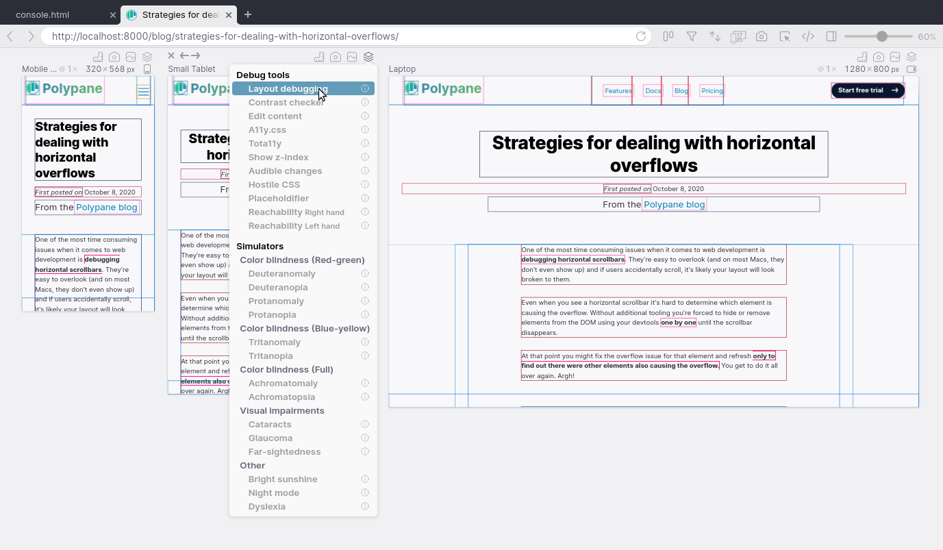
While you can now clearly see which elements are overflowing the page, you still have to hunt down their 1px outlines to find them.
Polypane: Highlighting overflowing elements
When Polypane detects a pane that has a horizontal scrollbar, it automatically highlights elements that cause the overflow. See this video for an example.
With this feature you won't have to hunt around for them any longer. All overflowing elements are visually highlighted so you don't have to spend time hunting them down any longer.
With the shared elements editor you quickly verify that the changes you made fix the overflow in all panes.
Polypane: Detecting horizontal overflows automatically
In Polypane, any pane that has a horizonal overflow or contains a layout that uses 100vw for the width is highlighted
with a horizontal overflow icon that tells you which issue it found.
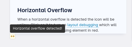
Clicking the icon will help you detect the overflow causing elements by highlighting them in red, or show you which
layout element has 100vw applied.
All overflow-causing elements are also logged to the console so you can quickly inspect them.
With Polypane, debugging horizontal layout issues goes from diving into the devtools to delete elements one by one to your browser telling you there's an issue and giving you the solution by clicking a single button.
Start a trial and try Polypane for yourself.

