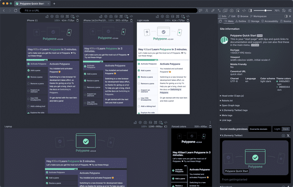
For a sharp picture on a desktop you need a much larger image than on a mobile phone. If you just add images for the desktop size, your mobile users will end up downloading large images, wasting their bandwidth and slowing your site down. With responsive images, you can offer a set of images at different sizes and quality (and even content), and the browser will decide which is the best to show to the user.
You can do this by using the srcset and sizes attribute on an <img> element, or by using the <picture> element and adding <source> elements to it. With this, you can vary the size of images you send, the pixel density (so mobile phones with sharper screens get sharper images), the type of image (you can send a webp to browsers that support it, and a jpg to browsers that don't) or even do art direction, where on smaller screens you zoom in to a specific part of the image.
A really good overview of how to apply these techniques can be found on MDN: responsive images on MDN.
