Each year, the state of CSS takes a global survey of the CSS landscape. Its results are highly regarded and influence browsers, toolmakers and web developers around the world. So I (Kilian) was super honored when I was asked to help out with making the survey results more responsive and accessible. I also ended up writing this years conclusion.
To be clear: the survey results website was already well coded. The site was built in a responsive way and had accessibility testing done but there was still opportunity to optimize many parts of the survey.
I started out doing a quick 5 minute scan to see the issues that came up. While I focused primarily on things that could be improved on smaller screen sizes, but Polypane also found accessibility-related improvements that could be made. I noted down a variety of issues, from truncated text to missing landmark elements and from spacing issues to color contrast issues.
Here's a roundup of the things I found, and how I fixed them.
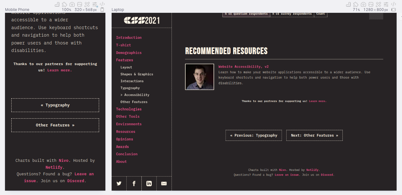
Forward/previous buttons had text-overflow issues
At the bottom of each page were navigational buttons that let users go to the previous and next pages. On mobile the contents of these buttons were truncated, so part of the text was no longer readable.
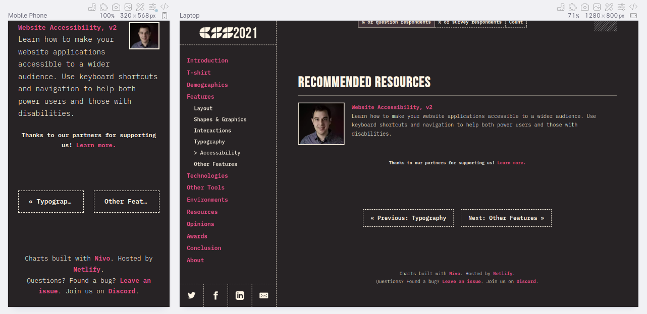
This happened because on mobile a grid layout was used with each button taking up 1fr. Because the grid dictated the available space, the text inside the buttons was truncated.
By changing the container from a grid layout to a flex layout which allowed wrapping (with flex-wrap: wrap), the buttons would align vertically on mobile layouts making them wide enough for text not to get truncated. With the flex layout, I could also make sure the buttons grew to full width on mobile, but keep their intrinsic width at desktop sizes.
Giving charts more space
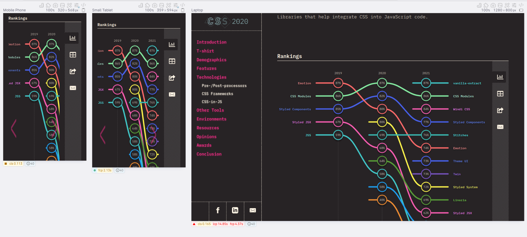
The charts are the main show of the State of CSS results so I wanted to make sure they had as much space as possible, while also making the most of the available space. At the start, a chart always has a right-aligned set of icons called the "side area". The header too could have a set of tabs that'd be right-aligned next to the header, making the charts feel cramped on smaller mobile phones:
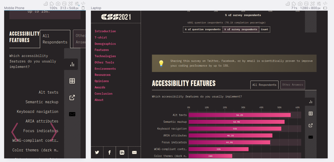
To clear the space for both on mobile, I made two changes:
- The tabs in the header would be shown below it, giving the header the full width of the screen.
- The side area would be shown above the chart, giving more horizontal space to the chart.
This gave both the charts and header some well-needed horizontal space:
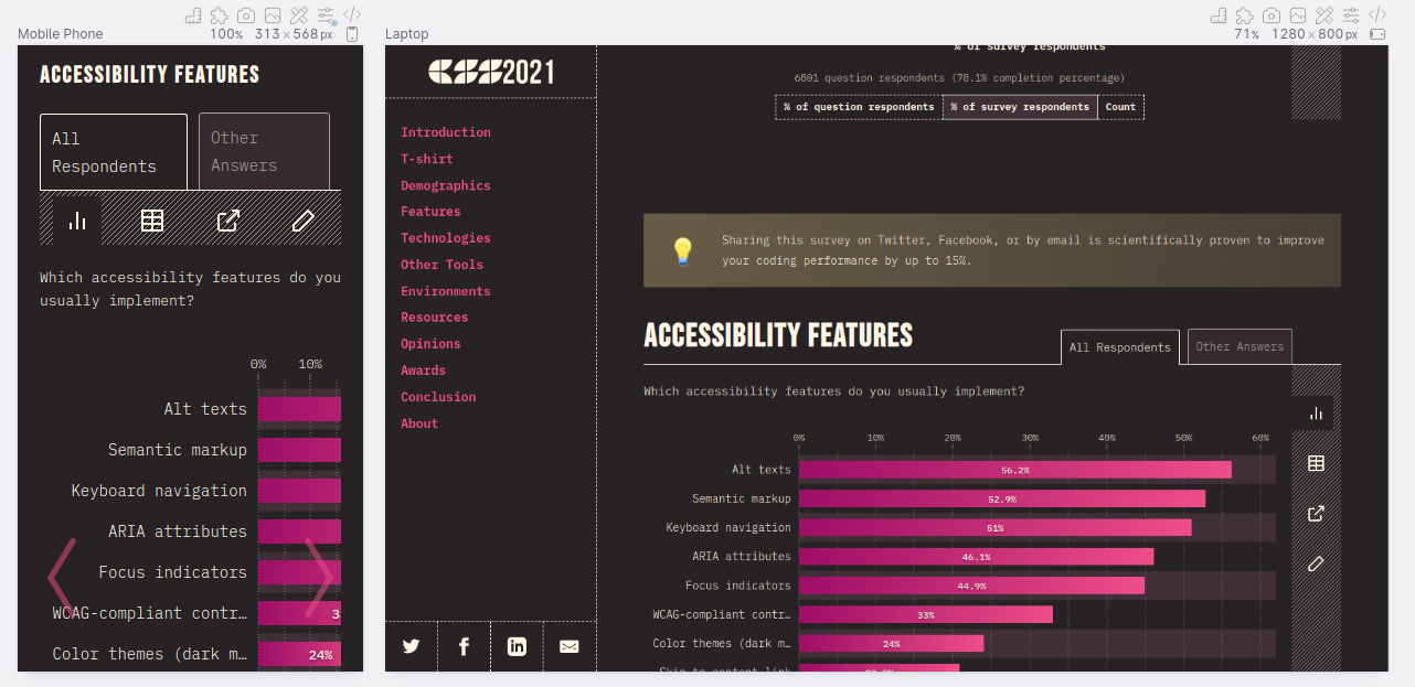
The main and side areas were split using a CSS grid with named areas, but for mobile I switched this out for a columnar flex layout. This made it easier to position the buttons with a few lines of CSS. I could've also still used a CSS grid with updated named areas, but it would've required more CSS to specify.
While the side area in the new location looked fine on Polypane, due to the CSS property
appearance: buttonon each button in the side area, Mobile Safari rendered extra padding around each of the buttons. This was not visible in the old layout, and not visible in Polypane either.
I'm mentioning this explicitly: while using Polypane means you no longer have to test all the layouts on all the browsers, each rendering engine is different and you should still test each one for issues.
Updating each chart
After maximizing the space available to each chart, I set out to make sure each chart made the most of the available space. The charting library used by the State of CSS is called Nivo and it's really good. Each chart type comes in two variants: a fixed width size and a responsive size that adapts to the available space.
For the mobile layouts, it doesn't always make sense to show the responsive chart variants: some charts simply have more data than would fit the available screen space. In those cases, charts were given an explicit scroll area. Several charts already used this, so I went over each chart to determine how best to make use of the available space:
- Make it scrollable or keep it fitted to the available space
- Minimize spacing around parts of the charts to make the most of the space.
- Minimizing space around the charts, so visitors had to scroll less.
This is most noticeable in the ranking chart. Initially this always took up the same amount of space between each column. By updating the available space for charts, Nivo automatically minimized the space between columns while the desktop size made use of the space, allowing visitors to follow the changing in rankings easier.
Some other changes to the charts I made were:
- Cutting the amount of spacing below each chart in half on mobile.
- Making charts scroll horizontally when the screen width was too narrow.
- Prevent tooltips from being clipped by charts on mobile.
Document structure
Polypane's outline panel gives you an overview of headings, landmarks, links and images in one go, helping you spot errors and areas of improvement. By browsing the pages with the panel open I quickly found some improvements:
Add landmarks
Landmarks are elements like header, nav and footer that tell people using assistive technologies what part of the page they're currently at. Not all pages need them, but most do. Because of this, Polypane doesn't show an error when they're missing, but it will show warnings.
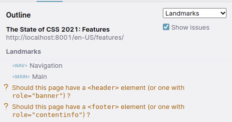
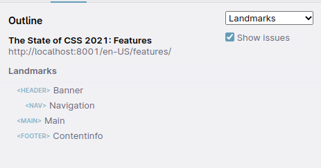
For the State of CSS website, there were definitely areas of the site that acted as a header and footer, so I updated those areas to use the right semantics.
Duplicate titles
Polypane also found some instances of duplicate titles. These can be hard to spot, since the duplication usually happens at different parts of the page and you don't see them side-by-side. While a sighted user can usually distinguish between these as they probably look different and they're on different parts of the page, someone using assistive technologies might have a harder time determining from the title which part of the page they're on. When you can, you want to avoid duplicate titles.
It turns out the recommended resources block duplicated the header above and below a separator. This is most likely a copy-paste bug, but Polypane quickly flagged this as an issue and I could delete one of the headings:


More duplicate titles
But I also noticed a lot of repeated headings on the features pages. All the labels for the stacked horizontal barcharts were marked up as h4 elements.
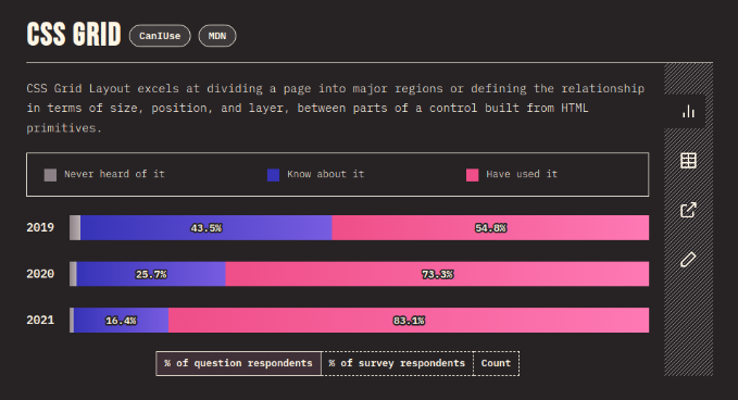
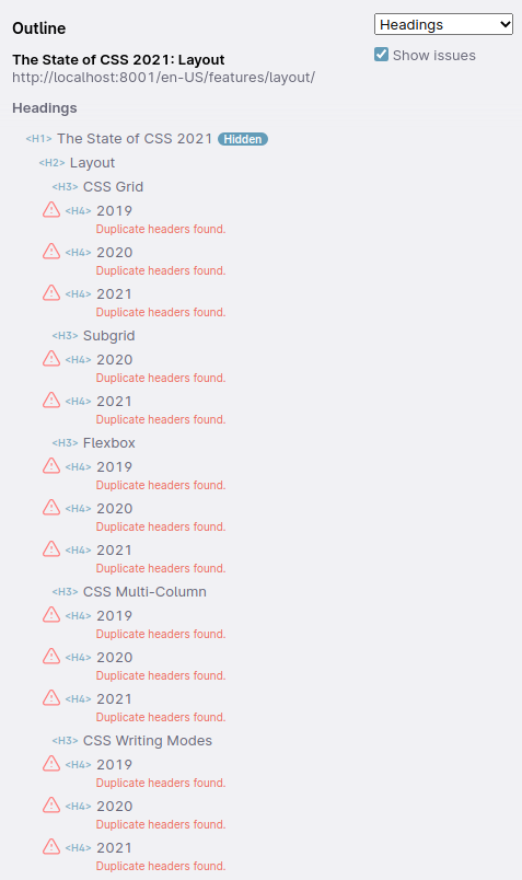
While I felt that an h4 was the wrong element, I didn't immediately know what the right element would be. So I asked the help of fellow front-enders in the HTML channel in the Fronteers Slack group.
After a short discussion most people thought a <dl> element was most appropriate, though <table> semantics were also suggested. Between those I opted for <dl>, since it covered the right semantics and was easier to implement.
This cleaned up the outline a lot, making it easier to navigate from chart to chart using assistive technologies while still using the right semantics to make sure that each bar chart had a proper label attached to it.
Color contrast changes

The State of CSS has a dark mode style, fitting the developer-focused nature of the website. Unfortunately the existing link colors ( #ed2e84 and #1734bf), while bright and punchy, did not have enough contrast with the background.
While Polypane automatically suggested colors ( #f2498e and #7c83dc ) that would've worked well, we ended up referencing the new logo for this year (designed by Christopher Kirk-Nielsen) and using a pink from it: #ef4e88.
In Closing
I made more changes, like set the minimum font size to 12px, added a theme color (the Meta panel helpfully pointed this out) and updated spacing in many different places to make the mobile display more cohesive (like on the awards page). If you want to go through the changes I made, have a look at the List of PRs I opened.
It's always exciting to work in a new (for you) codebase, and I definitely needed time to get my bearings. Sacha was very patient with me and helped me find my way around the codebase. Even though our workdays could not have been further apart, me living in The Netherlands and Sacha in Japan, we managed a good cadence and could sync up before my workday started and after his workday properly ended.
The State of CSS (and State of JS) surveys are some of the largest surveys of developers out there, and their results really have a material impact on browsers, tool developers and the wider industry. If you're not participating in them yet, keep an eye out for them and be sure to have your voice heard.
To stay up to date with them, you can sign up to be reminded for the next edition below the conclusion.

