Table of contents
Skip table of contentsIf you want to be kept up to date with new articles, CSS resources and tools, join our newsletter.
In this article we'll check the quality of a web page in about 5 minutes, from meta info to accessibility. Polypane has many features that make it easy to see different parts of your site, inspect them for issues and it will even tell you how to improve any issues it finds.
Because Polypane is completely made for building and testing websites all the tools are easily accessible. You won't need to dig into the browser devtools, have your site be publicly accessible or wait for a spot on slow online tools. Just open Polypane, type in the URL (even localhost) of the page you want to check and go!
Here's 5 topics that each will take you a minute to check:
Minute 1: visual issues
First we'll take a look at how things ...look. By checking our page across different screen sizes we get a quick overview of any glaring visual issues.
Quick overview
We'll begin with a spot check to make sure that there is nothing obviously broken.
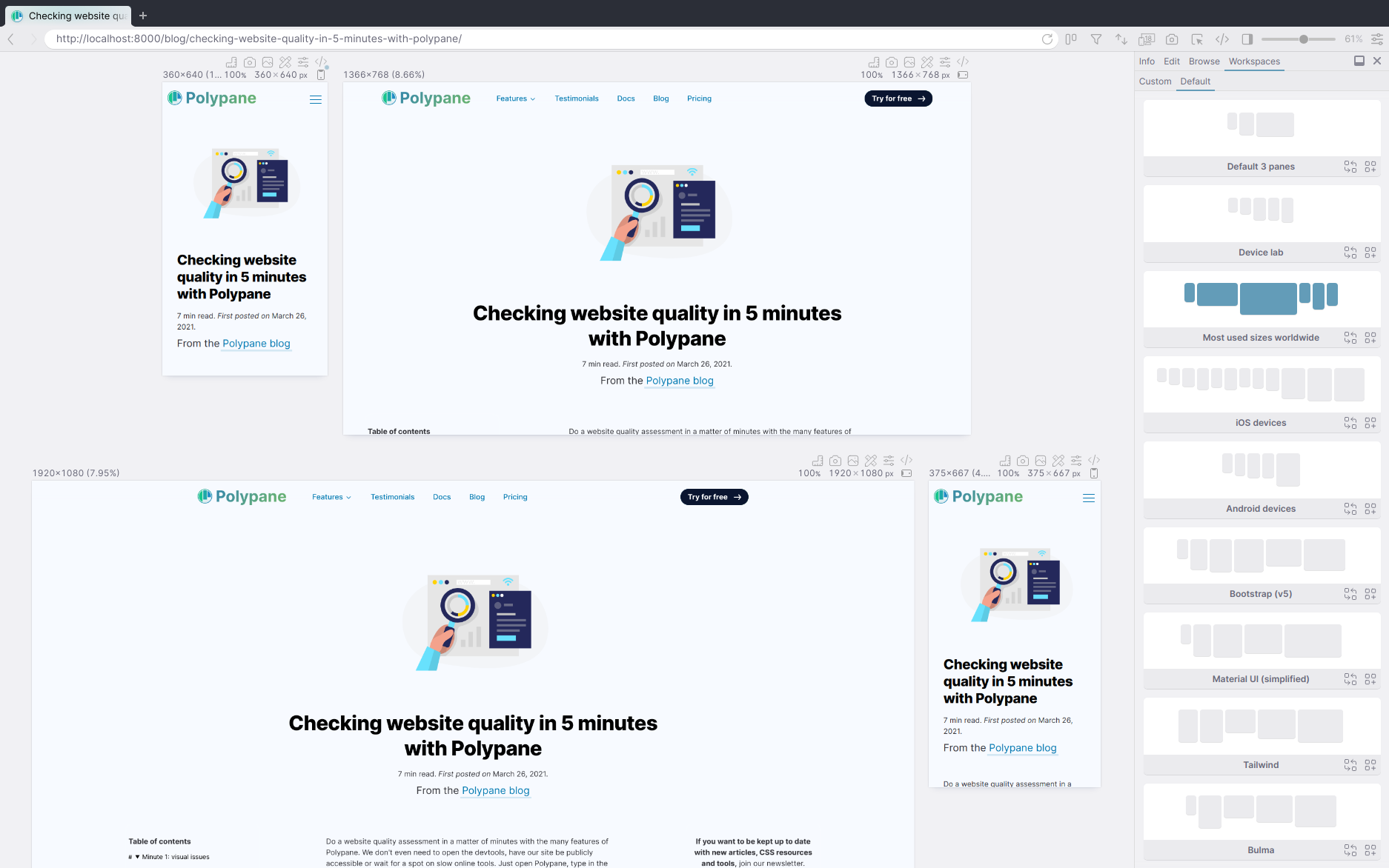
1. Switch to the "Most used sizes worldwide" workspace.
Open the side panel, then switch to workspaces, default and select the "Most used sizes worldwide" workspace.
2. Scroll through them to see if everything renders correctly.
You only need to scroll in a single pane, all the other panes will follow. You can always zoom out to get all the panes in one overview by dragging the slider in the top right of the application.
3. Check for hidden overflow issues
Press ctrl + d (or cmd + d on macOS) to turn on Layout debugging. This draws boxes around all your elements so you can fix layout issues easily, but it also checks the entire page for elements that are too wide and cause an unprofessional looking horizontal scrollbar. If you have elements like that, Layout debugging will make them bright red.
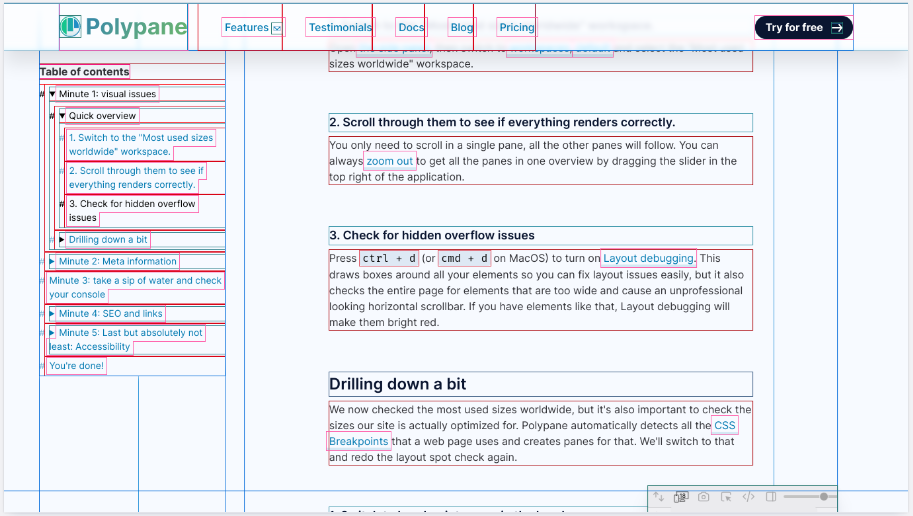
Drilling down a bit
We just checked the most used sizes worldwide, but it's also important to check the sizes our site is actually optimized for. Polypane automatically detects all the CSS Breakpoints that a web page uses and creates panes for that. We'll switch to that and redo the layout spot check again.
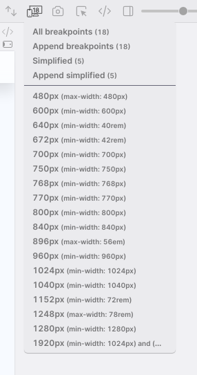
1. Switch to breakpoint panes in the header.
Tip: right click the icon for an overview of all breakpoints.
This will use the sizes your website is optimised for. Get a warning that there's too many? That's something to look into, there's probably ways to combine them in your CSS and simplify your styling. Click "simplified breakpoints" in the warning and use that instead: it will take all your breakpoints and create 5 screen sizes that span the range of your CSS breakpoints.
2. Scroll through them to see if everything renders correctly.
Again, scroll in any of the panes to scroll in all of them, and adjust the global zoom level as needed.
3. Turn on layout debugging.
Scroll through the page again. Red areas highlight elements causing horizontal scrolling.
That was minute one. We now have a global overview of how our layout is performing at different sizes and whether there are any layout issues we should definitely look into.
Minute 2: Meta information
Meta information is the information search engines like Google and social media like Twitter and Facebook use to display information about your site. So it's pretty important. But unfortunately that information is hard to see in a browser. Typos are quickly made and only discovered when it's already too late.
Polypane can check the meta information of any page. That includes pages that aren't even available publicly yet, like your localhost.
Let's check the meta info.
Open the side panel again and go to the Info tab, then the Meta tab.
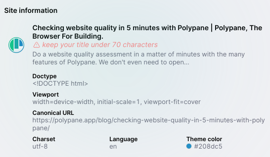
The top part of the panel shows you a quick overview of the meta info. Check the following things:
- Is there a favicon?
- Do the title and description have typos?
- Are the title and description too long or too short? Don't worry, we'll tell you when this is the case.
- Do we have a language, charset and canonical URL set?
Is something missing or giving warnings? Consider adding or fixing these for better SEO.
Drilling down a bit on the meta info
From here, click open the various items like "Open graph tags", "Twitter tags" et cetera. We're going for speed so just check if there's a warning icon somewhere. These indicate duplicates or other issues and you should make sure to remove or fix them (keeping the one with the right value.)
Social media previews
The social media previews in Polypane are pixel-perfect so you can be sure that they render correctly (even if your site isn't on the right domain yet!). Lets go over what to check:
- Do Twitter and Facebook have a nice, large image?
- Does the image fit everywhere, or are some parts cut off?
- Check for typos in the Twitter and Facebook titles and descriptions.
- Is the Facebook description visible? If not, your title is too long. This can also be intentional, but be sure to check!
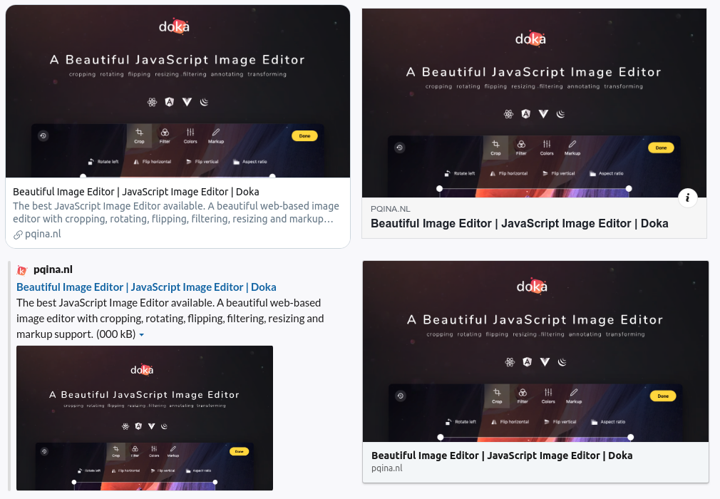
All the other social media (Slack, LinkedIn, Discord and Telegram) use the values from Twitter and Facebook so if those look good, then the others will too.
Minute 3: take a sip of water and check your console
After all, it's important to stay hydrated.
We're going to stay in the Side panel for this one. Let's switch to the Console tab in the side panel under Edit. How does it look? Does it have a lot of messages? Are there any warnings (with a yellow background and a warning sign) or errors (with a red background and an error sign)?
Ideally this tab would be completely empty, but sometimes there are still console.logs around the code, or third party JS sends some debugging information. They don't do harm but if you can, you should get rid of them.
If there's warnings or errors however, those can have unintended consequences or even cause your site to stop working. That's something to fix.
Minute 4: SEO and links
Real quick, take a look at the address bar. Are you using HTTPS? Great, then let's continue.
If not, do something about that: HTTPS websites are more secure and HTTPS increases your visitors privacy. As a bonus: using HTTPS makes you rank better in many search engines!
Inspect the page structure
Time to open the Outline panel under Info, because we're going to check the page structure to see if there are any issues.
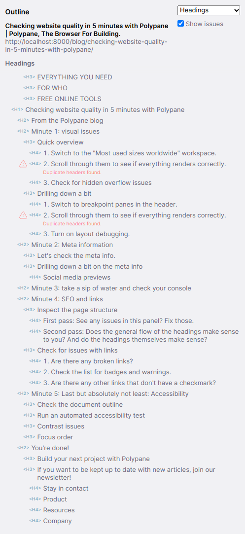
First pass: See any issues in this panel? Fix those.
The Outline panel opens to the headings panel by default, which shows you the hierarchy and content of all headings. Are there any warnings visible, like skipped levels? Or do you see headings that are missing text or have text you don't expect? Polypane shows the accessible name here, which is what assistive technologies read out as the title.
Second pass: Does the general flow of the headings make sense to you? And do the headings themselves make sense?
If they don't make sense on their own, consider rewriting them. Most users of assistive technologies use headings to go through your page and they're also the most valuable parts of your page for search engines. When it comes to headings, you have to make the words count.
Check for issues with links
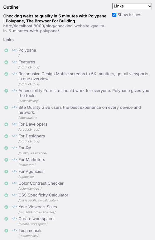
Click the drop down in the top right of the outline panel to switch to Links. Take another sip of water while Polypane checks all the URLs on your page. Done? Great, let's go through them.
1. Are there any broken links?
Problematic errors, like a 404 or a 500 get a red background and are things you definitely want to fix.
2. Check the list for badges and warnings.
Polypane warns you for some issues when it comes to links, like when they're missing, well, a link, or when they don't use HTTPS. Are there any warnings visible?
3. Are there any other links that don't have a checkmark?
These are almost all redirect issues (HTTP status codes that start with a "3"). They're not super problematic but are nice to fix. Most of them will likely need a "/" added to the end.
Minute 5: Last but absolutely not least: Accessibility
Accessibility is the bedrock of a good website. Without it, nothing else you do will matter. It's at the core of a good user experience, good SEO and even performance. And Polypane brings the tools to make sure everything is in order.
Check the document outline
We already checked a few accessibility issues by making sure our headings look good, but lets switch to "Document outline" in the Outline panel. This shows your site using the HTML5 document outline algorithm. What we're looking for here is if it makes sense in general. The HTML5 document outline combines landmarks (elements like nav, main and aside) with headings. Does this look good, is anything highlighted, indented incorrectly, missing content or have weird titles?
Run an automated accessibility test
Automated accessibility tests don't guarantee your page is accessible but they're a good start. So switch to the Accessibility panel, run a test (maybe take a sip of water again) and see if there's issues that crop up. The tests Polypane runs are a combination of WCAG and best practices.
Don't have any issues? Click the button, you earned it. (Click it again).
Did you find issues? No problem! We identified them so now we can fix them. Note especially the Critical and Serious issues, those are the ones you want to start with. Common issues here are images with missing alt attributes and color contrast issues.
Missing alt attributes are usually an easy fix. Go over them and if an image is decorative add an empty alt attribute (alt="") to indicate it's decorative. Otherwise, make sure to add a description that explains the content of the image so that it makes sense for people that can't see it.
Contrast issues
For contrast issues though, we'll switch over to a more convenient view. Pick a pane (it's easiest if you pick one of the larger ones), click the Debug Tools icon ( )and select the Contrast checker debug tool. That will go through your page and test all your text for contrast issues, then show a red label for any text without enough contrast.
Note down any elements with a red label. If they show a little arrow (➜) it means Polypane has a suggestion. It has determined the closest color that does have enough contrast and you can copy it with a single click. Easier than going back to your designer or trying out different colors one by one!
Focus order
The focus order of your page is the order in which keyboard users tab through your page and is a reflection of your page structure. In Polypane, you can visualize this using the focus order outline. To do that, we go back to the Outline panel and this time select "Focus order" in the dropdown. Check the list to see if there's not any highlighted issues, then click the "Show Overlay" button next to the list.
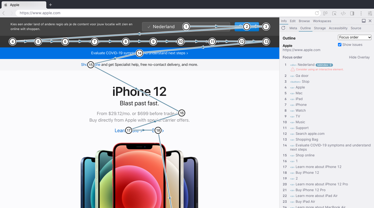
This will draw a line from each focusable element to the next in the order that they get focused. Take a look. Does it flow nicely from left to right (for latin scripts), top to bottom? That's good! If it jumps around a lot, especially up and down, that's potentially confusing. See if there is a way to simplify that by improving your HTML structure.
Of course, these together do not 100% guarantee the accessibility of your web page, but they're a couple of different aspects that give you a good idea of how much work there is to do.
You're done!
With those last checks, you're done! You did a complete page quality check in five minutes! (Maybe a little more? who's counting anyway)
Take a sip of water and look at the issues you found. Do you need to look more closely at any of them? If not, scroll back up and start over with the next page. ;)