Documentation
Learn how Polypane improves your workflow
Outline Panel
The "Outline" tab in the panel shows you the page structure in various ways: by headings, landmarks, links, images, forms, focus order or accessibility tree. These outlines are used by assistive technologies to allow users to go through your page quickly. For automated WCAG issue detection, see the Accessibility panel.
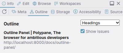
You can switch between different outlines using the dropdown in the top right, and check or uncheck "show issues" to show just the list or suggest improvements as well. The outlines are updated live on changes to the page, though you can forcibly refetch data with the reload icon in the top left.
Hover over any of the elements to scroll them into view on all panes and show a tooltip with their element info. Clicking on the element will open it in the Polypane element panel. Read on for more information on each outline.
Polypane is filled with accessibility features. We wrote a full overview on our blog: Find and fix accessibility issues with Polypane.
Tracking and performance
The outline panel is built to be as efficient as possible to allow for live updates, but for certain types of pages this can still cause performance issues:
- Pages with a very large number of elements
- Pages where the DOM/Accessibility tree changes very frequently
Because of this, the Outline panel for new tabs is disabled by default. You can turn on live tracking by clicking the "track" button. This will turn on live tracking for the outline panel for this tab, and it will update automatically on Accessibility or DOM changes. You can turn off tracking again by clicking the "tracking" button that replaces the "track" button.
You can also get the outline data once by clicking the (re)load icon in the top left. This will not live update.
Headings
Shows all the headings and ARIA headings currently on the page. The overview will warn you when it finds the following issues:
- The page has more than one H1.
- The page has no H1.
- Heading levels are skipped.
- Headings with duplicate content, missing content or hidden content.
- Headings with overly long content.
- Using aria heading levels beyond 6 (which is not recommended) and 9 (which is not supported).
- When the accessible name and visual name are too different (WCAG SC 2.5.3).
- When the accessible name has repeating substrings.
None of these are strict WCAG failures or spec violations but they are considered best practices. It will also highlight headings that are presentational, hidden and where the text content is different from the accessible name.
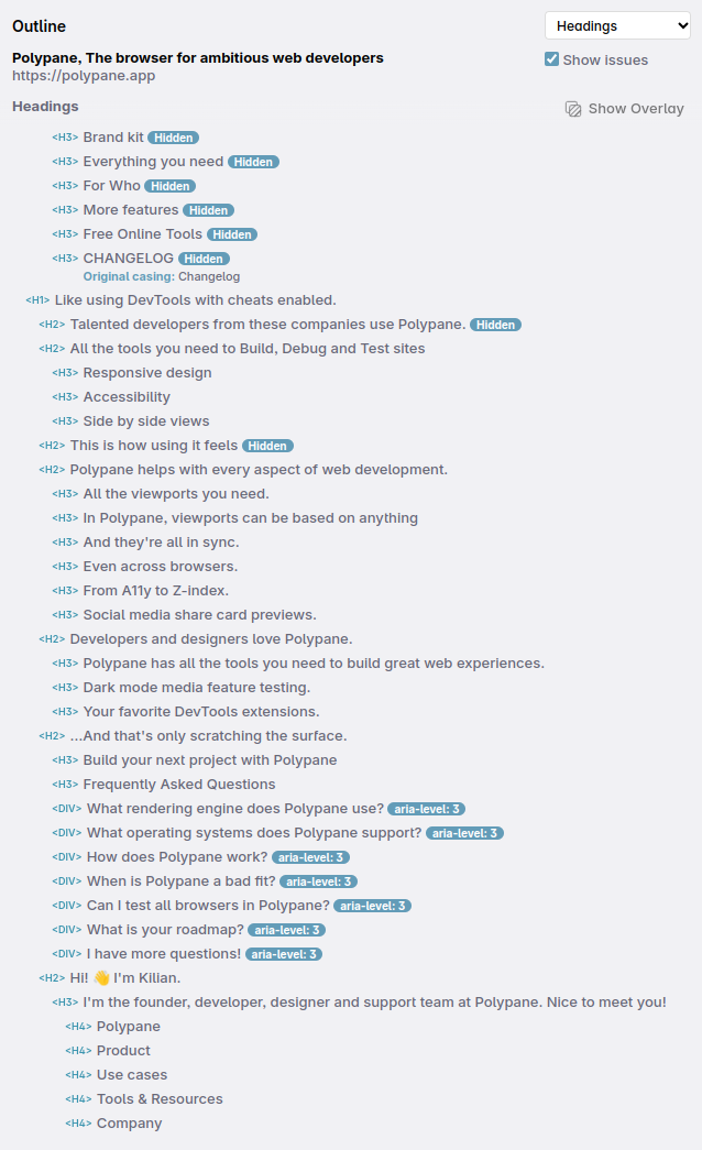
To get a visual overview inside the panes, click "Show overlay". This will draw boxes around all headers and display any issues, which will also be visible in the screenshots you make.
Polypane ignores headings inside known devtoolbars like the ones from Astro and Nuxt. If you have a custom devtoolbar you want to ignore, let us know.
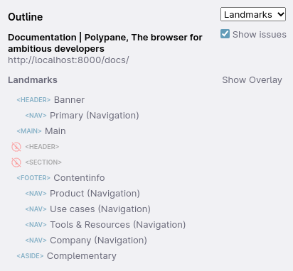
Landmarks
This will show all HTML 5 and ARIA landmark elements on the page and display them with the appropriate role. Polypane will warn you if there are issues with your landmarks, such as:
- Duplicate landmarks,
- Missing landmarks,
- Unnecessary labels
- Incorrect nesting
When you check the 'show potentials' option in the top right, Polypane will also show landmark-like elements in the overview and the overlay and explain why they aren't added to the list of landmarks properly.
If you want to learn more about how these landmark rules work exactly, check out landmarks and where to put them, which Kilian wrote for the HTMHell advent calendar.
To get a visual overview inside the panes, click "Show overlay". This will draw boxes around all landmarks and display any issues, which will also be visible in the screenshots you make.
Polypane ignores landmark elements inside known devtoolbars like the ones from Astro and Nuxt. If you have a custom devtoolbar you want to ignore, let us know.
Links
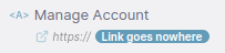
Shows a list of links (both a elements and elements with role=link set). If an element has a target, hreflang or title that will be displayed, and the overview will warn you if there is no text, duplicate content in the title or a missing aria-current attribute.
Additionally, a badge will be shown for any non-https links, for empty href attributes and for links that have a placeholder value like mailto:. When a link has non-descriptive text, like "click here", "contiune" or "more", we show a warning. External links are given an icon indicating they leave the website.
To get a visual overview inside the panes, click "Show overlay". This will draw boxes around all links and display any issues, which will also be visible in the screenshots you make.
Broken link checking
If the links panel is opened or switched to, Polypane will automatically test all the URLS in the page and highlight broken urls or urls with redirects unless you have more than 100 links. In that case, you need to click "Check status" button to test them, so you don't unintentionally overload your server.
Document fragment links (starting with #) will be checked by testing if the referenced element ID exists on the page. Alternate protocols like mailto: and tel: are skipped.
Not all sites support testing URLs and some will send error codes back indicating this. The appropriate error code for this is 405 Method Not Allowed, or 429 Too Many Requests if you have a lot of URLs going to one origin. When that happens Polypane will show a question mark to indicate you need to manually check these.
There are also sites that send back alternative error codes like 400, 999 and 503. This isn't a clear indication so we show the error code as-is.
Learn more: How to find broken links with Polypane
Showing only broken links
Check the "Show only broken links" checkbox to only show links that did not retun a 200 status code. This helps you focus on links that have issues and ignore the ones that are fine.
Additional warnings
Polypane also warns you about inaccessible links, incorrect use of anchor (#) links and for missing accessible text.
We also check the accessible name of the link for the following issues:
- When the accessible name and visual name are too different (WCAG SC 2.5.3).
- When the accessible name has repeating substrings.
When Polypane encounters multiple links with the same URL but different text content, or multiple links with the same text content but different URLs, it will show a warning and a list of the mismatched links.
Images
Shows all the images and elements with role="img" that are currently visible on the page, with a preview, their current source, alt attribute, title, dimensions, file size, aspect ratio and actual dimensions when the image isn't displayed at full size.
Image files that can't be found as well as any other issues with the image are highlighted with a warning.
You can right-click a preview to save the image to disk or copy the image location.
To get a visual overview inside the panes, click "Show overlay". This will draw boxes around all images and display any issues, which will also be visible in the screenshots you make.
Polypane makes a difference between content images and presentational images. Presentational images are marked as such either by an explicit role or aria-hidden and as such do not need an alt attribute.
You can toggle 'show presentational' to show or hide the presentational images in the overview.
Alt attributes
If the alt attribute is missing a warning is shown. An alt attribute that is present but empty is seen as intentional so will not show an issue.
For alt attributes that contain redundant or nondescriptive text, like Emoij's, "A photo of", a color like "a green button", the text "alt" or "placeholder" or repeats the file name we show a warning.
alt texts that are too long can be tedious, so Polypane also shows a warning when it detect long descriptions.
Role="img"
Elements with role="img" are listed in the image outline so you can check their accessible name and other properties they might have said. Instead of a preview these elements show a placeholder icon in the same aspect ratio as the element.
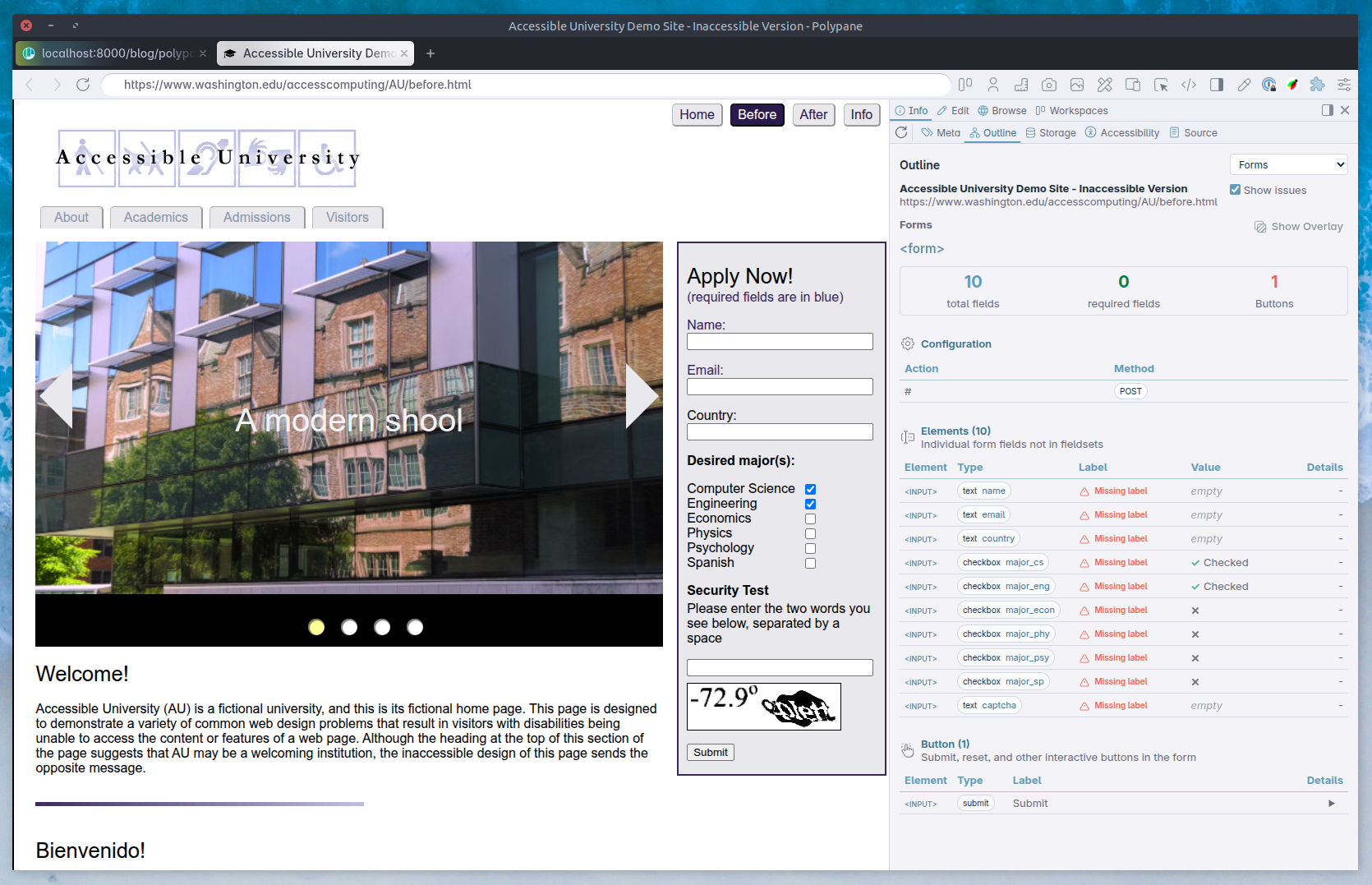
Forms
The form outline will list all forms on the page and their fields split out into the following groups:
- Summary of the form, with the number of fields, required fields, fieldsets and buttons
- The form's configuration with action, method and other form properties
- The form's fields with their type, name, label, value and other properties
- The form's fieldsets with their legend and fields contained in them
- The form's buttons with their type, name, value and other properties
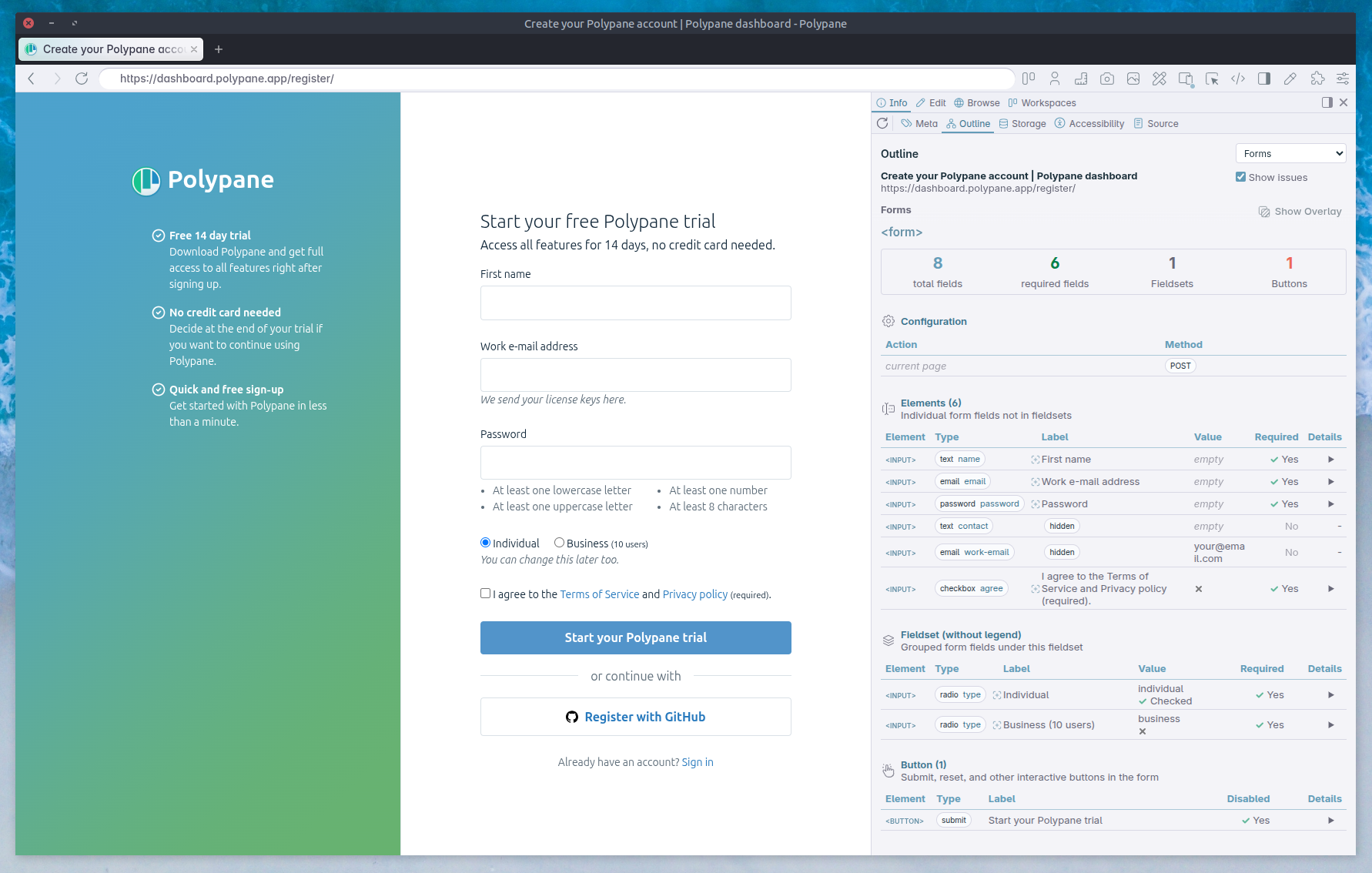
This overview makes it easy to see if all fields have the right settings, if fields marked as required are communicated as such and if you're missing any labels or have duplicate labels. Polypane will warn you about various issues, for example:
- Insecure form submissions
- Duplicate labels
- Missing labels
- Repeated text in labels
- Form fields with multiple labels
- Unknown autocomplete values
- The use of
resetbuttons
Focus order (Tab order)
Will show you all focusable elements in the order that they are focused when pressing the tab button, along with any tabindex and autofocus attributes.
The "show issues" checkbox will show you elements that are focusable but not in the (tabbable) focus order. When it finds elements that are not focusable/interactive by default but have been made focusable, Polypane will suggest changing them to a native interactive element instead. It also gives a warning when you use positive numbers for tabindex, which are best avoided. It highlights focus stops that go against the reading direction.
To get a visual overview, click "Show overlay". This will draw a focus trial along all the focusable elements. Numbers shown in red are elements that go against the reading direction of the page.
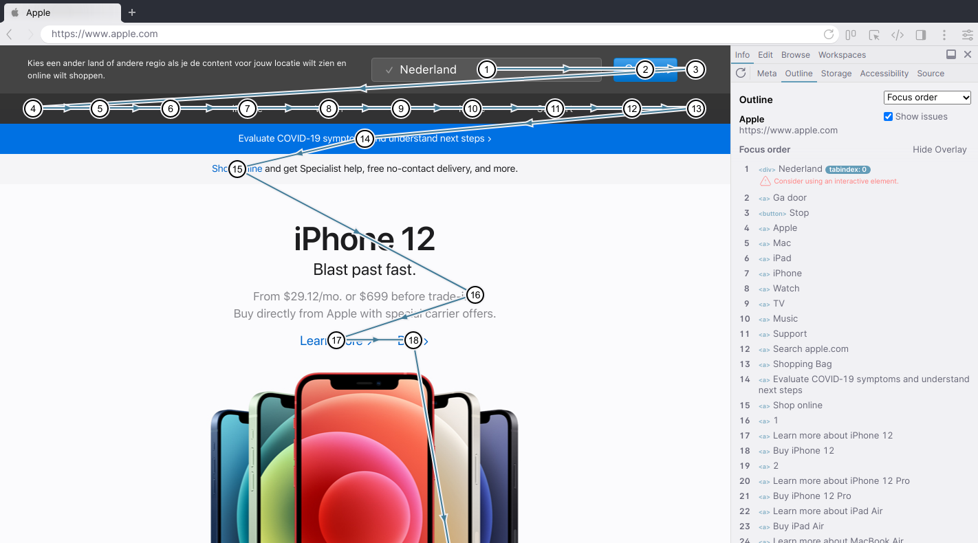
The Focus order overview will show the accessible name for elements but fall back to the visual text content when no accessible name is present to make it easier to identify elements. When there is no accessible name, the focus outline will show a warning even if the element does have text content.
Keeping track of the focused element
When you page has an element with focus, that element is indicated in the Focus order list with an arrow in front of the item, and de the list automatically scrolls to move the focused element into view.
When the overlay is active, it also shows the currently focused element by filling the dot in blue.
Accessibility tree
The accessibility tree is similar to the DOM (it's also called the AOM, Accessibility Object Model), but the rendering engine builds it up for assistive technology like screen readers who take the accessibility tree and use that to present the page to the user.
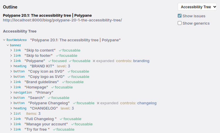
In the accessibility tree you will find all the relevant elements and their information: role, name, description, state, properties, and children. Polypane will warn you when there are issues with the accessibility tree, like missing roles, missing names, or elements with names that shouldn't have them.
For elements linked by aria-controls, Polypane will check that the linked IDs are in the DOM and give a warning if they're missing.
The accessibility tree will show a warning when multiple elements have the same accessible name. This can be confusing for screen reader users, so it's best to make sure all elements have unique names.
Generic roles
By default, Polypane hides all elements with generic roles. This makes the accessibility tree easier to navigate (since you don't have to click through any nested div elements). You can show the generic roles by checking the "Show generic roles" option.
Showing generic roles is useful to verify that all the elements you expect to be in the accessibility tree are. If an element doesn't show up but you expect it to be, showing generics will let you inspect why.
Custom Selectors
The "Custom selectors" option in the outline panel allows you to define your own custom outlines based on CSS selectors. This is useful for quickly checking specific elements on the page that don't fall into the other categories, for example you can find all live regions by adding a custom selector for [aria-live], or find elements where the class starts with your design system prefix: [class^="ds-"].
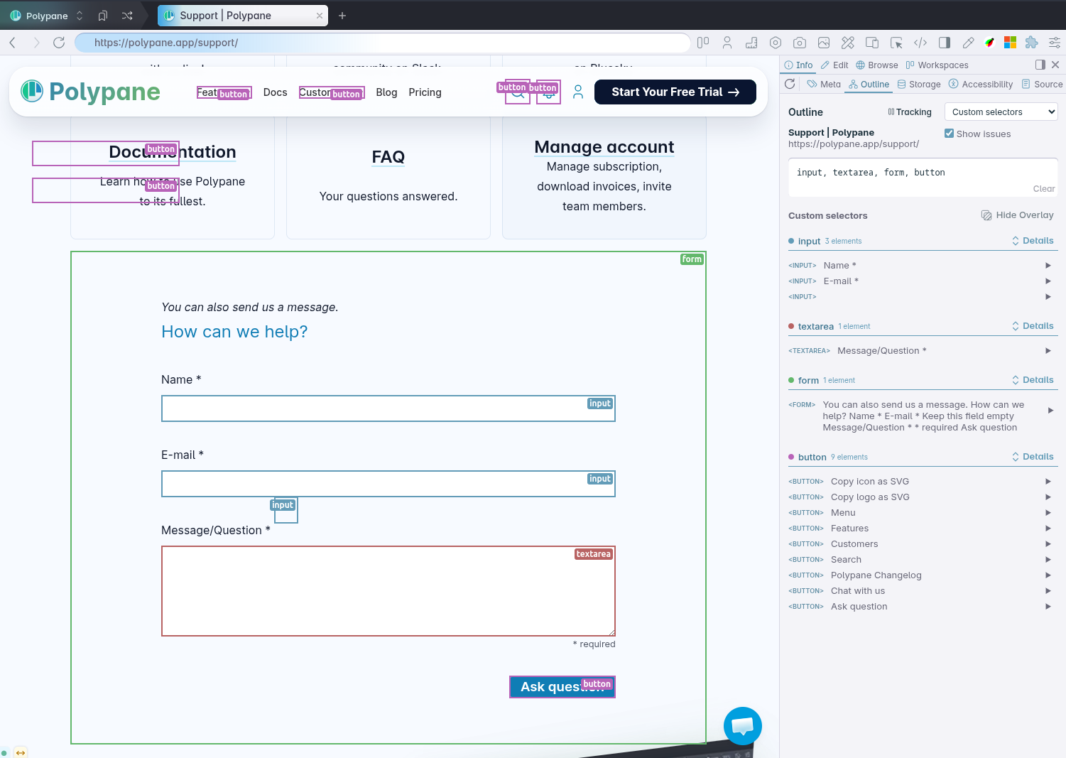
Add your selectors in the textarea just like you would write a normal CSS selector. If you want to check for multiple selectors separate them with a comma and they will be split into separate items in the outline.
The list of matched elements will show element and accessibility information, and each selector is given a unique color that is also used in the overlay to make it easy to identify the elements on the page.
Have a question about Polypane?
Reach out via (real human) chat, Slack or our contact form:
Contact SupportBuild your next project with Polypane
- Use all features on all plans
- On Mac, Windows and Linux
- 14-day free trial – no credit card needed

