If you want to be kept up to date with new articles, CSS resources and tools, join our newsletter.
We get it, there's infinite breakpoints you need to test on and only so much hours in a day, so some breakpoints just get a little more attention than others. You focus most of your time on the devices you have.
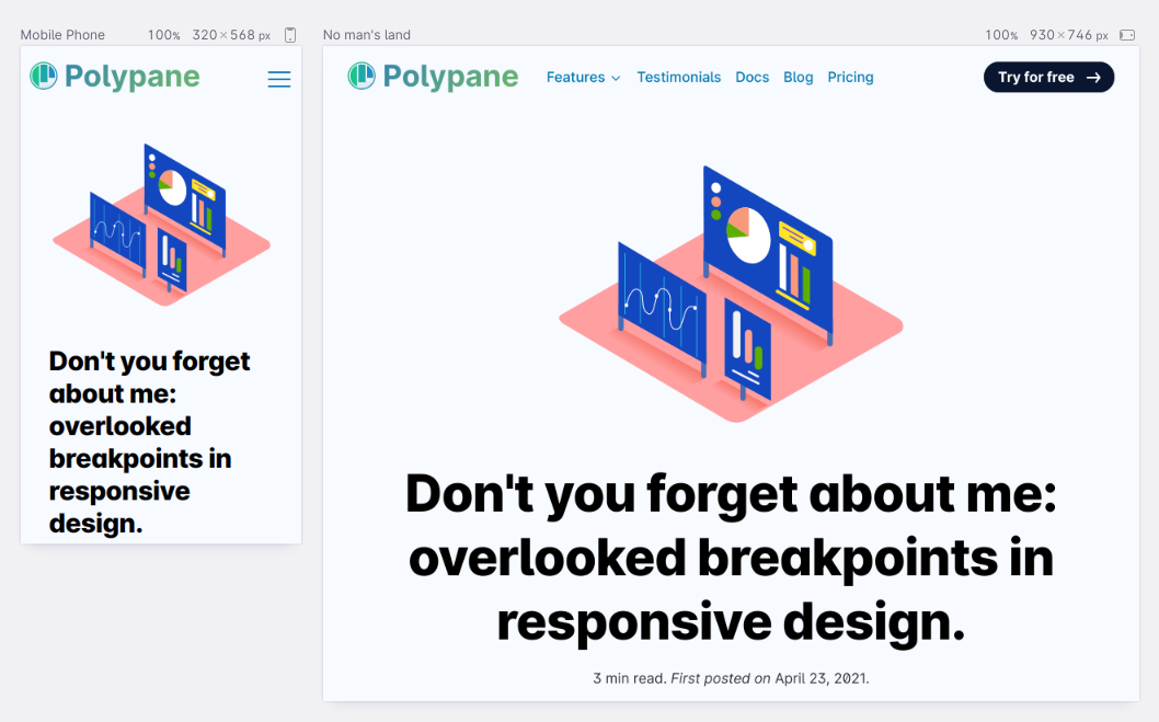
At Polypane we see and test a lot of websites and we've noticed two size ranges that don't seem to get as much attention:
- Between 320px and 375px wide.
- Between 930px and 990px wide.
Read on to learn why they're overlooked, and why they're still important.
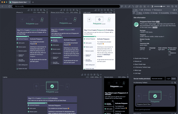
Testing breakpoints in Polypane is really easy: we automatically detect the breakpoints of your page and create viewports for them, so you get the perfect overview of what you optimize for.
Between 320px and 375px
For the longest time, mobile phones were 320px wide. But that changed a couple of years ago when first Android and then Apple phones became larger and larger, and slowly 375px became the minimum size people use to test with.
But 320px wide is still important! There's still plenty of people around using an older Android or iPhone SE (the model based on an iPhone 5), iPads and other devices can show sites at 320px in split mode, and people can still resize their browser on desktop as well.
More importantly though, 320px is an accessibility requirement. The WCAG success criterion 1.4.10, "Reflow", indicates that at 320 CSS pixels wide you should not have a horizontal scroll bar.
That's not because WCAG is concerned about small phones particularly, but because it's a "reasonable minimum size that authors can achieve" (The "author" in this situation is you, the developer). Specifically, 320px wide is what you get when you zoom in by 400% on a desktop browser that's 1280px wide. That zooming in helps people with low vision.
So next time you check on one of the mobile viewports in Polypane, check the "small android" viewport as well to make sure there's no scroll bars and no breaking
If you do end up with a scrollbar at 320px wide, the quickest way to find the element is to turn on layout debugging in Polypane. That highlights in red all the elements causing the scrollbar.
Between 930px and 990px
Between 930px and 990px is a sort of no man's land. Too wide for mobile phones and tablets in portrait mode, but too narrow for tablets in landscape mode and desktops, it sits right in the middle.
And so often this is the most awkward size, where sites haven't gone from a one or two column layout to a wider layout yet and you end up with elements that seem too large or too wide.
But its also the size where we most often see layout bugs appear, where not-quite mobile/tablet and desktop breakpoints don't quite line up and the layout is broken right in the middle of them.
It's also a very common width for an unmaximized browser on a regular desktop, and if you have for example a Galaxy tab in split mode with a 320px sidebar what's left is ...960px!
So it's worth the effort switching to Polypane's focus mode and quickly scale between 930px and 990px to see if there's some weird jumping around happening.

Polypane workspace
A cool thing in Polypane is that you can import (and export) workspaces with predefined pane sizes. So we made a workspace with these two sizes for you:
Overlooked breakpoint sizes workspace
Download it, import it into Polypane and check your site!
Checking all sizes, impossible?
There's no denying that the amount of screen sizes we need to adapt sites for is always growing. So much so that it feels like you might not be able to check every size. Especially if you need to go through it one by one.
Luckily there's strategies you can use to keep your site more flexible. For one, sticking to some ground rules like only using media queries using min-width makes it much easier to reason about your styling, but you can also use modern CSS like calc() and clamp() to give elements a minimum, ideal and maximum size and then hand it off to the browser to sort it out.
Still, you're gonna have to validate your site at a bunch of different screen sizes.
For that, Polypane is by far the easiest.
It syncs everything you do across viewports so you only have to do it once (scrolling, clicking, typing and even hovering!) while testing all screen sizes at once.
Start a free trial with the link below!
