Back when the mobile web just got started, mobile design was simple (...it wasn't, but bear with me). Your site had to fit 320px wide and it would work for "Mobile". 320px is the width of the original iPhone and Android phones dutifully followed. Unfortunately that didn't take long, and mobile phones have been growing larger and larger ever since.
Especially in the Android ecosystem the variety of screen sizes exploded, rapidly growing to 360, 393 and 412px wide. On the iOS size the expansion was much more gradual. First to 375px, then 390px and 414px for the "large" phones. Apple kept this for a while: small phones were 375px (pre-notch) or 390px wide (Pro or otherwise), and the large phones were 414px (pre-notch) or 428px wide.
With Apple's dominance, especially with people designing and building websites, it meant we could hold the fiction that there were two widths for designing for devices, and that was manageable. It doesn't matter that this wasn't true (hello, Android), but it's true enough that people could get away with believing it.
But the iPhone 14 changed that.
iPhone 14 comes in two flavors: Normal and "Pro". The Pro changed the device from using a notch to something Apple calls the "dynamic island". It looks really cool, but that's not what this article is about.
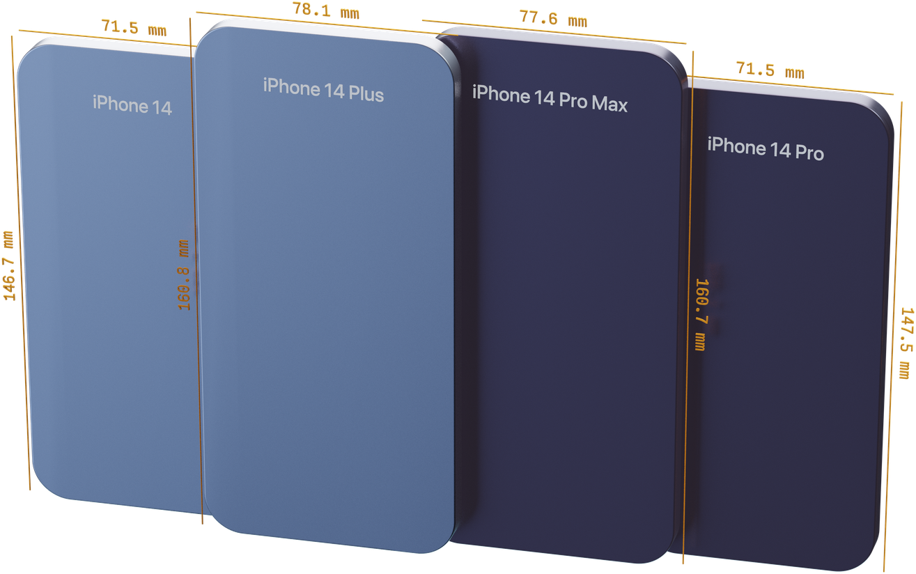
Rendering courtesy of Davo Galavotti
While the normal iPhone 14s have the same dimensions as the 12 and 13 (390px wide for normal size, 428px for Plus) it's the Pro's that throw a wrench in our fiction of clearly different widths.
| iPhone 12/13 | …Pro | iPhone 14 | …Pro | |
|---|---|---|---|---|
| 'Normal' | 390px | 390px | 390px | 393px |
| Plus/Max | n/a | 428px | 428px | 430px |
There's a 3px width difference for the iPhone 14 and Pro, and a 2px width difference for the iPhone 14 Plus and Pro Max. That's a tiny difference, but it breaks the nice fiction that developers have been telling themselves regarding mobile devices:
If the site fits on 390px and 428px, you'll be fine. In fact, you can optimize precisely for these widths.
If it fits precisely on your iPhone Pro Max, it can now easily no longer fit on someone's iPhone Plus. You have to test both. And when a new device has another tiny change, you can add that one yet again.
Testing on specific device widths is an evolutionary dead end
If you optimize for a device today, it's going to break in a year. Your design has to be fluid and flexible to make it look good regardless of a device's width. Today, in a year, in a decade.
Of course I'm not the first to argue against optimizing for devices (this isn't even the first time I'm doing so) and recently Andy Bell has done so far more eloquently over at buildexcellentwebsit.es and in his talk Be the browser’s mentor, not its micromanager.
But it's hard to change. Designers design at 390px wide, device emulators have fixed widths and at the end of the day, time pressure maybe means that's all we use. And the site ends up being broken at random sizes, extra work needs to be done after a project is delivered and no one has a good time.
So what now?
Let go of the idea that you're designing a site to fit devices. You're designing a site to fit its content.
When you design for the content, it's always going to fill the dimensions. This means you have to let go of fixed sizes and allow more flexibility in your design, but it will be more resilient and serve you for longer. None of this is new information, but it bears repeating.
Some general tips:
- Don't use fixed widths.
- Design with real content.
- Leave some space around elements.
- Switch to different layouts not as soon as possible but keep things flexible: keep a simpler layout for slightly longer.
- Let the content dictate where to add spacing.
- Base your layouts on flex and grid to make them less brittle.
- Decide in the browser: design the last 10% in code, not in a design tool.
In short: stick to the responsive design ground rules.
It also means you shouldn't test just on whatever the current device sizes are in your responsive design mode, device emulators or browser. Whatever tool you use, make sure you can resize your emulated device easily to test what happens to slightly larger, or smaller, screen sizes. If the tool can't do that, maybe pick another one.
How we approach it
While Polypane has plenty of device presets, they're just a small part of how we show your site. We can also show sizes based on your breakpoints, the css framework you use or the most used viewports worldwide.
Each pane that shows your site is completely freeform. Really: quickly checking a slightly smaller or larger pane is as easy as grabbing an edge and resizing.
That flexibility is much more powerful thank you might think. It makes testing a wider range of sizes essentially free. Removing that barrier makes finding out if your site has issues happen much faster. You have to experience it for yourself though.
Next time you work on a site…
Rather than picking your favorite bunch of devices, add a couple of new panes in Polypane, resize them to roughly "Mobile", roughly "Tablet" and roughly "Desktop" and we promise what comes out will be more resilient for much longer.
Designing to device widths is dead, thanks iPhone 14!
Thanks again to Davo Galavotti for rendering the iPhones image.

