Table of contents
Skip table of contentsIf you want to be kept up to date with new articles, CSS resources and tools, join our newsletter.
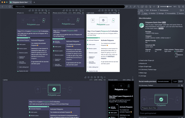
Polypane 11 now renders JSON files in a completely new viewer, adds a ton of new accessibility testing features and improves upon existing ones, updates the rendering engine to Chromium 106, includes new iPhone 14 devices and has new screenshotting features.
We've also made improvements to the Element, Live CSS and Meta panels as well as added more into to the node tooltips.
JSON Viewer
Polypane now included a JSON viewer that lets you visualize your JSON, inspect and filter it. There are two modes: you can show the JSON as it's sent from the server (optionally pretty-printing it), or show it in an interactive tree view.
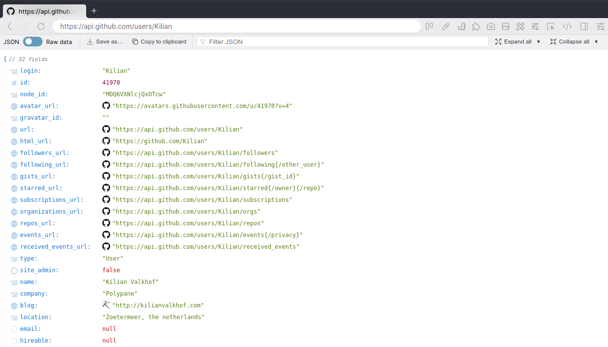
In the tree view you can quickly collapse, expand and filter your JSON object. Each property has an icon matching the type of the value, like text, number or URL. Where possible, values are richly displayed: URLs get a favicon and are clickable, datetimes get a pretty printed preview etc.
In the treeview you can expand and collapse individual objects and arrays, but you can also expand and collapse all properties or pick which properties you want to expand in one go. This really helps when you're dealing with large JSON files and want to hide a lot of info you don't currently need.
The JSON viewer is automatically launched whenever you open a JSON file, locally or from a server, in both the panes and in the Browse panel. We have a lot of plans on where to take the JSON viewer next and look forward to your feedback.
Accessibility features
This release we've been working with a lot of you (❤️ thank you!) to figure out where the gaps in Polypane's tooling are when it comes to assessing accessibility issues effectively.
With the new and improved tooling, we hope we closed the gap letting you use Polypane end-to-end when auditing websites for accessibility issues. If you're missing functionality, let us know!
New visualization debug tools
One of the first things that came up discussing with the team at ElevenWays was tooling to quickly show all the roles and ARIA attributes on a page. With the new 'Show Roles' and 'Show ARIA attribute' debug tools you can now not only get an overview with a single click, you can also easily export screenshots to use in auditing reports or issue tickets.
Show Roles debug tool
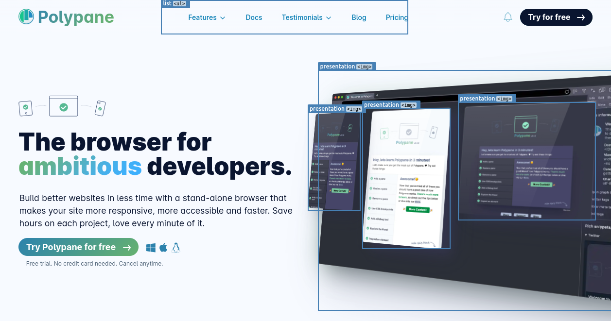
The Show Roles debug tool highlights all elements that have a role attribute and lists both the role and the element name. This helps you verify that the role is applicable and valid for a given element.
Show ARIA attributes debug tool
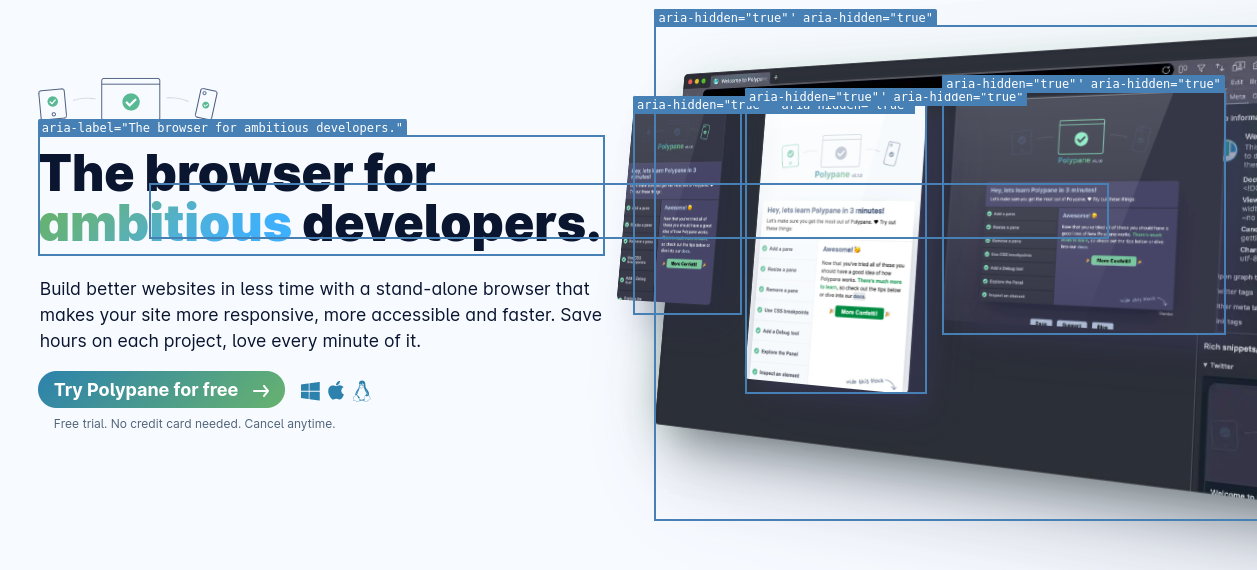
The show ARIA attributes debug tool on the other hand lists all ARIA attributes and values that are applied to a given element. Test if ARIA attribute usage makes sense and if the right combinations are used.
Updated achromatopsia simulator and new Photophobia simulator
Recently, Nate Baldwin release the amazing Color & Contrast. It's an amazing online resource with everything there is to know about, well, color and contrast. Included are lots of visualizations and examples, including for achromatopsia (full color blindness). We highly recommend you check it out.
Comparing Nate's visualization to the one available in Polypane, we realized that ours was simulating cerebral achromatopsia. So we set out to create a more true-to-experience visualization for achromatopsia itself:
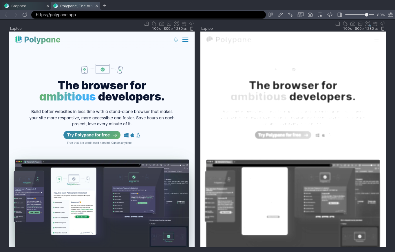
In the process, we renamed our existing visualization to indicate it's simulating cerebral achromatopsia. We also added a new Photophobia simulation:
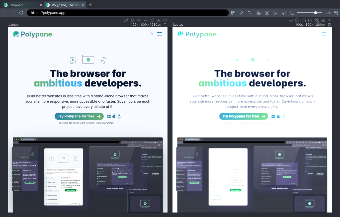
With these updates, we hope to create a more true-to-life experience, though it's worth noting that no two people experience anything we simulate the same way. The simulators are indicative and you should use them for broad-strokes analysis, not for specific styling tweaks.
Focused element in focus order outline
The Track Focus debug tool can be used to highlight the element that is currently focused in a pane, but if you don't want to turn that debug tool on, we now also highlight the focused elements in the focus order outline panel and in the focus order overlay provided by it. Thanks Eric for requesting this feature!
Target size debug tool WCAG 2.2 support
This request by Ronny was made all the way back in June but it took me a while to get around to it. One of the new success criteria in WCAG 2.2 is a specification for minimum sizing for clickable elements ("targets").
Polypane already included a "Target size" debug tool that tested using 48 by 48 pixels, following Google's 'mobile friendly' algorithm. Now you can choose whether to use the WCAG 2.2 version (24px), Apple HIG (44px) or Google's Mobile Friendly heuristic (48px with some allowed overlap). Thanks Ronny!
Contrast Checker debug tool
We improved a bunch of stuff to the Contrast Checker debug tool. This started after we noticed there sometimes was a 0.01 difference in the calculated contrast ratio that our debug tool and our new color picker gave us.
Getting it 0.01 more correct
After investigation, it turned out that in some situations we were incorrectly handling opacity on elements. We updated the algorithm we used to calculate accurate color contrast, and now there is no longer a difference between picking colors on screen and having Polypane generate them from your CSS, even in complex situations with many layers of transparency.
Choosing between AA and AAA
You can now choose if you want to test against AA or AAA color contrast, bringing it in line with our online color contrast tester.
Click to apply
When Polypane finds contrast issues, we automatically calculate the closest color that does have enough contrast with the background. In previous releases, you could hover the suggestion to preview it and click the color to copy it to your clipboard.
In Polypane 11, clicking now copies and applies the suggestion, making it easy for you to head over to the elements inspector and tweaking the color to your liking.
Detect small text debug tool
Like the Contrast Checker tool, the Detect small text debug tool now applies the suggested font size with the click of a button, letting you see the effect of a font change instantly.
Color picker updates
We added three new features to our color picker:
Test non-text contrast
Alongside Small text and Large text, you can now also check against the WCAG guideline for non-text contrast (3:1). Thanks Eric for requesting it!
Visible suggested color
Instead of only showing the overlaid square, the color suggestion is now also shown as text below the contrast ratio. Click it to quickly copy the suggestion to your clipboard.
Export swatches
Click the new screenshot button in the color picker to export a swatch image:
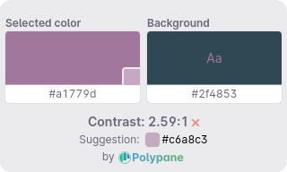
We hope this will make it easier to communicate color changes across your team or in your audits. Additionally, the file name contains a textual description of the image that you can use as alt text when distributing the image. This was another great request by Eric.
Screenshot updates
The screenshotting functionality has received a number of quality-of-life improvements.
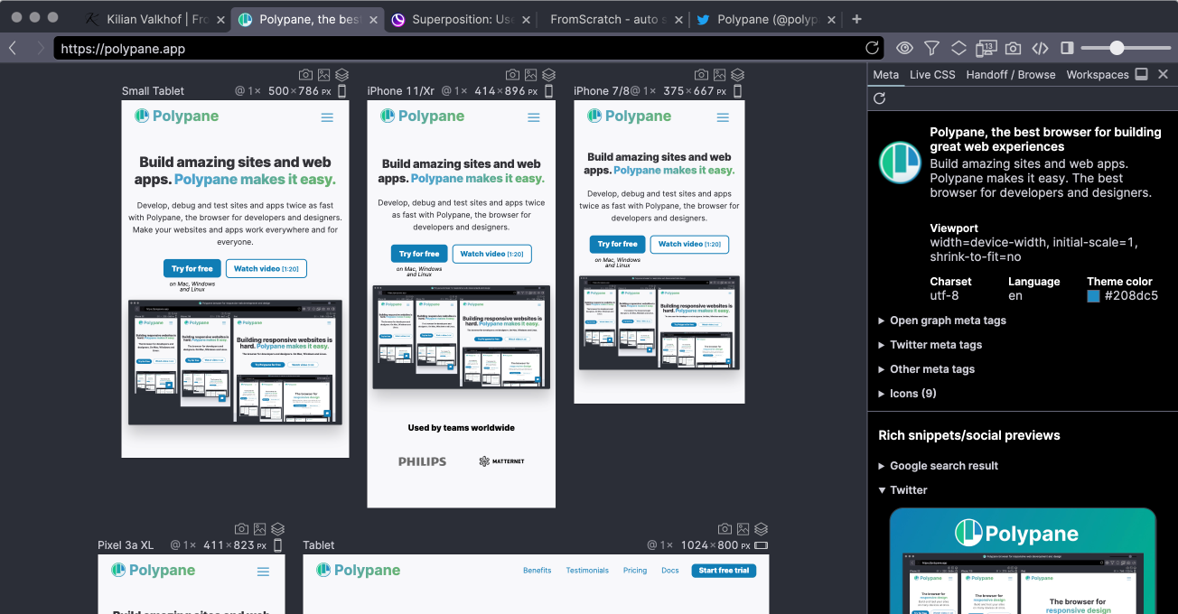
Dimensions are back in the overview screenshot
When creating the new fast overview screenshot we left out the pane dimensions, showing just the title for each pane. We've re-activated them:
Path tool
The screenshot editor (powered by Pintura) has been updated to the latest version and now includes a new "path" tool that you can use to draw polygons on top of your image.
Set preferred action for screenshots
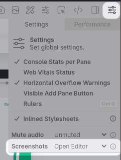
Instead of always opening the screenshot editor, you can now select what you want to do when creating a screenshot: open the editor, save it directly to disk, or copy it to clipboard.
Depending on what you make screenshots for this really speeds up your workflow. Find the option in the settings menu.
New UI for selecting Element screenshots.
When selecting elements on a page for the Element Screenshot (or Live CSS panel) we now dim the rest of the page, rather than draw a blue line around an element. This makes it easier to see which element you're selecting.
Elements inspector
We're continuing to refine the Elements inspector, which lets you inspect and edit elements in all panes at the same time. This time, we've updated the box model visuals, made it easier to get element information and fixed some annoying bugs.
Updated box model
This came about when Stephan asked if the box model visualization in browsers could be more useful and show more information about the display of the element. That's exactly the type of stuff we want to do with Polypane, so we quickly came up with a way to show the border-radius and if an element had a box shadow inside the box model:
Each border with a radius has a thickened line, and if all border radii are the same their value is shown in the top right, otherwise each border radius is shown in the corner. Lastly, if an element has an explicit overflow, like auto or scroll, that's shown in the bottom right:
All three of these additions help you get a better idea of what the element looks like. Thanks Stephan! And if you have ideas on how to make the box model visualization more useful, let us now!
Click to copy font info and dimensions
To quickly copy the font declaration and the dimensions of an element you can now click their display in the element panel:
New color contrast indicator
The color contrast indicator in the elements panel now matches the one used elsewhere, using the "AA" and "AAA" markers instead of checkmarks. You can hover the marker to get the specific ratio and a preview of the colors:
Noteworthy bugfixes
Polypane 11 also includes some noteworthy fixes to the way style editing works. We no longer show suggestions as soon as you focus an element, but only after you begin typing or press the arrow keys. This also fixed another issue, which is that sometimes you had to tab twice to go to the next item when adding a style rule. You could also get into a situation where a disabled and subsequently deleted style would still be listed. Those are now correctly removed.
We've also fixed a bug related to how we parse CSS selectors that use :is() and friends containing other pseudo-classes like :hover.
Though the elements panel and Polypane worked without a problem, it did cause a console message. If you used something like Redbox or Next.js, they throw a big red error box on top of your site for any console error (even those that don't come from your app). That will no longer happen!
Meta panel
As always, there are subtle (and less subtle) new changes to the way various social media render their social media previews that we've updated, and we added proper GIF handling.
Support for GIFs
When implementing "sniper links", the reference article we consulted had a GIF as OG image. After testing we noticed that some social media allowed the animated GIF while others used the first frame of the GIF and disabled the animation. Polypane now accurately shows the way social media previews deal with GIFs.
Updated Slack, Twitter and Telegram previews
The Slack preview has updated designs for the large and small image variants, Telegram has a new maximum width, and Twitter changed how they deal with information-poor pages that we now follow.
For Slack Polypane now automatically hides the image when it's larger than 2 megabytes, the default value in Slack:

UI Updates
We've made improvements to the UI in various places across the application:
New iPhone 14 devices
Polypane 11 includes the new iPhone 14 device sizes in our devices list. The difference between the regular and pro versions are a little weird this time around, which we've written about here: Thanks iPhone 14, designing for device sizes is dead.
More info in the element tooltip
If an element uses a flex or grid layout that's now shown with a small icon in the element tooltip. Additionally, the contrast indicator has a preview just like the Elements panel.
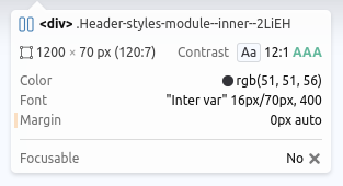
For images, the element tooltip now also shows the current src so you can quickly see which of your responsive variants is loaded.
Sniper links
When you request a new licence key from inside the app we now detect if you use one of the popular email providers (like Gmail, Outlook etc) and provide direct links to your inbox, sometimes even filtering your inbox to emails coming from just us (using query parameters). This means you no longer have to manually go to your inbox and search it for emails coming from Polypane.
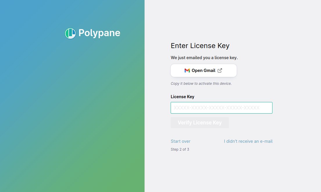
This technique is called "Sniper links" and it really speeds up both the email verification step when you sign up, and the licence request step during the app activation.
Debug tools split into categories
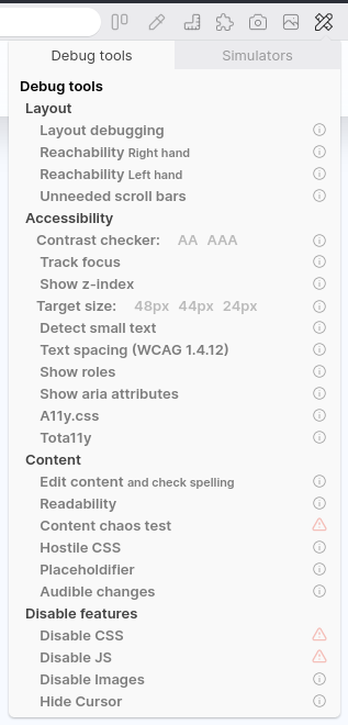
While the list of simulators was already split up into different categories, the list of debug tools was just one long list and as we reached 20+ debug tools it started to become a little hard to find things. So the debug tools are now also split into four categories:
- Layout
- Accessibility
- Content
- Disable features
By splitting it up into categories it should be easier to find a specific debug tool, and hopefully also helps you understand what each one does.
For an overview of what all debug tools do, head over to our docs on debug tools.
Context menu defaults to preferred devtools
Depending on if you have set the Polypane devtools or the Chromium devtools as the default, the first "Inspect element" item in the context menu will now use your preferred devtools.
So whenever you right-click to inspect an element, the first item in the context menu is the one you'll want to use.
Picking a starting layout
When activating a new copy of Polypane, rather than letting you choose between three responsive panes, or five mobile panes, the last step in the activation flow now lets you choose between two starter layouts: the responsive design (horizontal) layout and a more traditional browser layout (with the full layout and sidebar open):
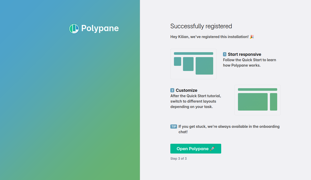
Starting with three panes can be a lot when you just get started with Polypane, so we wanted to make it easy for people to get started with all the tooling that Polypane provides, even if they don't need multiple viewports just yet.
Updated Chromium to 106
Chromium has been updated to 106.0.5249.61, and ships with a number of experimental features turned on by default, like support for the page transition API and jpegXL.
Head over to our docs on Experimental Chromium Features for a full overview of the available APIs. If you'd like to see one activated, Let us know.
Get Polypane 11
Polypane is available for Windows, Mac and Linux (.deb or AppImage) in both 64 bit and ARM versions.
Polypane automatically updates on Mac, Windows and on Linux when using the AppImage. Otherwise, go to the download page to download the latest version!
Don't have Polypane yet? There is a 14 day trial available. Try it for free.
Polypane 11 Changelog
New Features
- New JSON viewer
- New iPhone 14 devices
- New Save color swatch as image (Thanks Eric!)
- New Duplicate tab feature
- New Photophobia simulator
- New Role visualization debug tool
- New Aria visualization debug tool (Thanks ElevenWays!)
- New Copy link, copy link as markdown and open in browse panel support for tabs
- New Copy link as markdown context option for all links
- New Chromium 106.0.5249.61
- New Sniper links and layout picker in app setup
Improvements
- Improved Achromatopsia simulator is now more true to life
- Improved Debug tools are now split into categories
- Improved Target size debug tool now supports wcag2.2, Apple HIG and Android guidelines (Thanks Ronny!)
- Improved Target size debug tool no longer checks inline links per specification
- Improved Text size debug tool: Clicking a suggestion applies it
- Improved Color Contrast debug tool: now supports AAA checking
- Improved Color contrast debug tool: improved logic for solid text in elements with transparency
- Improved Color contrast debug tool: clicking a suggestion applies it
- Improved Outline panel: focus outline highlights the currently focused element
- Improved Outline panel: images now also show input[type=image]
- Improved Outline panel: focus order overlay has updated colors
- Improved Outline panel: image overview warns for alt text of 200+ characters
- Improved Outline panel: image overview warns for alt text containing emojis
- Improved Live CSS and source panels now use platform specific monospace font (Thanks Ivan!)
- Improved Live CSS Panel now has better indenting and formatting support
- Improved Live CSS Panel font size now follows the rest of the UI
- Improved Node tooltips now show icon for flex and grid boxes.
- Improved Node tooltips now show current src
- Improved Elements panel: a11y tab shows auto-suggestions for role attribute
- Improved Elements panel: clicking font or dimensions now copies them to clipboard
- Improved Elements panel: supports nested pseudo-classes like :is(:hover)
- Improved Elements panel: box model now shows border radius, box shadow and overflow indicators (Thanks Stephan!)
- Improved Elements panel: tree-view has a max-width and height to prevent it from pushing away the rest
- Improved Elements panel: color contrast now shows a preview and "AA" or "AAA" instead of check marks
- Improved Meta panel: Proper handling of GIFs for all social media previews
- Improved Meta panel: Slack card now supports unexpanded images, and updated image views
- Improved Meta panel: Telegram card preview
- Improved Meta panel: Twitter card preview
- Improved Enable experimental JPEGXL support
- Improved Updated Google Fonts database
- Improved Trial period now has a visible button in the header to go back to tutorial
- Improved New handling of past due and paused subscriptions
- Improved Add spacing between pane header icons
- Improved Updated screenshot editor
- Improved Option to set default action for screenshots
- Improved Overview screenshot now shows dimensions above each pane again
- Improved New design for element screenshot and live CSS element selection
- Improved Improve logic for disabling cache and cache clearing to be more effective regardless of server settings
- Improved When right-clicking input fields on mac, a context-menu option for the emoji picker is visible
- Improved Context menu "inspect element" defaults to the currently selected one being the first
- Improved Less calls to CrUX data when not available
- Improved Color picker now lets you check against non-text contrast (Thanks Eric!)
- Improved New shortcut to open and focus console:
cmd/ctrl shift j - Improved Shortcut to open settings (Thanks Roel!)
- Improved Emulation: There is a new "auto" option for color scheme emulation that follows the app settings
Fixes
- Fix Random resize all panes functionality works again
- Fix Elements panel: Prevent showing suggestions before typing or using the arrow keys
- Fix Elements panel: sometimes you needed to press tab twice in the style editor
- Fix Elements panel: emptying a text node in the navigator prevented it from being updated again
- Fix Elements panel: Disabled and removed CSS styles were still visible in the elements panel
- Fix Elements panel: commas in pseudo-selectors no longer cause newlines in selector
- Fix Prevent reading out node env on load
- Fix Choice of device or viewport sizing wasn't preserved on device change
- Fix Overview screenshots heights now better fit the visible panes
- Fix Make screenshot button in full mode no longer falls behind devtools
- Fix 0.01 difference between color contrast debug tool and color picker
- Fix Issue where node tooltip rendering wasn't properly applied
- Fix Alignment of add icon in cookie overview
- Fix Outline panel: issue where link list would be empty
- Fix Issue where Polypane's scripts would interfere with core-js on a website (Thanks Oleg!)
- Fix Prevent errors when calculating the specificity for nested compound CSS selectors
- Fix Last open tab should not have a visible close button
- Fix Improve loading of .prettierrc.js variant
- Fix Issue where context menu on tabs on Windows weren't handled correctly (Thanks Reinhard!)
- Fix Panes no longer shrunk to fit (Thanks Andrew!)
- Fix Tooltips in detached panel not rendering correctly
- Fix Meta panel: Incorrect missing favicon message if a site has just a favicon.ico
- Fix Incorrect synced hover states for Tailwind CSS in dark mode (Thanks Austin!)
- Fix Node tooltip not being visible for some sticky elements
