Blog
Tips for responsive design & developer tools
Page 7 of 12
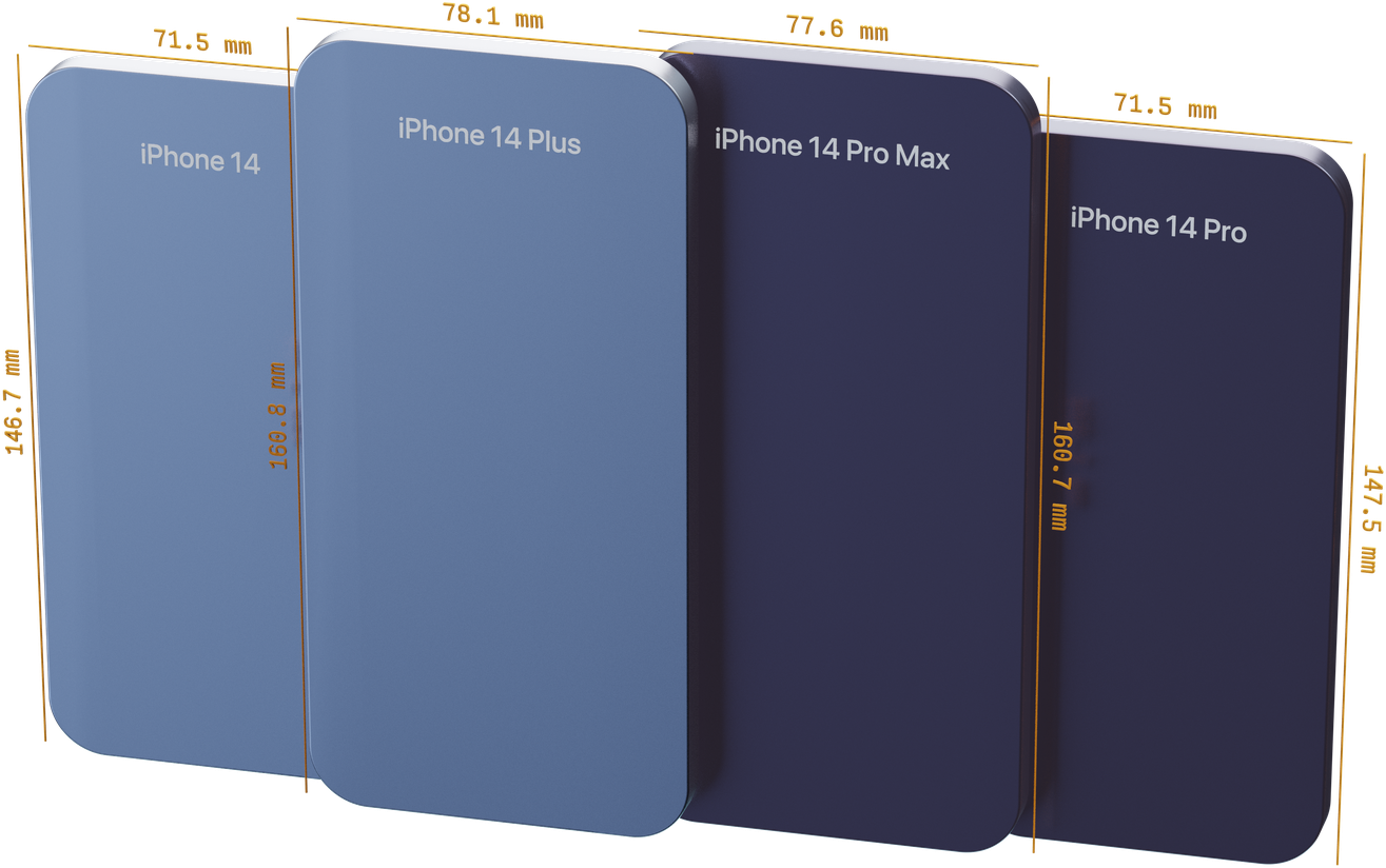
Thanks iPhone 14, designing for device sizes is dead
Back when the mobile web just got started, mobile design was simple (...it wasn't, but bear with me) . Your site had to fit 320px wide and it would work for "Mobile". 320px is the width of the original iPhone and…
How Blhack doubled their development speed with Polypane
We are Blhack , an Italian software house. We develop tailor-made solutions for our customers' needs. Our technology stack is based on Ruby on Rails and React. We are also very active in the e-commerce ecosystem with…
How using Polypane for Nureply helped Onur learn to love the web
Nureply is a cold emailing tool created by Onur Geneş that helps you to write automated emails with personalization and send those emails to the people you want to reach out to. When you add your lead’s website or…
How Matchless Web halved their mobile optimization time
Matchless Web Studio is a one-man web agency based in Clinton, Mississippi USA. The aforementioned one man in charge is me (Jon Phillips), all-time employee of the month for 8 years and counting. My introduction to the…
How Short Hills Design saves over $700 per year thanks to Polypane
Short Hills design is a closely-knit team of six located in the USA, UK, Canada and Finland that helps healthcare and other professional small business service providers get 10-20 new patients/clients per month without…
Polypane 10: detachable panel, navigation sync, element screenshots and more
Polypane 10 brings a number of often requested workflow features to Polypane: a detachable panel, the ability to turn off navigation sync for panes and element screenshots. It also updates Polypane to Chromium 104, adds…
Polypane 9.1: Form autofilling, fast overview screenshot and outline panel overlays
Polypane 9.1 comes with new features to quickly test forms, a much faster and robust overview screenshot feature, support for the INP web vital and a new way to show the heading and landmark structure inside the panes…
Polypane 9: Screenshot editor, structured data support and new debug tools
Polypane 9 ships with a completely new way of making and editing screenshots, support for different types of structured data in the Meta panel, new debug tools and many improvements to the outline and elements panel as…

Create a Polypane account with GitHub
Today we launch the option to start a Polypane trial with GitHub Auth. When you register for a Polypane trial click the "Register with GitHub" button to authenticate with Github instead of creating a username and…
Polypane 8.1: Resizable element tree, disable JS feature, new debug tools and more
Polypane 8.1 comes with two often requested features: The tree view in the elements panel is now resizable so you can adapt it to your preferences, and there is a new Disable JS debug tool that disables JavaScript in a…

How we made the State of CSS more responsive and accessible
Each year, the state of CSS takes a global survey of the CSS landscape. Its results are highly regarded and influence browsers, toolmakers and web developers around the world. So I (Kilian) was super honored when I was…

Polypane is now part of the GitHub Education Intro to Web Dev pack
We are proud to announce that Polypane is now part of GitHub Education Intro to Web Dev . The response to Polypane being part of the Github Student Developer Pack has been phenomenal. Seeing Polypane be used across the…