Table of contents
Skip table of contents- What's Polypane?
- Built-in contrast checker
- HTML validation
- Pixel perfect image overlay
- Quickly checking alignment
- Better insights into fonts
- Remember the inspected element
- Accessibility insights
- Inspecting @starting-style
- Persistent user styles
- Find overflowing elements
- No network
- Atomic CSS Style editing
- Easily toggling dark mode and other preferences
- Debugging offset parents and stacking context
- Quickly disable JS
- Screenshots
- Responsive design mode
- Missing anything else?
If you want to be kept up to date with new articles, CSS resources and tools, join our newsletter.
A while ago Adam Argyle of the Chrome Devtools team asked developers on X/Twitter a question:
what's missing from Chrome DevTools?
— Adam Argyle (@argyleink) September 16, 2024
let's make a tasty list of features and goodies that would make our lives easier, and I'll aggregate it and bring it to the mother ship for 2025 potential work.
Adam got a ton of responses with many good suggestions and ideas. After reading through all of them, I realized many suggested features are already available in Polypane. Here's an overview of those requests and how they're possible in Polypane today.
What's Polypane?
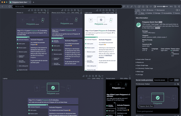
Polypane is the web browser for devs who care. It's a stand-alone browser that shows sites in multiple fully synced panes and helps you make your site more responsive, more accessible and faster.
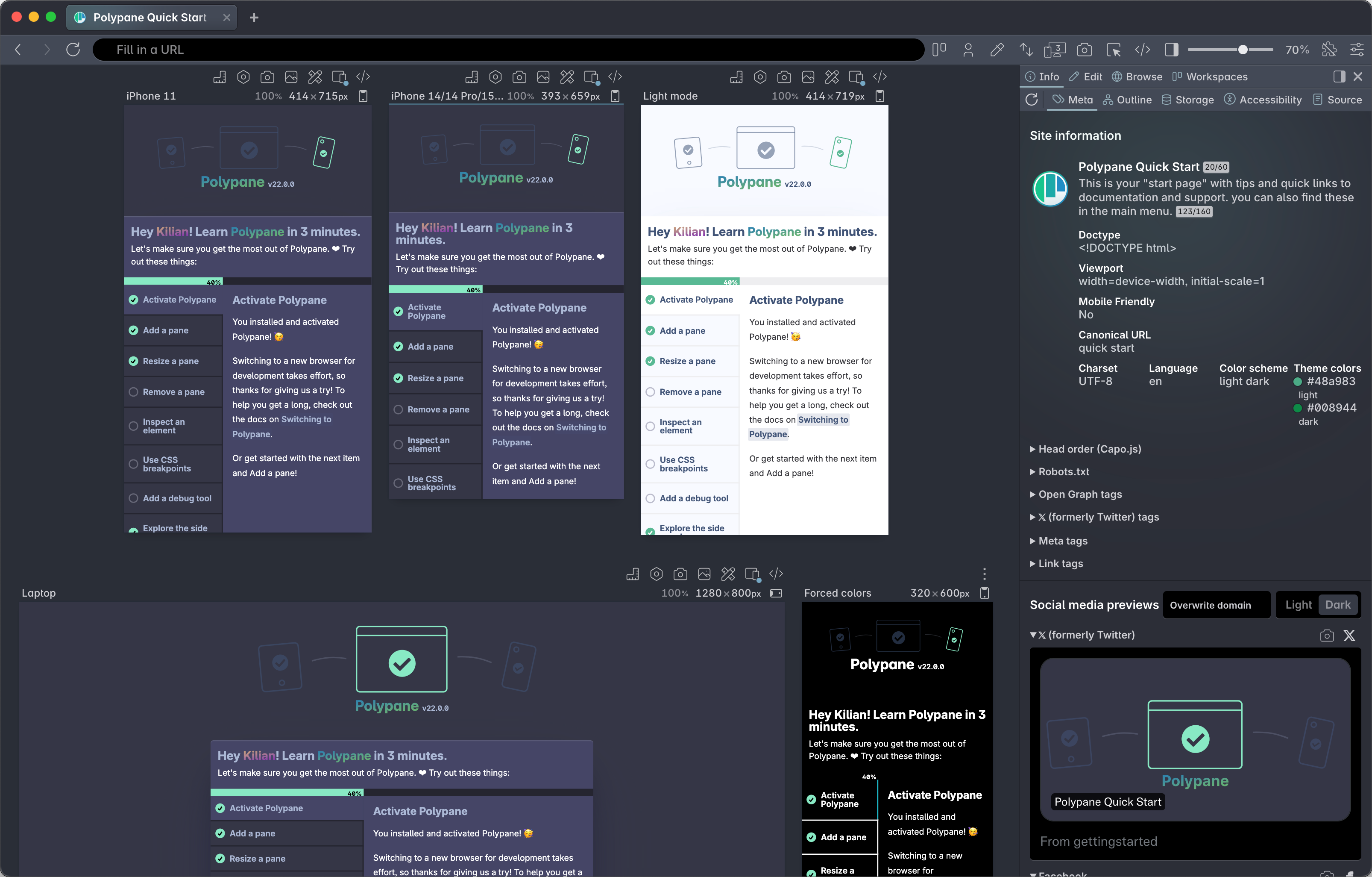
It's chock-full of features that help you build and inspect your sites, whether that's for performance, accessibility or things like using the right meta tags. Be sure to check out the product tour to learn more.
For specific requests from web developers, read on:
Built-in contrast checker
A kingdom for a contrast checker. Bonus points if it includes the newer color spaces.
— Caleb Williams (@calebwilliams12) September 16, 2024
Rulers so we can quickly show alignment of items.
Basically Visbug, but that my work can’t block because it’s an extension.
And I’d prefer to be able to check the flattened contrast in a given spot on a page.
— Caleb Williams (@calebwilliams12) September 16, 2024
Polypane has a number of different built-in contrast checkers that can be used for different scenarios.
Want to check the contrast of a specific element?
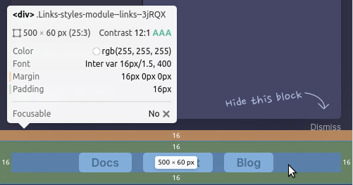
The absolute quickest way to check the contrast of an element is to hover over it and hold down the ⌥ key to trigger Polypane Peek.
Polypane shows you the contrast ratio between the element and its calculated background. That means it will take into account any semi-transparent backgrounds, shadows and more and use those to calculate the actual background. It also takes into account the font size and weight to determine which ratio's to use.
Want to check the contrast between any two items on the page (or actually, anywhere on your screen)?
Use the built-in color picker. Quickly check the contrast between any two colors and compare them to WCAG AA or AAA for large text, small text or non-text elements (like icons). You can also check with the in-development APCA algorithm here.
When there isn't enough contrast, Polypane automatically calculates the closest color to the one you picked that does have enough contrast.
Want to check your entire page in one go?
Use the "Color Contrast" debug tool at AA or AAA level to go through all the elements on your page and highlight the ones that fail contrast. Like checking the contrast of a single element we will automatically calculare the correct text and background colors for you by combining backgrounds, text shadows and other CSS effects.
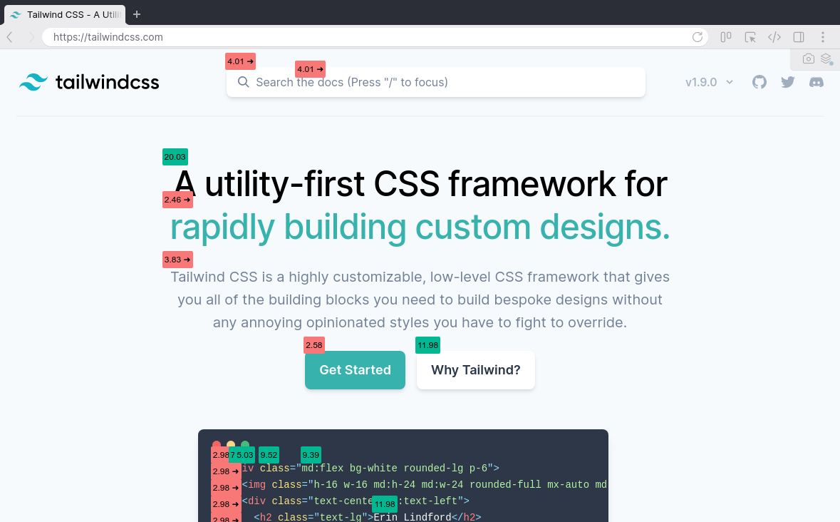
If an element fails contrast, Polypane will automatically suggest a color that does have enough contrast inline, which you can preview by hovering over the suggestion and then click to apply and copy the color to your clipboard.
HTML validation
So basically a https://t.co/0d2Xho7pmM built into DevTools I guess?
— Benjamin Aster (@Benjamin_Aster) September 17, 2024
Polypane's Source panel automatically validates your HTML source and shows you issues inline as well as in a list:
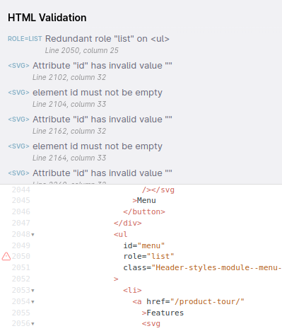
Because so much HTML is minified or unformatted, the Source panel also automatically formats your HTML with Prettier. This makes it easier to read and understand, and also makes it easier to spot issues.
Pixel perfect image overlay
«Pixel perfect» image overlay
— Даниил @grawl@mastodon.social (@GrawlCore) September 17, 2024
The reference image feature in Polypane lets you overlay an image on top of any pane. You can adjust the opacity of the overlay, move it around to align it or highlight just the differences between your page and the image.
Along with that, there's also a split view and a side-by-side view, so however you want to compare your page to an image, you can do it in Polypane.
Quickly checking alignment
A kingdom for a contrast checker. Bonus points if it includes the newer color spaces.
— Caleb Williams (@calebwilliams12) September 16, 2024
Rulers so we can quickly show alignment of items.
Basically Visbug, but that my work can’t block because it’s an extension.
In Polypane, turning on Rulers with ⌘ g will show rulers along your pane. You can click on the rulers to draw guides on top of your page, perfect to check the alignment of elements.
Beyond that you can overlay grids, rows and columns depending on what your design is built with, so you can be sure that the components on your site all align correctly.
Better insights into fonts
There doesn't seem to be a way to identify which font is actually being rendered (i.e. Do I have the style-declared font loaded?). You know, other than just knowing what the font is supposed to look like.
— Kevin Leedrum (@kevinleedrum) September 16, 2024
an easier way to see which font is being shown, maybe it highlights. Sometimes the fallbacks can look similar so it is sometimes not obvious to see quickly if something isn't working as expected.
— Stacy Kvernmo (@stacykvernmo) September 16, 2024
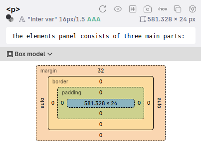
Figuring out if you're using the right font is as easy as holding down ⌥ and reading the font line!

Polypane checks which of the listed fonts in an elements font-family is actually being rendered and then shows it in the Polypane Peek as well as right in the Elements panel:
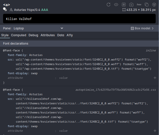
To be able to view @font-face declarations.
— Phloe_ (@phloe_) September 16, 2024
When inspecting an element with a font-family declaration in the Elements panel, you can scroll down to the Font declarations to inspect and edit them:
Remember the inspected element
A way to have dev tools auto-inspect/auto-select an element on page refresh.
— Rik Schennink (@rikschennink) September 17, 2024
Select element (the option to keep it highlighted ) just like in Firefox dev tools
— Jorge Galarza (@jorsisu) September 17, 2024
The Elements panel in Polypane works like this: if you refresh the page and the element you were inspecting is still in the DOM, we automatically re-inspect it so you keep the context of what you're working on even if you needed to refresh the page.
Accessibility insights
A good out-of-the-box beginner experience for accessibility (aXe) checks.
— Josh Goldberg 🦋 (@JoshuaKGoldberg) September 16, 2024
You can go through Lighthouse, but the UI isn't intuitive for simple "scan the page, tell me what's wrong, and let me jump to elements + docs" runs.
I.e. I want the aXe devtools, but not spammed with ads.
A headings visualizer like the one in Web Developer Toolbar that shows h1-h6 headings, surfacing skipped levels and multiple h1s
— Marcy Sutton Todd (@marcysutton) September 16, 2024
Polypane has two panels that give you this experience: the Outline panel and the Accessibility panel. In the Accessibility panel you can quickly run an accessibility check for the current page and find the issues and which elements they appear on. From there it gives you suggestions and you can click to go straight to the Elements panel to remedy your issues.
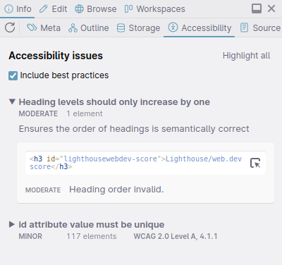
The outline panel shows you various outlines of your site: the Headers, Landmarks, Images, Links, Focus order as well as a full accessibility tree.
All of these show you your structure, and then give feedback on issues it finds: what the issue is and how to fix it.
There are dozens more accessibility features in Polypane. For all of them, check out our accessibility overview.
Inspecting @starting-style
I used starting-style recently and found it unusual to not see it in the style panel in the dev tools
— Adam Collier (@CollierAdam) September 17, 2024
Couldn’t find an easy way to play with starting-styles to tweak transition values. Checked out the animations panel but couldn’t make it work.
— Agustín Díaz (@HiroAgustin) September 16, 2024
Polypane was the first browser to land @starting-style inspection back in June of 2024. Inspect the element, go to the @starting-style declaration and edit like any other CSS:
Persistent user styles
A way to make user styles and user scripts that persist even once devtools is closed.
— Luke 🦋 @lukewarlow.dev (@luke_warlow) September 16, 2024
The Snippets panel lets you add CSS (or JS) to your page either to all open panes, or to specific panes so you can compare your changes to the default page styles.
The CSS stays active until you turn the snuppet off so it's ideal for testing out CSS while working on your page across reloads.
Find overflowing elements
I might be mistaken but there's no "this is the reason because this element is overflowing" right?
— 🧪 Pablopang.sveIte (@PaoloRicciuti) September 16, 2024
With Polypane's layout debugging finding overflowing elements is as easy as pressing ⌘ d to show all boxes on your page and highlight the elements that cause overflows.
Overflowing elements are also logged to the Console so you can quickly inspect and edit them.
No network
More prominently displaying that the network is turned off!!! Keyboard shortcuts for changing the network throttling settings.
— Robert Balicki (👀 @IsographLabs) (@StatisticsFTW) September 17, 2024
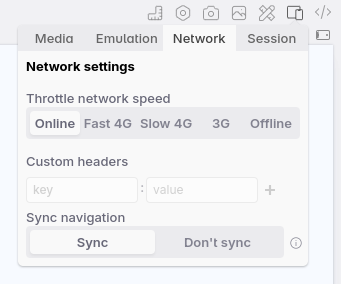
Managing the network per tab is easy in Polypane:
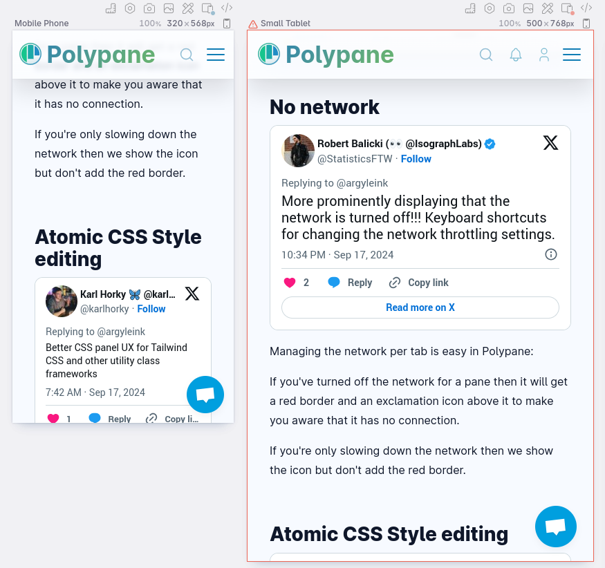
If you've turned off the network for a pane then it will get a red border and an exclamation icon above it to make you aware that it has no connection.
Atomic CSS Style editing
Better CSS panel UX for Tailwind CSS and other utility class frameworks
— Karl Horky 🦋 @karlhorky.com (@karlhorky) September 17, 2024
The Class editor in the Elements panel Polypane works really well with atomic or utility CSS: You can quickly add and remove classes or toggle them on and off.
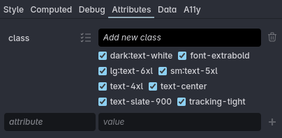
Adding classes can be done by typing into the field above the list, and Polypane automatically suggests classes for you to select.
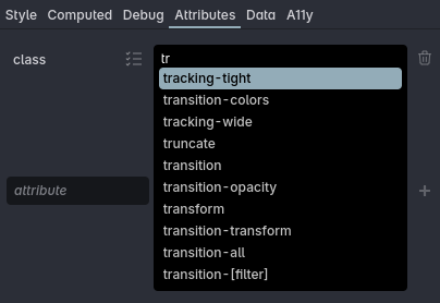
We'll be building more specialised tooling for atomic CSS styles in 2025, so look out for that!
Easily toggling dark mode and other preferences
Ability to add custom quick actions button. Such that I can add a button to easily switch between css prefer dark theme and light theme.
— Simon Karman (@simon_karman) September 18, 2024
The device toolbar/responsive design mode should stay open even when devtools are closed.
— Ryan Christian (@_rschristian) September 16, 2024
Also, easy toggles for switching between light/dark preferences. They should be front and center, not buried in a menu.
These are the biggest pain points when I need to use Chrome.
Quick(er) switch back and forth between normal view and colorblind view
— Knut Behrends (@sudo_f) September 16, 2024
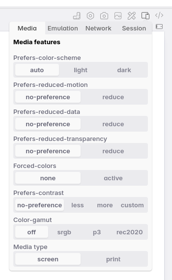
Polypane lets you toggle both media features and simulators per pane through easy menus.
Media features let you quickly toggle light/dark mode, forced colors, reduced motion and all the other media queries:
- prefers-color-scheme: Switch between 'light' and 'dark' mode color schemes using prefers-color-scheme. Defaults to 'auto', which follows the browsers color scheme.
- prefers-reduced-motion: Switch between 'no-preference' and 'reduce' options for the prefers reduced motion media feature.
- prefers-reduced-data: Switch between 'no-preference' and 'reduce' options for the prefers reduced data media feature.
- prefers-reduced-transparency: Switch between 'no-preference' and 'reduce' options for the prefers reduced transparency media feature.
- forced-colors: Emulates the forced-colors mode when active. This overwrites all the styles on your page to either a light mode or dark mode theme, depending on what you picked for prefers-color-scheme.
- prefers-contrast: Switch between 'no-preference', 'less', 'more' and 'custom' options for the prefers-contrast media feature.
- color-gamut: Switch between 'off', 'srgb', 'p3' and 'rec2020' color gamut emulation.
- Media type: Switch between 'screen' and 'print' stylesheets.
- Auto dark theme: Toggle the Chromium automatic dark theme feature. Not strictly a media query, but it does change the way your site is rendered based on the user's settings.
And the Simulators in Polypane, 22 in total including 9 different color blindness simulators can be easily toggled on and off from the debug tools menu.
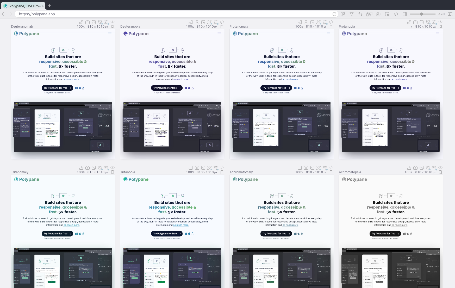
Beyond color blindness, Polypane can also simulate other visual impairments like cataracts, glaucoma and macular degeneration.
Debugging offset parents and stacking context
A stacking context debugger (This, but built-in: https://t.co/wwZ1qgV0Cr)
— Nathan Albrecht (@albrechtnate) September 16, 2024
Hopefully less necessary thanks to top layer, but still would be helpful!
Show the closest position:relative ancestor for an absolute positioned element.
— Senjor Egg (@senjoregg) September 17, 2024
Some tool for debugging stacking context
— Dominik Jašek (@jasek_dominik) September 17, 2024
Offset parents and stacking contexts are difficult to debug, but with the Debug tab in our Elements panel you can easily see both the stacking context of an element and its offset parent, as well as CSS properties that often cause issues like z-index and position.
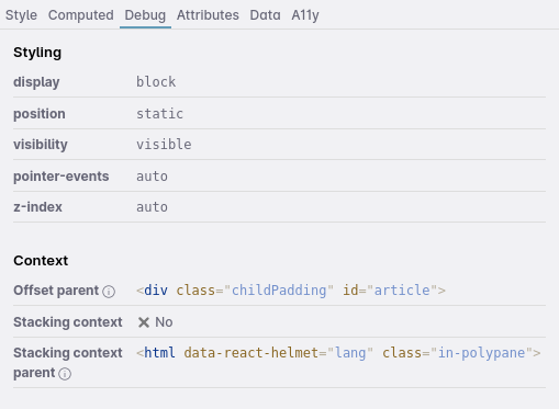
To learn more about offset parents and stacking contexts, read our article Offset parent and stacking context: positioning elements in all three dimensions.
Quickly disable JS
Quick disable javascript checkbox
— Даниил @grawl@mastodon.social (@GrawlCore) September 17, 2024
Disabling JS for a pane can be done quickly through the Debug tools menu for each pane.
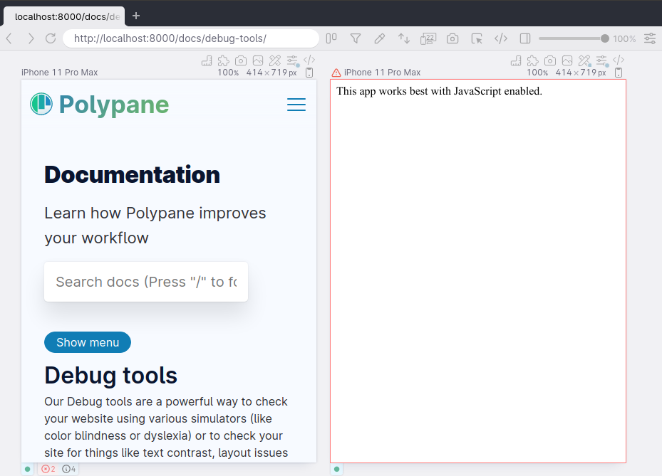
When JS is disabled we draw a red border and show a warning icon, so that you know something is different about this pane and you don't accidentally waste time figuring out why your JS doesn't work.
Screenshots
I'd like all the screenshot commands to be accessible without having to invoke cmd-P.
— codeOfArmz (@codeofarmz) September 16, 2024
In Polypane, ⌘ p will create a screenshot of all visible panes in an easy overview.
Screenshotting individual panes is available by clicking the camera icon above a pane, where we have options to screenshot the viewport, a specific element or the full height of the page.
When screenshotting an element you can choose to add padding around the element so your screenshot contains some of the context, and you can also add a delay before taking a screenshot so you can capture hover states or animations.
Responsive design mode
The device toolbar/responsive design mode should stay open even when devtools are closed.
— Ryan Christian (@_rschristian) September 16, 2024
Also, easy toggles for switching between light/dark preferences. They should be front and center, not buried in a menu.
These are the biggest pain points when I need to use Chrome.
- a hotkey to open responsive view without devtools themselves
— Lukas Trumm (@LukasTrumm) September 17, 2024
- a hotkey for every tab to open devtools right on that tab (at least console and network)
using those in Firefox every day...
This is what Polypane does.
Polypane shows your site in multiple different viewports by default, so it's always in responsive design mode.
There's a number of different layouts available letting you see different viewports side by side, focus on just one or have a regular browser pane. Each layout has a one-letter shortcut so you can quickly switch between them.
Missing anything else?
Are you missing any other features? Let us know! We're always looking to improve Polypane and make it the best browser for web developers.
If the above has piqued your interest, click the link below to start a free trial of Polypane!
