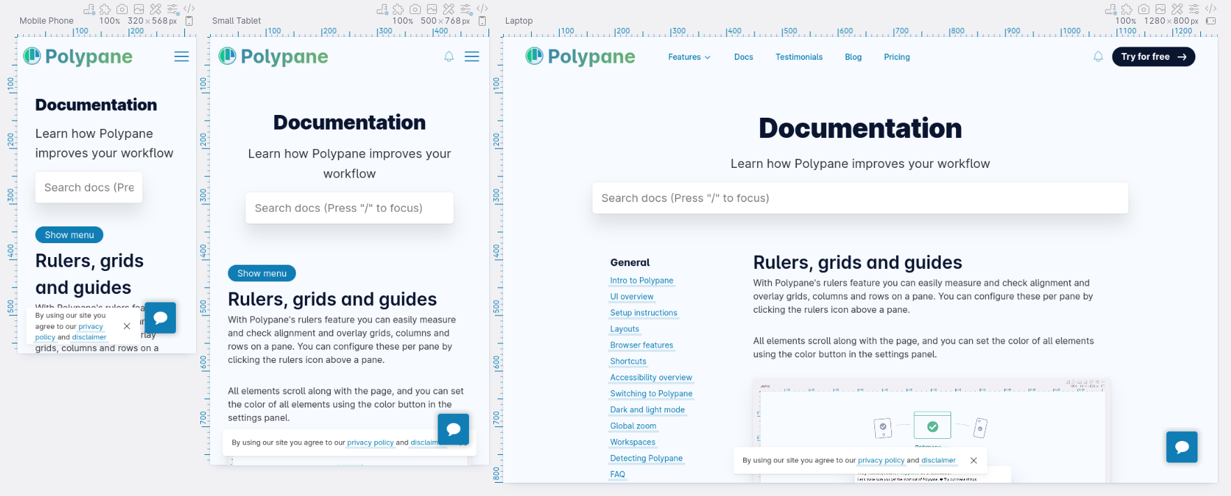
Documentation
Learn how Polypane improves your workflow
Rulers, grids and guides
With Polypane's rulers feature you can easily measure and check alignment and overlay grids, columns and rows on a pane. You can configure these per pane by clicking the rulers icon above a pane.
All elements scroll along with the page, and you can set the color of all elements using the color button in the settings panel.
Rulers
To show rulers for all panes in a tab press ⌘ g, middle click the rulers icon above a pane, click "Toggle Rulers" in the View menu or open the rulers popup for a pane and click "Show Rulers". Rulers are shown for all panes to keep the alignment consistent.
Rulers are shown either in pixels or in ems, depending on the settings for a pane (click the "px"/"em" indicator to toggle this).
To hide the rulers again, press ⌘ g again, middle click the rulers icon or click "Hide Rulers" in the View menu or rulers popup.
Changing the color
You can change the color of the rulers, grids and guides in the settings, to make sure it has enough contrast with your page.
Area measure overlay
The area measure overlay lets you draw rectangles on the page to measure their dimensions and distances to the edges of the pane, guides you have and each other. You can draw a rectangle, drag it around and resize it.
To toggle the area measure overlay, click the area measure icon visible in the top left corner when the rulers are active or click "show/hide area measure" in the Rulers popup. You can now click and drag anywhere on the page to draw a rectangle, or drag and resize existing rectangles. Click the close button inside a rectangle to remove it.
While the area measure overlay is active you can still scroll the page but clicks will be captured by the overlay. Hide the area measure by clicking the area measure icon in the top left next to the rulers or toggle the rulers completely ( ⌘ g ) to interact with the page again.
While interacting with a rectangle it will snap to any guides you have set, making it easy to measure the distance between two elements.
Screenshotting the measure
With a visible rectangle on the screen, the "Measured area" button in the pane screenshot menu will be available and will take a screenshot of the area you have selected. If you have multiple rectangles, the last selected one will be used.
This is useful when you need to screenshot a portion of the page that can't neatly be captured by the element screenshot functionality.
Guides
Hover over the rulers to show a guide. On either side of the guide is a number displaying how many pixels from that edge the guide is, making it easy to place.
Click anywhere on the ruler to add a permanent guide there, and a click in the same position to remove it again.
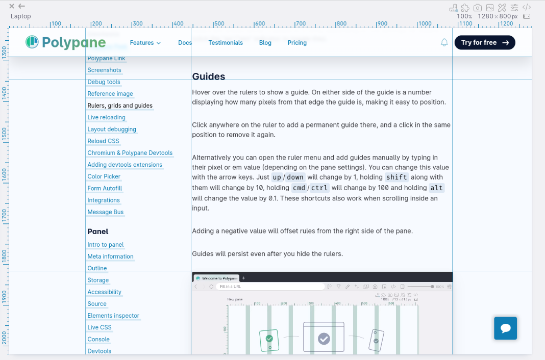
Alternatively you can open the ruler menu and add guides manually by typing in their pixel or em value (depending on the pane settings).
You can change these values with the arrow keys up and down keys to change the value. Holding ⇧ will change the value by 10, holding ⌘ changes the value by a 100, while holding ⌥ will change the value by 0.1.
Adding a negative value will offset rules from the right side of the pane.
Showing the distance between guides
By default, guides show the distance to the edges of the pane, but you can check 'Show distance between guides' to show the distance between all shown guides. This is useful when you want to check the distance between two elements, or when you want to check the size of something.
Guides will persist even after you hide the rulers.
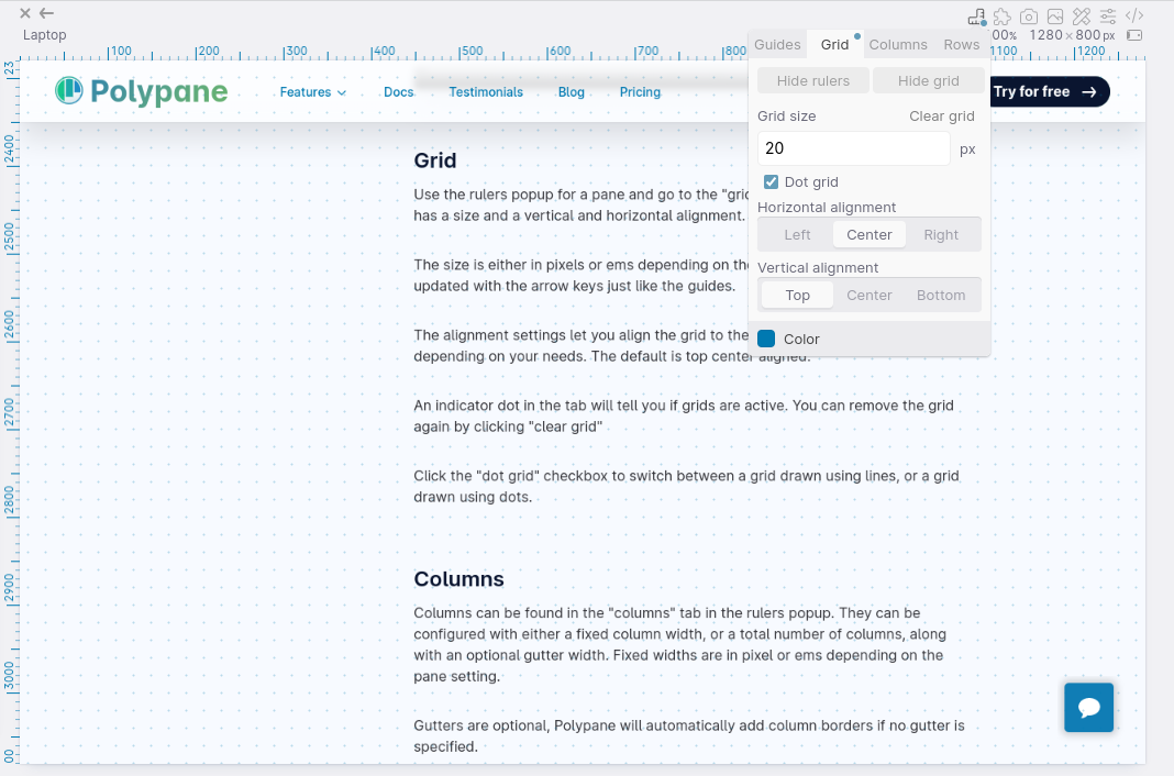
Grid
Use the rulers popup for a pane and go to the "grid" tab to configure a grid. A grid has a size and a vertical and horizontal alignment.
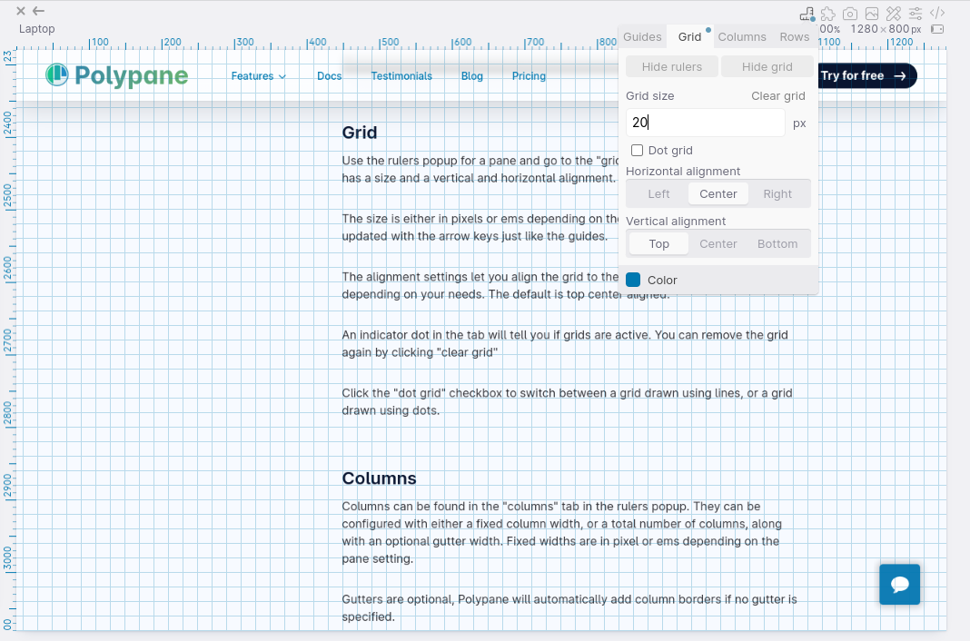
The size is either in pixels or ems depending on the pane setting, and can be updated with the arrow keys just like the guides.
The alignment settings let you align the grid to the edges or center of the page, depending on your needs. The default is top center aligned.
An indicator dot in the tab will tell you if grids are active. You can remove the grid again by clicking "clear grid"
Click the "dot grid" checkbox to switch between a grid drawn using lines, or a grid drawn using dots.
Columns
Columns can be found in the "columns" tab in the rulers popup. They can be configured with either a fixed column width, or a total number of columns, along with an optional gutter width and offset. Fixed widths are in pixel or ems depending on the pane setting. The offset is a margin from the aligned edge, so you can add e.g. a specific left margin to your design.
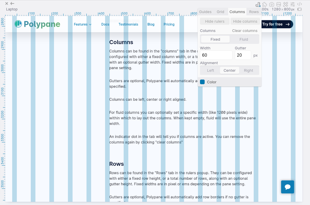
Gutters are optional, Polypane will automatically add column borders if no gutter is specified.
Columns can be left, center or right aligned.
For fluid columns you can optionally set a specific width (like 1200 pixels wide) within which to lay out the columns. When kept empty, fluid will use the entire pane width.
An indicator dot in the tab will tell you if columns are active. You can remove the columns again by clicking "clear columns"
Rows
Rows can be found in the "Rows" tab in the rulers popup. They can be configured with either a fixed row height, or a total number of rows, along with an optional gutter height and offset. Fixed widths are in pixel or ems depending on the pane setting. The offset is a margin from the aligned edge so you can add e.g. a specific top margin to your design.
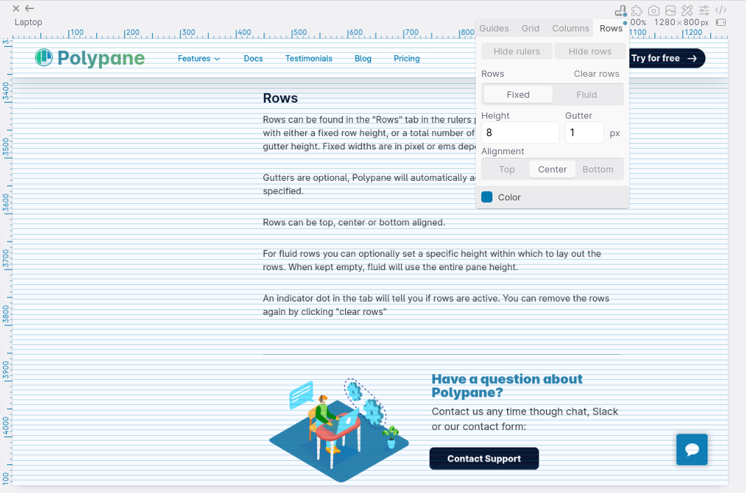
Gutters are optional, Polypane will automatically add row borders if no gutter is specified.
Rows can be top, center or bottom aligned.
For fluid rows you can optionally set a specific height within which to lay out the rows. When kept empty, fluid will use the entire pane height.
An indicator dot in the tab will tell you if rows are active. You can remove the rows again by clicking "clear rows"
Have a question about Polypane?
Reach out via (real human) chat, Slack or our contact form:
Contact SupportBuild your next project with Polypane
- Use all features on all plans
- On Mac, Windows and Linux
- 14-day free trial – no credit card needed

