Documentation
Learn how Polypane improves your workflow
Device presets
Polypane comes with a list of pane presets in four different categories: Mobile, Tablet, Desktop and Other. These contain a wide range of common devices, from iphones to android phones to smart watches to TV sizes. These device presets contain both viewport and device size options.
We keep this list up to date with popular iOS and Android devices and add new devices as they become available. If you have requests, let us know
Selecting devices
To select a device, click the title of a pane. The list of devices will be overlaid on top of the pane, and you can either click or use the arrow keys to select a device preset.
To the right of each device you can see the dimensions, and these will be updated depending on whether you pick viewport sizes or device sizes, and whether the current pane is in landscape or portrait orientation (depending on if a device supports orientation: a phone does, but TVs don't).
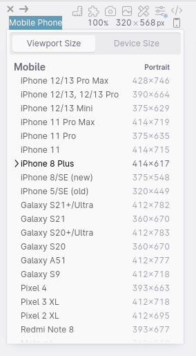
Viewport size or device size
at the top of the device selector there is a toggle button that will change the devices between the viewport size or the device size.
The viewport size is the size that is available to your site inside a (mobile) browser and includes small viewport and safe-area-inset emulations. This is perfect for building websites, because the size of the pane matches the available space when shown inside a browser on the device.
Viewport sizes have portrait and landscape variants (the space taken up by the navigation bars is different depending on the orientation) and we will automatically resize them to the appropriate sizes when you rotate a pane.
The Device size is the full, specified pixel dimensions of a device, ideal if you're developing a hybrid app. This setting will be remembered per pane.
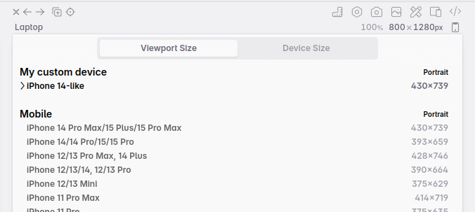
Custom device presets
If you want to add custom devices to this list, you can do so by creating a file called pane-sizes (no extension) in the Polypane application folder. This file should contain a JSON object with the following structure:
{
  "iOS": {
    "supportsOrientation": true,
    "sizes": [
      {
        "key": "iPhone 14",
        "releaseYear": "2022-10",
        "viewports": {
          "device": {
            "size": [390, 844]
          },
          "portrait": {
            "size": [390, 745],
            "svh": 82,
            "safeAreas": [0, 0, 0, 0]
          },
          "landscape": {
            "size": [844, 390],
            "svh": 50,
            "safeAreas": [0, 47, 21, 47]
          }
        },
        "screenType": "mobile",
        "emulateOrientation": true,
        "pixelRatio": 3,
        "userAgent": "Mozilla/5.0 (iPhone; CPU iPhone OS 17_0_1 like Mac OS X) AppleWebKit/605.1.15 (KHTML, like Gecko) Version/17.0 Mobile/15E148 Safari/604.1",
        "platform": "iPhone"
      }
    ]
  }
}
In this file you can add, remove or rename categories and presets. You can add as many categories as you want (so you could split 'Mobile' into 'iOS' and 'Android' if you wanted to) but they can't be named the same as the default categories.
The boolean supportsOrientation on a category determines if orientation should be taken into account for this category.
Replacing the default presets
You can add a global property replaceDefaults: true to replace the default presets with your own. This will remove all default presets and only show the ones you've added. The default for this property is false.
{
  "replaceDefaults": true,
  "iOS": {
    "supportsOrientation": true,
    "sizes": [ ... ]
  }
}
A future version of Polypane will provide a UI to manage device presets.
Have a question about Polypane?
Reach out via (real human) chat, Slack or our contact form:
Contact SupportBuild your next project with Polypane
- Use all features on all plans
- On Mac, Windows and Linux
- 14-day free trial – no credit card needed

