Documentation
Learn how Polypane improves your workflow
Debug tools
Debug tools give you instant, per-pane insight into your page's quality, layout, and user experience. They're built-in, so there are no browser extensions or separate auditing tools required.
The debug tools range from visual simulators (color blindness, vision impairments, bright sunlight) to structural analyzers (contrast checker, layout debugging, heading structure) to development aids (disable CSS/JS, edit content in-place).
This popup contains both debug tools and simulators in two separate tabs. To learn more about the simulators, read the Simulators documentation.
You can find the debug tools for each pane by clicking the pen-and-ruler icon above it. If a debug tool is active for the current pane, a blue dot will be displayed.
When a debug tool is active, you can clear it with the "X [debug tool]" button at the top of the popup and reload it with the "re-apply" button
There are over 40 different debug tools available split into different categories, ranging from color blindness simulators to text contrast checkers to disabling CSS and JS. Do you have an idea for a useful Debug tool? Let us know.
Polypane is filled with accessibility features. We wrote a full overview on our blog: Find and fix accessibility issues with Polypane.
Quick Mouse interactions
- Clicking the debug tool icon with your primary mouse icon will open the debug tool popup.
- Right-clicking the debug tool icon will reload the currently selected debug tool, useful for debug tools like the color contrast checker (after changes to the page) or the chaos content debug tool to apply new random content.
- Middle clicking the debug tool icon removes the current debug tool. Holding ⇧ while middle clicking will remove the debug tools from all panes.
Hold ⇧ while adding a debug tool will apply it to all panes.
Overview of all Debug tools
Polypane has over 40 Debug tools (which you can find on this page) and Simulators (which have their own page).
For more information on them inside Polypane you can hover the icon to the right of each overlay in the popup.
Debug tools
The debug tools tab contains tools that give you insight into how your page is built. It is split into four different categories: Layout, Accessibility, Content and Disable features.
Layout
Contains different tools to analyse the current layout of the page
Layout Debugging
Quickly find out if elements are where you expect them to be. This debug tool is also available as ⌘ d and you can read more about it on the Layout debugging page.
Elements that cause a horizontal scroll bar/horizontal overflow are highlighted in red, making it easy to spot them. Read more about detecting horizontal overflows.
Stacking Context 3D view
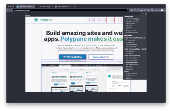
The 3D view shows the stacking context of your page in a 3D view. With every newly created stacking context or specified z-index, elements get pushed forwards.
This is useful to see how elements are stacked on top of each other and how they relate to each other, as well as debugging issues around z-indexs and stacking contexts.
Both the Show z-index debug tool and the Debug tab in the Elements panel can further help you debug stacking context issues.
To rotate the 3D view, click and drag with your mouse. Interactign with the page works as normal.
Reachability
Reachability overlays a color map to show how easy it is to reach parts of the screen. It's calibrated for the mobile device sizes in Polypane and comes in a right hand and left-hand version.
Unneeded scrollbars
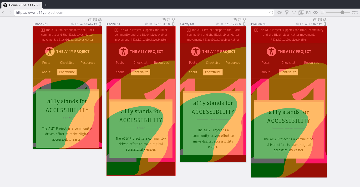
Draws scrollbars on the page where they are shown on regular browsers on Windows and Linux (and Mac with an external mouse) but aren't needed.
Show z-index
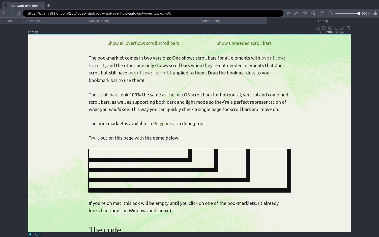
Show the z-indices of all visible elements, including if their ancestors have z-indices.
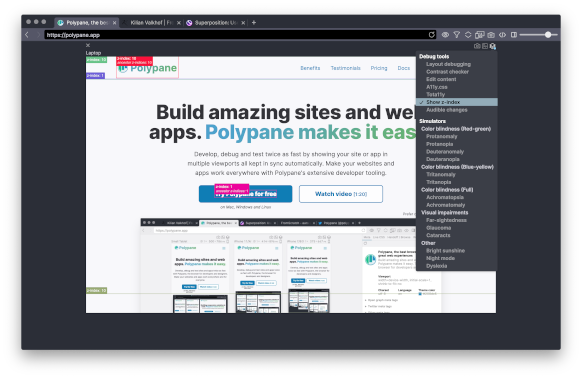
Both the Stacking Context 3D view debug tool and the Debug tab in the Elements panel can further help you debug stacking context issues.
View transition debugging
This debug tool slows down all view transitions so you can inspect them more closely, and highlights both the outgoing and incoming parts with different colored outlines.
Currently only works for same-page view transitions.
Accessibility
These debug tools give you ways to assess the accessibility of a page.
Contrast checker
Polypane will go through all your text and background color combinations and calculate the contrast ratio. Failing ones are highlighted everywhere they occur.
Hover over any of the failing ratios that have an arrow to see a suggested alternative color. You can hover over that suggested alternative color to preview it, or click it to apply the new styling and copy the suggested color to your clipboard.
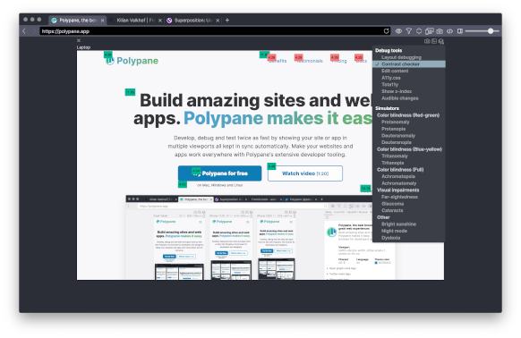
Polypane uses a custom-made algorithm to determine the ratio that takes the text color, background colors, text shadow, opacities, filters and text-strokes into account when determining the contrast ratio. Text with image backgrounds can not be checked automatically, for that we recommend using the built-in color picker to check the contrast ratio of the colors in the image against the text color.
Select AA or AAA to check against WCAG2 AA or WCAG2 AAA level contrast. The default is AA.
Make sure to check our free Color Contrast Checker to test colors online against WCAG and APCA, get previews and suggestions.
Track Focus
Get a visual highlight of the current focused element that follows the focus as you tab from element to element.
The focus order overlay shows you this information as well, but because the Track focus debug tool is dynamic it's better in handling things like focus traps and interactive pages.
While tabbing through your page you will find the role and computed name of the focused element in the bottom right corner of the pane. These are what screen readers use to determine what to read out loud so it's important to check if they are correct.
Target size cursor
Replaces your cursor with a square so you can measure if clickable elements are large enough and far enough apart. There are three sizes:
- 24 by 24 pixels: uses the dimensions and logic from WCAG 2.2 SC 2.5.8 (Level AA).
- 44 by 44 pixels: uses the dimensions from WCAG 2.1 SC 2.5.5 (Level AAA) and the Apple HIG.
- 48 by 48 pixels: uses the same dimensions and logic that Google uses for their mobile friendly test.
24 by 24 pixels is the default.
Elements that are too small and too close together (making tapping them hard) are detected and get a red area surrounding them indicating the space they need. Inline elements inside text content are exluded from this check, following the various specifications.
The target size debug tool has additional options visible in the top right corner of your pane.
The "Rescan target sizes" button will let you rerun the test to see if the changes you made to the page have fixed the issues.
Toggle the "Check inline elements" checkbox to also check clickable targets inside text content (like paragraphs). These are excluded from the WCAG 2.5.8 target size check, but you might still want to test them.
If the target size UI overlaps with the element you want to check, you can toggle it's position with the ⬍ icon button.
Detect small text
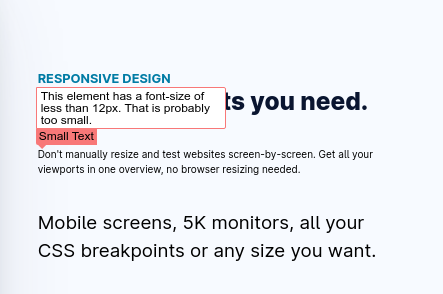
Detects elements that have small text: 12px for any content, and 16px for form elements (to prevent iOS from zooming in your page).
When small text is found, hover over the warning to show an explanation and click the button to increase the font size to 12 or 16 pixels (depending on the type of element) so you can preview its effects.
Text Spacing (WCAG 1.4.12)
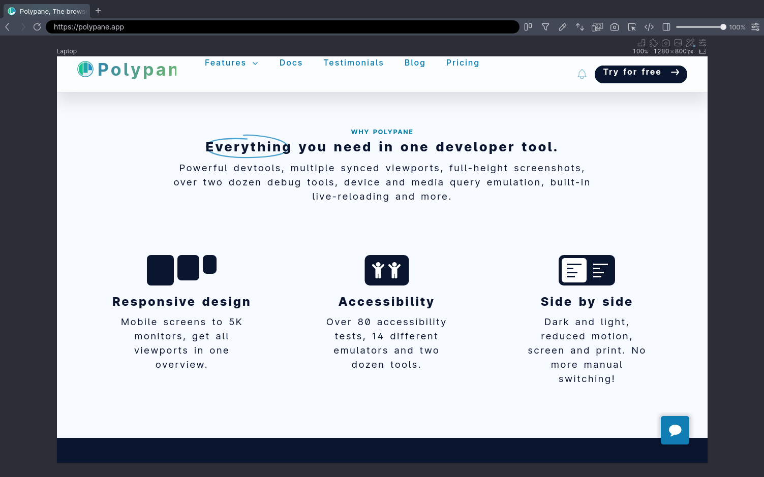
Applies the minimum text spacing requirements from the WCAG criterion 1.4.12. Use this to check if any content is lost with these extra settings. Here are the changes it applies:
- Line height (line spacing) to at least 1.5 times the font size;
- Spacing following paragraphs to at least 2 times the font size;
- Letter spacing (tracking) to at least 0.12 times the font size;
- Word spacing to at least 0.16 times the font size.
Show roles
Highlights all elements that have a role attribute, showing both the role and the element it's applied to. This helps you verify that the used role is appropriate and applicable for a given element
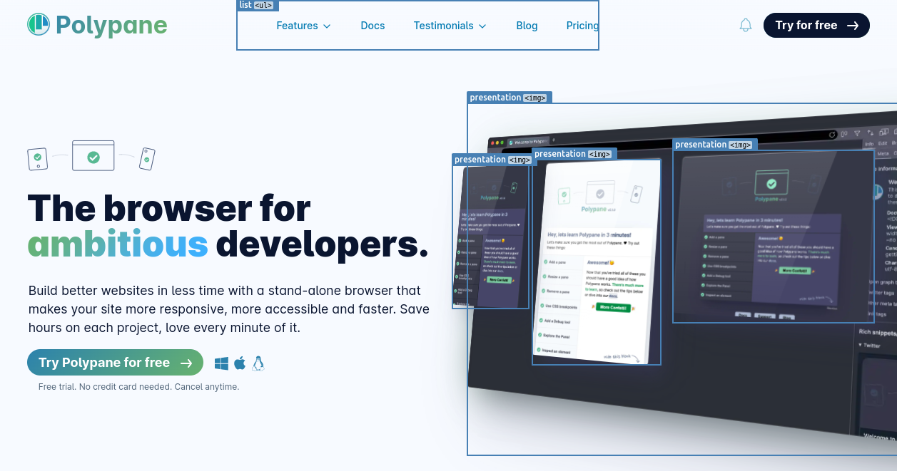
Show ARIA attributes
Highlights all elements that have aria attributes and lists the attributes and their values.
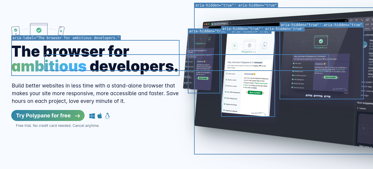
Apply all focus styling
Will apply the focus pseudo state to all focusable elements on the page so you can inspect their focus styles in one go.
Apply all focus-visible styling
Will apply both the focus-visible and focus pseudo state to all focusable elements on the page so you can inspect their focus styles in one go.
Apply all hover styling
Will apply the hover pseudo state to all interactive elements on the page so you can inspect their hover styles in one go.
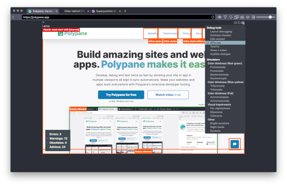
A11y.css third party
A11y.css will highlight any accessibility mistakes and possible risks on your page.
Content
Asses the content itself and the way it influences the page.
Edit content
Edit content makes the entire page editable so you can quickly try out new content and see how it looks.
Polypane automatically turns on spell checking when you're in edit content mode.
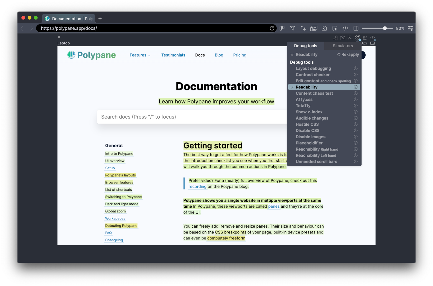
Readability
The readability debug tool will calculate how difficult each sentence on your page is. Darker, redder sentences are harder to understand while lighter, greener sentences are easier to read. We calculate this using the Automated Readability Index (ARI), which works well for most western, European languages. For pages in Arabic it uses the Automatic Arabic Readability Index (AARI).
If you know of Readability Index formulas for other languages, please contact us.
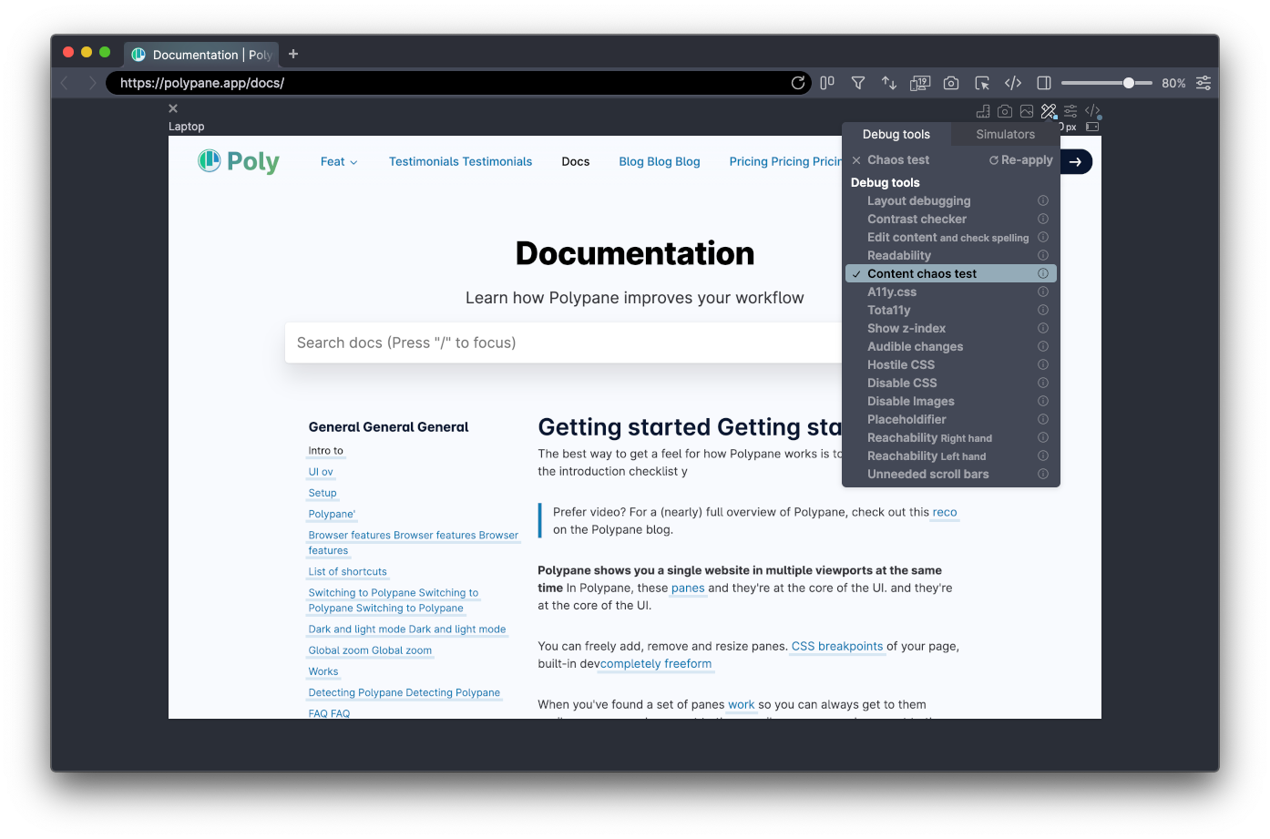
Content chaos test
Content chaos test will randomly increase or decrease text content so you can check how well your layout handles these situations. Can be used to check if you layout can handle different languages or longer and shorter content.
This debug tool has three variant: Less, More and Both. Less only shortens text (to test for languages that need less characters per word), More only lengthens text (to test for languages that need more characters per word). Both is a combination of the two with less extremes.
When active a warning icon is shown next to the pane title, and the entire pane has a red border.
Learn how to use this feature with our tutorial: How to check your site in different languages and writing modes.
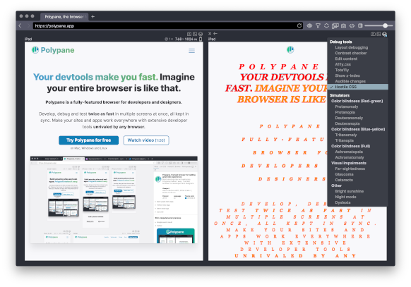
Hostile CSS
Hostile CSS will set ugly styles for all your default elements so you can see how well your component styles are isolated.
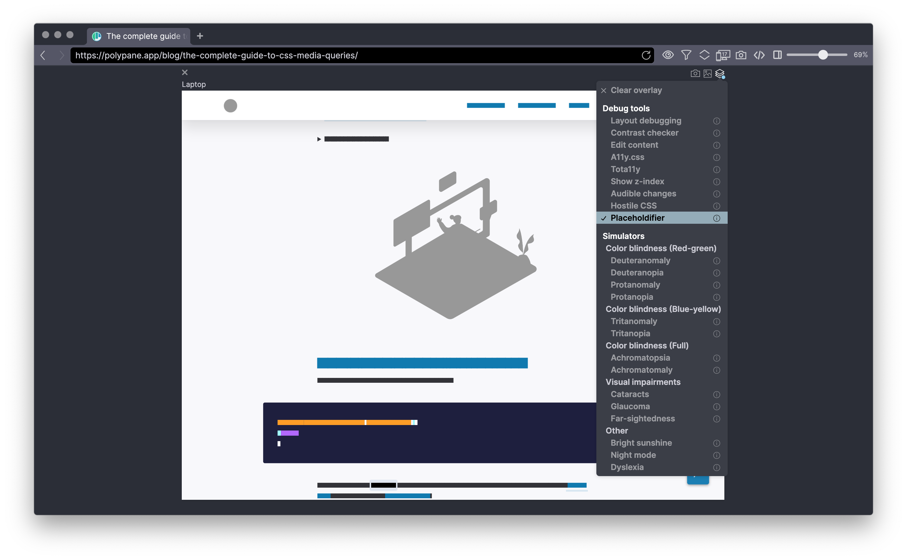
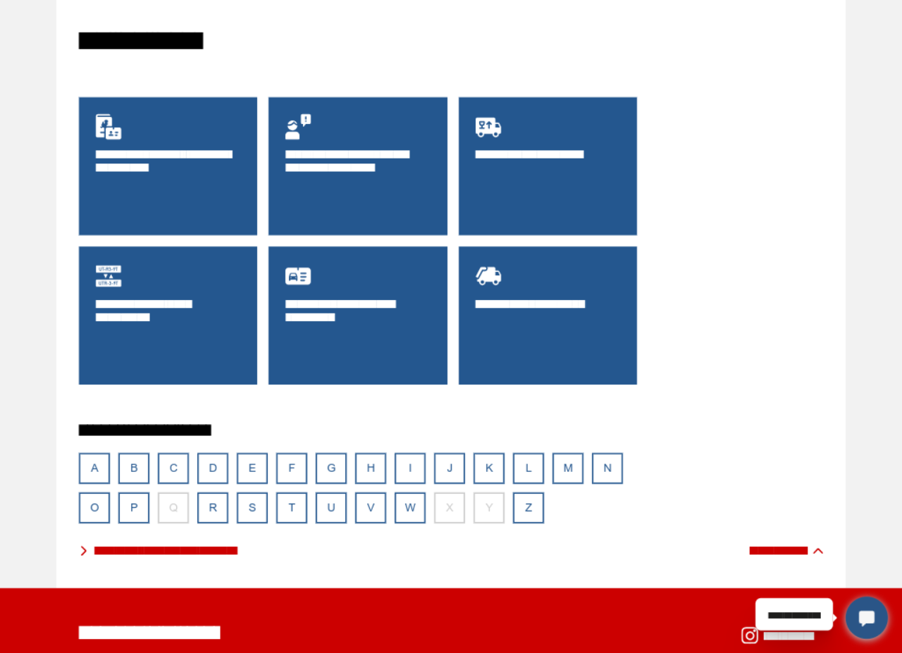
Placeholdifier (All content or Translatable only)
Placeholdifier replaces all your content (text, images and videos) with placeholders, so the (possible lorem ipsum/placeholder) content of a design doesn't distract from the design itself.
Only placeholderifying content that is translatable (excluding elements with a translate=no attribute) is useful when you quickly want to verify that certain parts of the page retain the specific language where they otherwise might get translated by a browser extension or service.
Audible changes
With audible changes, Polypane will sounds a beep whenever the page changes. A nice way to figure out when your page is too busy, or making changes when it does not have to.
Disable features
Turn off different features to test the resilience of your page.
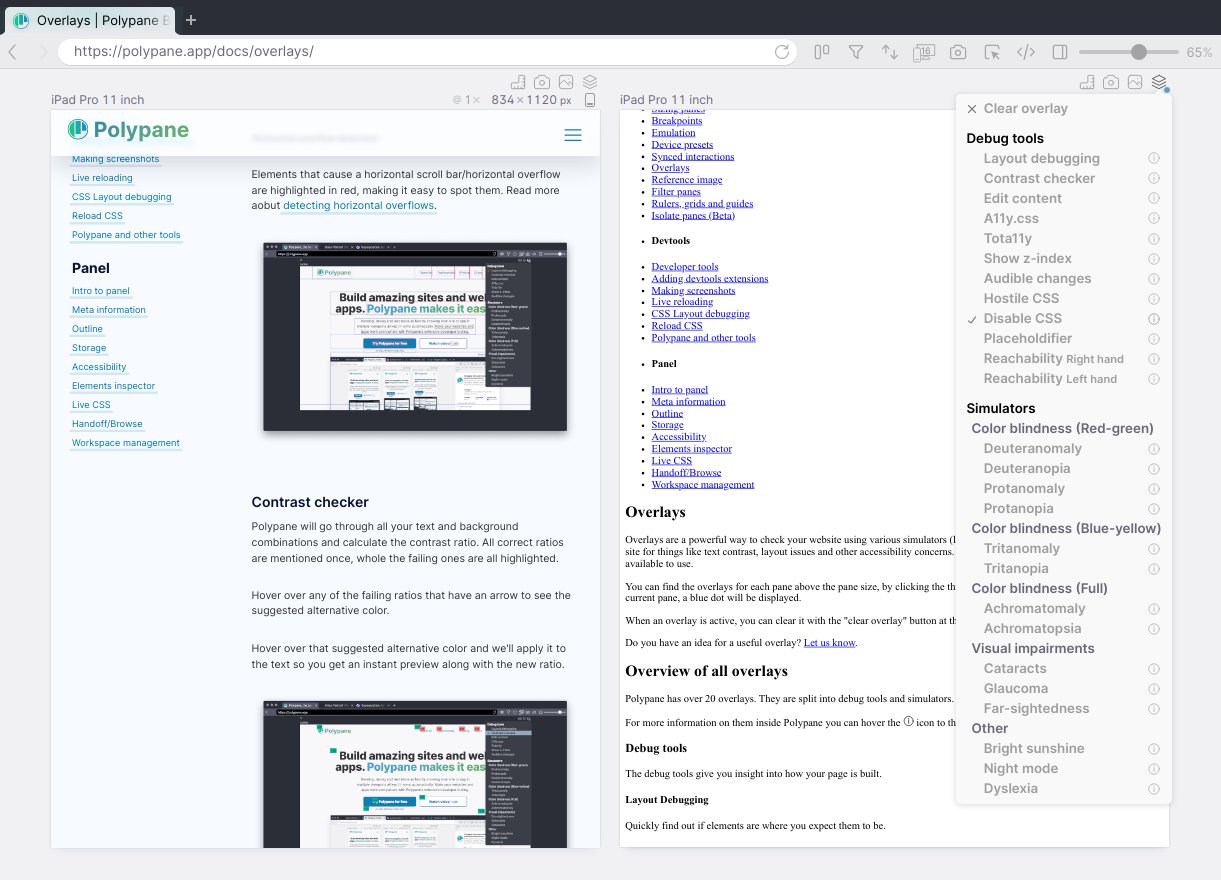
Disable CSS
Disable CSS will remove all CSS from stylesheets and style attributes on your page. When active a warning icon is shown next to the pane title, and the entire pane has a red border.
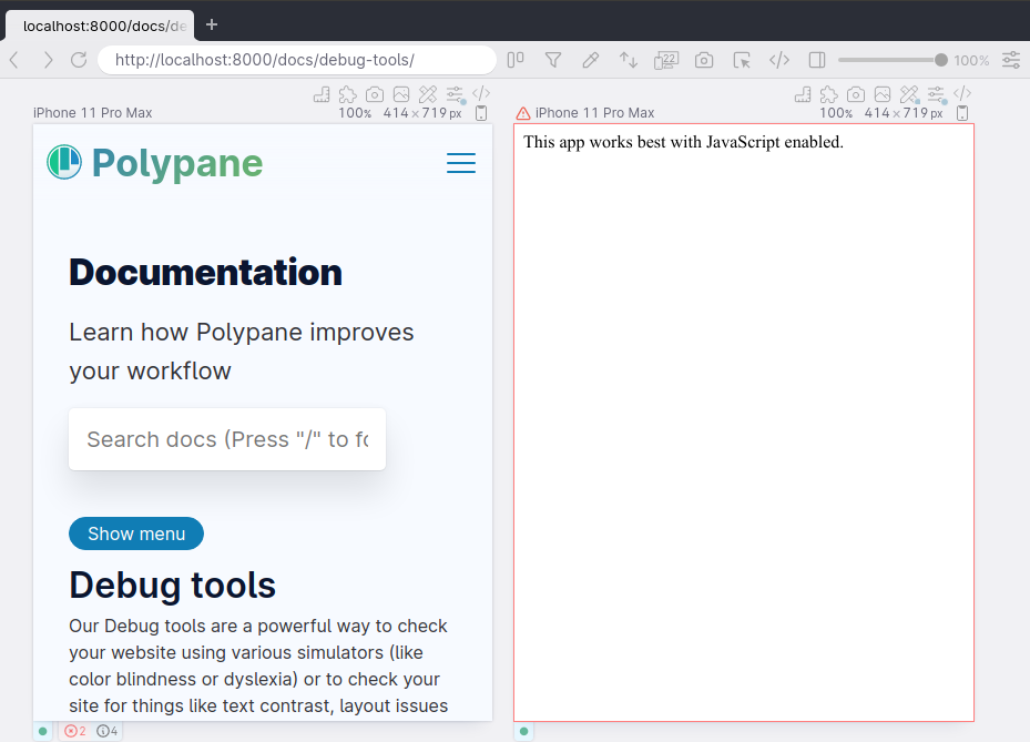
Disable JS
Disable JS will disable all JavaScript on a page. This will also prevent much of Polypane's tooling from running, so when this is active a warning icon is shown next to the pane title, and the entire pane has a red border.
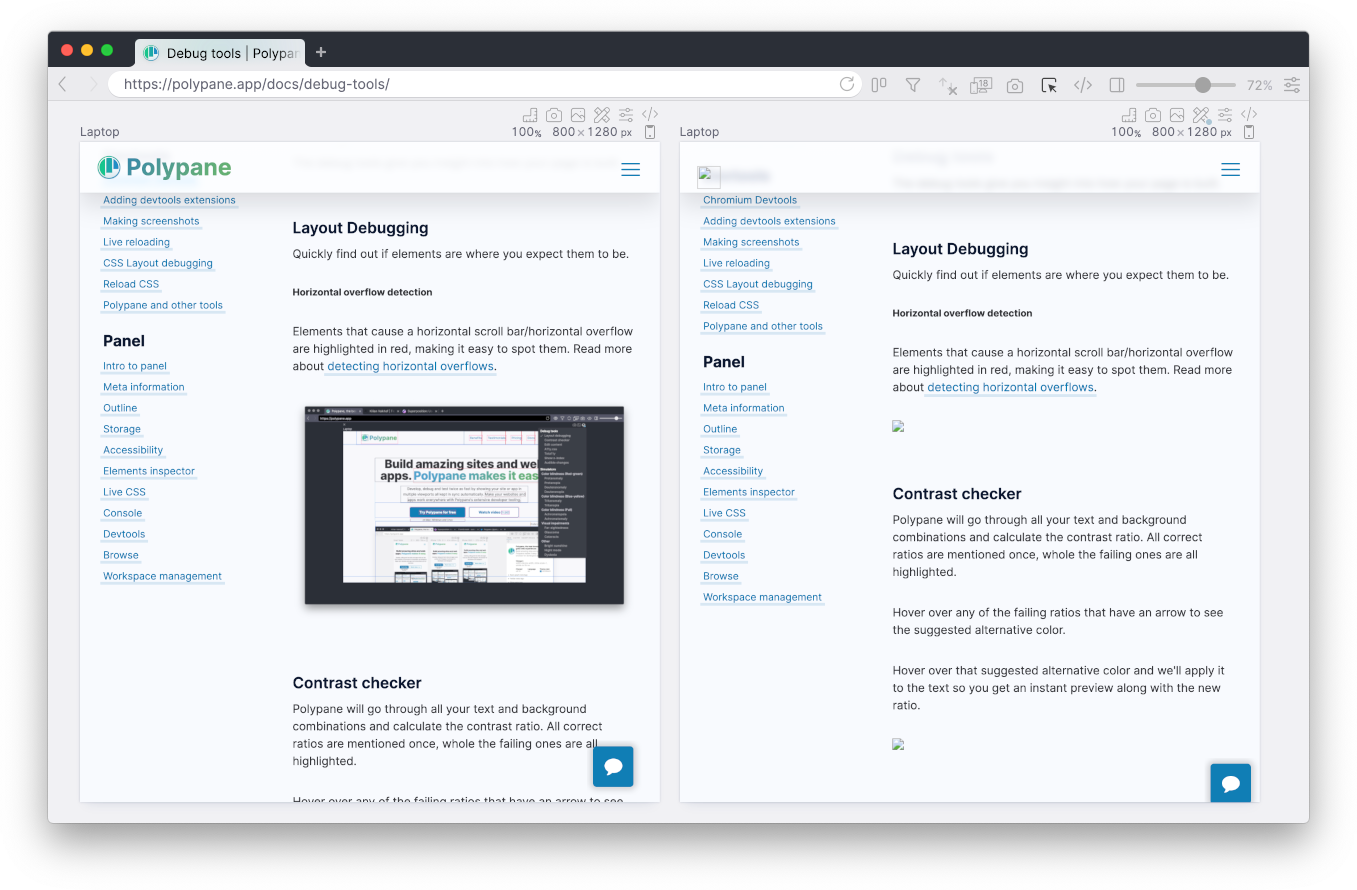
Disable Images
Disable Images will hide all images and background images on your page. You can use this to test your email rendering for email clients that block images or to check if your layout doesn't break when images are missing.
Hide Cursor
Hide the cursor in this pane to test keyboard accessibility without cheating.
Simulators
Polypane can simulate different types of impairments that lets you test your pages in different scenarios. The simulators are alxo available in the debug tools popup.
Learn more about the simulators in our Simulators documentation.
Have a question about Polypane?
Reach out via (real human) chat, Slack or our contact form:
Contact SupportBuild your next project with Polypane
- Use all features on all plans
- On Mac, Windows and Linux
- 14-day free trial – no credit card needed
