Documentation
Learn how Polypane improves your workflow
Responsive debugging workflow
Responsive bugs are hard to track down when you can only look at one viewport at a time. Polypane shows all your breakpoints side by side and syncs every interaction across them, so you can track down layout and media query issues in a single pass.
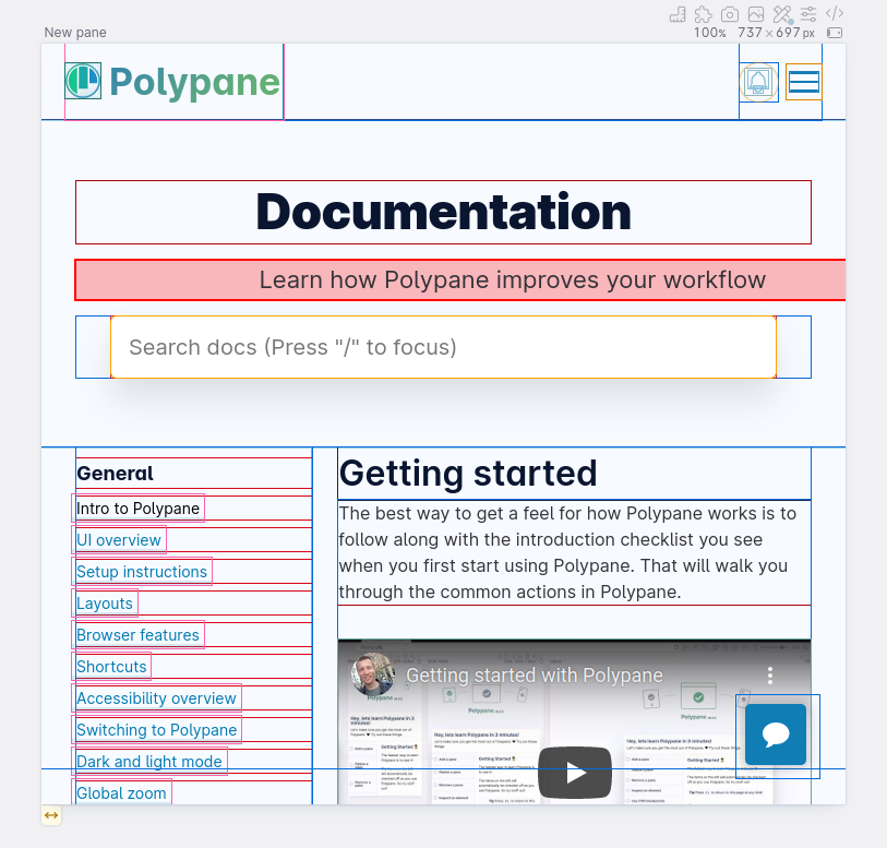
1. Generate panes for your breakpoints
Click the Breakpoints button in the top right of the screen (or press ⌘ b) to create a pane for every width-based CSS media query breakpoint Polypane detects in your CSS. Panes are sorted smallest to largest so you can read the layout progression left to right.

If you want a broader overview rather than every individual breakpoint, right-click the Breakpoints button and choose "Simplified" to get one representative pane per size range.
To test the boundaries where a breakpoint switches on or off, right-click the Breakpoints button and use "Breakpoint Edges". This creates panes at the breakpoint width and one pixel either side, which makes it easy to catch styles that apply at the wrong size.
2. Reproduce the bug in all panes at once
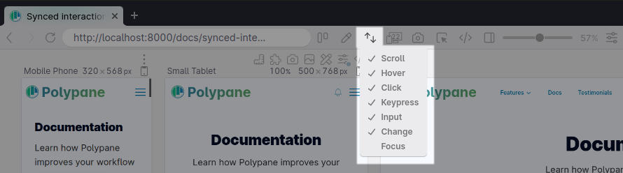
Synced interactions means anything you do in one pane, scroll, click, hover, type, happens in every other pane at the same time. Navigate to the page with the issue and interact with it normally. You will immediately see which panes show the broken behaviour and which do not.
If a bug only appears when a menu is open or a state is active, trigger that state once and all panes reflect it simultaneously.
3. Find the element causing the problem
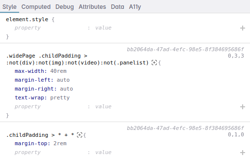
Hold ⌥ and click the broken element in any pane to inspect it. The Elements panel opens and highlights that element across every pane so you can compare how it renders at each size.
The Styles tab shows all CSS rules applied to the element including which media queries are active, so you can see exactly where your styles change and whether the right rules are applying at each breakpoint.
4. Enable layout debugging
Press ⌘ d to toggle layout debugging globally. This outlines every element on the page in a different colour, which makes it straightforward to see box model issues, unexpected wrapping, or collapsed containers that would otherwise be invisible.
Elements causing a horizontal overflow are highlighted in red. For automatic horizontal overflow detection before layout debugging is needed, see Horizontal overflow.
For individual panes, open Debug tools and apply layout debugging to a single pane only. You can also use the Flex/Grid overlay from the Elements panel to visualise flex and grid containers directly on the page.
5. Edit styles and see all breakpoints update
Make changes in the Styles tab of the Elements panel and every pane reflects the edit immediately. This lets you try a CSS fix and confirm it works at every breakpoint before writing it into your source code.
If you need to test a specific pseudo-state like :hover or :focus, toggle it on in the Elements panel so it stays active while you edit.
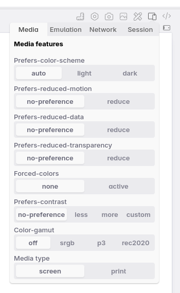
6. Check emulated conditions
Some responsive bugs only appear under specific operating conditions. Use Emulation settings on each pane to test combinations like:
- Dark mode alongside light mode
prefers-reduced-motionto check whether animations are correctly disabled- A different device pixel ratio to test high-density display styles
- Touch versus pointer input
Because emulation is per-pane, you can have the default and an emulated condition open side by side without switching anything on and off.
7. Capture your findings
Use overview screenshots to capture all panes in one image. Any active debug overlays appear in the screenshot, so layout debugging outlines and overflow highlights are preserved. Attach these to bug reports or pull requests to give a clear before/after comparison.
See also
- Breakpoints to automatically generate panes from your CSS media queries
- Synced interactions for how interactions are kept in sync across panes
- Layout debugging for element outlines and overflow highlighting
- Elements panel to inspect and edit elements across all panes
- Debug tools for per-pane overlays
- Emulation for device and user preference simulation
From the blog
- How to find the cause of horizontal scrollbars: strategies for tracking down elements that cause unwanted horizontal overflow
- Device testing is not enough: why testing at specific device sizes misses a large portion of your users
- Overlooked breakpoints in responsive design: the viewport sizes that often get forgotten during testing
- Offset parent and stacking context: positioning elements in all three dimensions: a deep dive into the layout concepts behind the most common positioning bugs
Have a question about Polypane?
Reach out via (real human) chat, Slack or our contact form:
Contact SupportBuild your next project with Polypane
- Use all features on all plans
- On Mac, Windows and Linux
- 14-day free trial – no credit card needed

